Get Fabric certified for FREE!
Don't miss your chance to take the Fabric Data Engineer (DP-600) exam for FREE! Find out how by watching the DP-600 session on-demand now through April 28th.
Learn more- Power BI forums
- Get Help with Power BI
- Desktop
- Service
- Report Server
- Power Query
- Mobile Apps
- Developer
- DAX Commands and Tips
- Custom Visuals Development Discussion
- Health and Life Sciences
- Power BI Spanish forums
- Translated Spanish Desktop
- Training and Consulting
- Instructor Led Training
- Dashboard in a Day for Women, by Women
- Galleries
- Data Stories Gallery
- Themes Gallery
- Contests Gallery
- QuickViz Gallery
- Quick Measures Gallery
- Visual Calculations Gallery
- Notebook Gallery
- Translytical Task Flow Gallery
- TMDL Gallery
- R Script Showcase
- Webinars and Video Gallery
- Ideas
- Custom Visuals Ideas (read-only)
- Issues
- Issues
- Events
- Upcoming Events
Join the FabCon + SQLCon recap series. Up next: Power BI, Real-Time Intelligence, IQ and AI, and Data Factory take center stage. All sessions are available on-demand after the live show. Register now
- Power BI forums
- Forums
- Get Help with Power BI
- Developer
- Comparing values based on slicer selections
- Subscribe to RSS Feed
- Mark Topic as New
- Mark Topic as Read
- Float this Topic for Current User
- Bookmark
- Subscribe
- Printer Friendly Page
- Mark as New
- Bookmark
- Subscribe
- Mute
- Subscribe to RSS Feed
- Permalink
- Report Inappropriate Content
Comparing values based on slicer selections
Hello, I am very new to Power BI and find some tasks difficult.
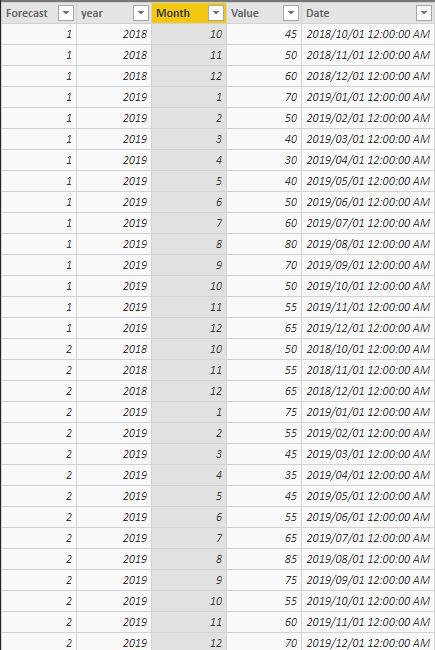
I have a single table with multiple forecasts that are timestamped (in this example simplified to just be called forecast 1, 2 etc.). Each forecast will contain the forecast periods (date, year, month).
I need the user to choose two forecast periods (most likley via two seperate drop downs) and then have a chart and table compare the two forecast periods.
Example: Dropdown 2 user chooses Forecast 2, Dropddown 1 user choose Forecast 1.
Chart shows line graph with the two forecasts, value over month/year
then a table that caclulates the delta between each of the year/month values.
I've looked online for about 3 hours but can't seem to find a solution. This is something that would take 10 minutes in Excel but seems much more complicated in Power BI.
Please help. I am on my knees!
Daniel
- Mark as New
- Bookmark
- Subscribe
- Mute
- Subscribe to RSS Feed
- Permalink
- Report Inappropriate Content
1. Try by Creating a duplicate dataset.
2. Display the value on the table chart from both dataset.
3. Add 2 slicers ie. 1st as from 1st dataset and 2nd from duplicate dataset on Forecast field.
SG
Helpful resources

Power BI Monthly Update - April 2026
Check out the April 2026 Power BI update to learn about new features.

New to Fabric Survey
If you have recently started exploring Fabric, we'd love to hear how it's going. Your feedback can help with product improvements.

Power BI DataViz World Championships - June 2026
A new Power BI DataViz World Championship is coming this June! Don't miss out on submitting your entry.

| User | Count |
|---|---|
| 2 | |
| 1 | |
| 1 | |
| 1 | |
| 1 |
| User | Count |
|---|---|
| 8 | |
| 8 | |
| 4 | |
| 3 | |
| 2 |

