FabCon is coming to Atlanta
Join us at FabCon Atlanta from March 16 - 20, 2026, for the ultimate Fabric, Power BI, AI and SQL community-led event. Save $200 with code FABCOMM.
Register now!- Power BI forums
- Get Help with Power BI
- Desktop
- Service
- Report Server
- Power Query
- Mobile Apps
- Developer
- DAX Commands and Tips
- Custom Visuals Development Discussion
- Health and Life Sciences
- Power BI Spanish forums
- Translated Spanish Desktop
- Training and Consulting
- Instructor Led Training
- Dashboard in a Day for Women, by Women
- Galleries
- Data Stories Gallery
- Themes Gallery
- Contests Gallery
- QuickViz Gallery
- Quick Measures Gallery
- Visual Calculations Gallery
- Notebook Gallery
- Translytical Task Flow Gallery
- TMDL Gallery
- R Script Showcase
- Webinars and Video Gallery
- Ideas
- Custom Visuals Ideas (read-only)
- Issues
- Issues
- Events
- Upcoming Events
The Power BI Data Visualization World Championships is back! Get ahead of the game and start preparing now! Learn more
- Power BI forums
- Forums
- Get Help with Power BI
- Desktop
- weird Ribbon Chart: not displaying full?
- Subscribe to RSS Feed
- Mark Topic as New
- Mark Topic as Read
- Float this Topic for Current User
- Bookmark
- Subscribe
- Printer Friendly Page
- Mark as New
- Bookmark
- Subscribe
- Mute
- Subscribe to RSS Feed
- Permalink
- Report Inappropriate Content
weird Ribbon Chart: not displaying full?
Hi there,
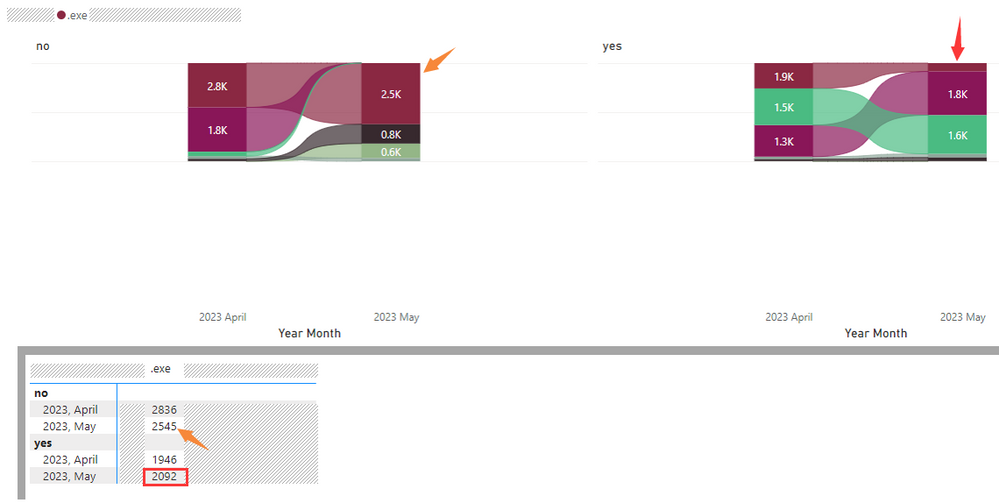
Got a question about Ribbon Chart as following shows, seems the display is incomplete (height issue).
As can be seen, a "small multiples" is applied, in the field, only 2 values: yes, no
After applying the small multiples, the Ribbon Chart changed with weird visuals:
as orange arrows point: the 2.5K area in May 2023 is apparently higher than 2.8K in April 2023.
as red box and arrow point: the 2092 in May 2023 is displaying much smaller area compare to 1.9K.
Seeing from the height of the 2 charts (left & right), seems the Y-axis is set to certain value so that the ribbon charts cannot be fully displayed, but I got nowhere to see the setting.
Is there any advice please?
Thanks.
H
Solved! Go to Solution.
- Mark as New
- Bookmark
- Subscribe
- Mute
- Subscribe to RSS Feed
- Permalink
- Report Inappropriate Content
Hi @Anonymous
Based on my test, I'm not able to reproduce this issue. I'm using Power BI Desktop 2.116.966.0 64-bit (April 2023). Which version of Power BI Desktop are you using? Is it possible to share a sample pbix which can reproduce this issue? How to provide sample data in the Power BI Forum
As the Ribbon Chart does not have a Y-axis formatting option, you can try converting it to a column chart, check whether the Y-axis range is appropriate, then change back to a Ribbon Chart.
Best Regards,
Community Support Team _ Jing
If this post helps, please Accept it as Solution to help other members find it.
- Mark as New
- Bookmark
- Subscribe
- Mute
- Subscribe to RSS Feed
- Permalink
- Report Inappropriate Content
Hi Jing,
The problem fixed after upgrading to June 2023 version.
Thanks.
H
Helpful resources

Power BI Dataviz World Championships
The Power BI Data Visualization World Championships is back! Get ahead of the game and start preparing now!

| User | Count |
|---|---|
| 40 | |
| 35 | |
| 34 | |
| 31 | |
| 28 |
| User | Count |
|---|---|
| 136 | |
| 102 | |
| 68 | |
| 66 | |
| 58 |


