FabCon is coming to Atlanta
Join us at FabCon Atlanta from March 16 - 20, 2026, for the ultimate Fabric, Power BI, AI and SQL community-led event. Save $200 with code FABCOMM.
Register now!- Power BI forums
- Get Help with Power BI
- Desktop
- Service
- Report Server
- Power Query
- Mobile Apps
- Developer
- DAX Commands and Tips
- Custom Visuals Development Discussion
- Health and Life Sciences
- Power BI Spanish forums
- Translated Spanish Desktop
- Training and Consulting
- Instructor Led Training
- Dashboard in a Day for Women, by Women
- Galleries
- Data Stories Gallery
- Themes Gallery
- Contests Gallery
- QuickViz Gallery
- Quick Measures Gallery
- Visual Calculations Gallery
- Notebook Gallery
- Translytical Task Flow Gallery
- TMDL Gallery
- R Script Showcase
- Webinars and Video Gallery
- Ideas
- Custom Visuals Ideas (read-only)
- Issues
- Issues
- Events
- Upcoming Events
The Power BI Data Visualization World Championships is back! Get ahead of the game and start preparing now! Learn more
- Power BI forums
- Forums
- Get Help with Power BI
- Desktop
- Re: up arrow / show a shape based on a formula
- Subscribe to RSS Feed
- Mark Topic as New
- Mark Topic as Read
- Float this Topic for Current User
- Bookmark
- Subscribe
- Printer Friendly Page
- Mark as New
- Bookmark
- Subscribe
- Mute
- Subscribe to RSS Feed
- Permalink
- Report Inappropriate Content
up arrow / show a shape based on a formula
Hi all.
I just want to show a shap (in this case a green arrow) based on a comparision between two numbers.
- Mark as New
- Bookmark
- Subscribe
- Mute
- Subscribe to RSS Feed
- Permalink
- Report Inappropriate Content
Hi,
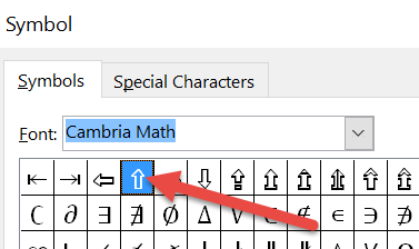
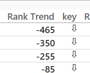
You can also use Cambria Math symbols to display the arrows.
Using a similar example smoupre gave you, the formula would look like:
Key = IF([Rank Trend]>-1,"⇧", "⇩")
You can copy the arrows directly from this thread into power bi.
/Ruth
- Mark as New
- Bookmark
- Subscribe
- Mute
- Subscribe to RSS Feed
- Permalink
- Report Inappropriate Content
Hi all,
Thanks for your contribution to the Community , I am learning and enjoying it because of you guys.
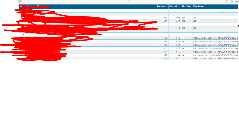
I have tried the KPI indicators using ruthpozuelo method as well as smoupre, I was able to use Unicode symbols in both Table and Matrix , Since I needed coloured arrows I was working with Image url's also, But it was not working as expected for me in Matrix.
Any workaround for this? I have shared a sample published link for your understanding.
Regards
- Mark as New
- Bookmark
- Subscribe
- Mute
- Subscribe to RSS Feed
- Permalink
- Report Inappropriate Content
ravsha85, can you share us your desktop file?
- Mark as New
- Bookmark
- Subscribe
- Mute
- Subscribe to RSS Feed
- Permalink
- Report Inappropriate Content
Thanks, I think this is the right solution
- Mark as New
- Bookmark
- Subscribe
- Mute
- Subscribe to RSS Feed
- Permalink
- Report Inappropriate Content
Hi
I have a problem finding the solution to this question.
Can anybody help ?
Kr / Per Hunosøe
- Mark as New
- Bookmark
- Subscribe
- Mute
- Subscribe to RSS Feed
- Permalink
- Report Inappropriate Content
There currently is no ability to edit interactions with shape visualizations or, to my knowledge, any kind of "conditionality" that you can have on shape visuals.
You could potentially get there with a custom column and a related table. What I am thinking of would be a table with your shapes loaded as images (URLs) along with something like an associated number or something, 1, 2, 3. You could have a custom column that based upon the comparison of two numbers, resulted in 1, 2, 3. IF([comparison]>xx,1,2) something like that. Then place the image in a table or card and filter it based upon the item selected. Obviously, I don't know anything about your data and this potential solution would only work in specific circumstances.
Follow on LinkedIn
@ me in replies or I'll lose your thread!!!
Instead of a Kudo, please vote for this idea
Become an expert!: Enterprise DNA
External Tools: MSHGQM
YouTube Channel!: Microsoft Hates Greg
Latest book!: DAX For Humans
DAX is easy, CALCULATE makes DAX hard...
- Mark as New
- Bookmark
- Subscribe
- Mute
- Subscribe to RSS Feed
- Permalink
- Report Inappropriate Content
So how could we show the difference between two figures?
- Mark as New
- Bookmark
- Subscribe
- Mute
- Subscribe to RSS Feed
- Permalink
- Report Inappropriate Content
@AuraCorp - Can you provide a little more information on what you are trying to accomplish? I'm not following what you are trying to do.
Follow on LinkedIn
@ me in replies or I'll lose your thread!!!
Instead of a Kudo, please vote for this idea
Become an expert!: Enterprise DNA
External Tools: MSHGQM
YouTube Channel!: Microsoft Hates Greg
Latest book!: DAX For Humans
DAX is easy, CALCULATE makes DAX hard...
- Mark as New
- Bookmark
- Subscribe
- Mute
- Subscribe to RSS Feed
- Permalink
- Report Inappropriate Content
Yes of course.
I am trying to migrate an existing excel dashboard to power BI.
In this dashboard we show the current score and compare then to the previous score. We do not show the previous score but use a formula to compare them.
The formula we use results in either a p or a q. I then use wingdings 3 to convert the p’s and q’s into up and down arrows and then use conditional formatting to make the font red or green.
The other solution we have is to use VBA showing an up arrow and hiding the down or vice a versa based on a formula.
I know arrows our a little old hat but my clients like them
Thanks in advance.
- Mark as New
- Bookmark
- Subscribe
- Mute
- Subscribe to RSS Feed
- Permalink
- Report Inappropriate Content
@AuraCorp - OK, here is what I did, see if something like this will work for you:
Values Table
Value 1,Value2
100,10
20,5
Keys Table
Key,Image
p,https://upload.wikimedia.org/wikipedia/commons/3/31/Urban_Meyer_vs_Michigan%2C_2013.jpg
q,https://upload.wikimedia.org/wikipedia/commons/b/b5/Luke_Fickell_in_2014.jpg
Formated Image as Image URL
In Values, create new custom column:
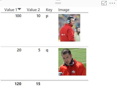
Key = IF([Value 1]-[Value 2]<20,"q","p")
Relate Key to Key table
Simple table visualization shown below:
"p" is Urban Meyer, "q" is Luke Fickell
So, if you have a red down arrow or green up arrow that you can point to online this might fit the bill.
Follow on LinkedIn
@ me in replies or I'll lose your thread!!!
Instead of a Kudo, please vote for this idea
Become an expert!: Enterprise DNA
External Tools: MSHGQM
YouTube Channel!: Microsoft Hates Greg
Latest book!: DAX For Humans
DAX is easy, CALCULATE makes DAX hard...
- Mark as New
- Bookmark
- Subscribe
- Mute
- Subscribe to RSS Feed
- Permalink
- Report Inappropriate Content
HI, @Greg_Deckler
how did you manage to get your picture URL display as image.
I used matrix to create a table. but when use the image URL as VALUES, it's still dispaying as URL not the actual image, i have applied the set the column to be "Image URL" as for the Data Category.
I read from other post where it will work for ROWS but not values, i have tried that it's the fact for me. can you please let me know how did you make the image to display and it's a value of the table please?
thanks,
Vida
- Mark as New
- Bookmark
- Subscribe
- Mute
- Subscribe to RSS Feed
- Permalink
- Report Inappropriate Content
instead of Matrix, you have to use use tables to be able to display the image. Matrix doesn't work.
Thanks,
Vida
- Mark as New
- Bookmark
- Subscribe
- Mute
- Subscribe to RSS Feed
- Permalink
- Report Inappropriate Content
HI, @Greg_Deckler
how did you manage to get your picture URL display as image.
I used matrix to create a table. but when use the image URL as VALUES, it's still dispaying as URL not the actual image, i have applied the set the column to be "Image URL" as for the Data Category.
I read from other post where it will work for ROWS but not values, i have tried that it's the fact for me. can you please let me know how did you make the image to display and it's a value of the table please?
thanks,
Vida
- Mark as New
- Bookmark
- Subscribe
- Mute
- Subscribe to RSS Feed
- Permalink
- Report Inappropriate Content
Hi
How did you format the image url? I get just a link when i do it?
Thanks
Alexander
- Mark as New
- Bookmark
- Subscribe
- Mute
- Subscribe to RSS Feed
- Permalink
- Report Inappropriate Content
Hi
I have a problem finding the solution to this question.
Can anybody help ?
Kr / Per Hunosøe
- Mark as New
- Bookmark
- Subscribe
- Mute
- Subscribe to RSS Feed
- Permalink
- Report Inappropriate Content
Go to Modelling tab and select the table column in which URL is present. On the top there is a 'Data Category' dropdown. Select Image URL in it. You should see images when you return to report.
Thanks,
Raja
- Mark as New
- Bookmark
- Subscribe
- Mute
- Subscribe to RSS Feed
- Permalink
- Report Inappropriate Content
It is not an image but a symbol within a DAX measure.
Maybe this helps:
https://youtu.be/7oCygwn75tQ
/Ruth
- Mark as New
- Bookmark
- Subscribe
- Mute
- Subscribe to RSS Feed
- Permalink
- Report Inappropriate Content
Hi Thanks Ruth! I actually managed to do it both ways via your way and also through linking an image to them with different colours,
Luckily we can now import KPI's from SSAS and PowerPivot to make things a bit easier!!
- Mark as New
- Bookmark
- Subscribe
- Mute
- Subscribe to RSS Feed
- Permalink
- Report Inappropriate Content
Have a great evening 🙂
/Ruth
- Mark as New
- Bookmark
- Subscribe
- Mute
- Subscribe to RSS Feed
- Permalink
- Report Inappropriate Content
I Know right , also cant wait until they let you change the axis size as well xD My bosses profusley moan at me for not being able to make it readable to stick a snapshot in a slide!
Hopefully the basics will come eventually!
Have a good evening too
Helpful resources

Power BI Dataviz World Championships
The Power BI Data Visualization World Championships is back! Get ahead of the game and start preparing now!

Power BI Monthly Update - November 2025
Check out the November 2025 Power BI update to learn about new features.

| User | Count |
|---|---|
| 59 | |
| 43 | |
| 42 | |
| 23 | |
| 17 |
| User | Count |
|---|---|
| 190 | |
| 122 | |
| 96 | |
| 66 | |
| 47 |


