This is best Fabric, Power BI, SQL and AI community event. How do we know? The last event sold out! Save €200 with code FABCMTY200.
Register nowJuly 28 - August 9 | Final Round of the Power BI Dataviz World Championships. This is your chance. Learn more
Hi All,
I have the below requirement:
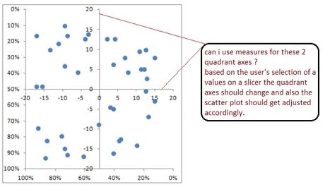
The end user wants to use a combination of a scatter plot and a quadrant chart, where the end user wants to specify the values of the quadrant axes(may be by slicer values) and the scatter plot(data points) should get adjusted based on the end user's values.
Not sure if this is possible with the Scatter chart/custom Quadrant chart...
Any inputs are appreciated...
Thanks !!
Solved! Go to Solution.
@sd782,
In Power BI Desktop, the Scatter Chart doesn't include quadrants. An idea about showing quadrants in Scatter Chart has been submitted in this link, you can vote it up.
In your scenario, the closest visual that you can create is Quadrant Chart custom visual, you are able to drag measures to X Axis and Y Axis of the custom visual.
Regards,
Lydia
@sd782,
In Power BI Desktop, the Scatter Chart doesn't include quadrants. An idea about showing quadrants in Scatter Chart has been submitted in this link, you can vote it up.
In your scenario, the closest visual that you can create is Quadrant Chart custom visual, you are able to drag measures to X Axis and Y Axis of the custom visual.
Regards,
Lydia
Hey -
I like the idea of quadrant chart which helps convey a strong message. However, the lines on X axis and Y axis that define these quadrants are not always fixed. It would change if user changes filter selections - for example, from filter country US to UK. Is this flexibility possible?
voted !!
thank you @Anonymous !!
Join us in Barcelona for FabCon and SQLCon, the Fabric, Power BI, SQL, and AI community event. Save €200 with code FABCMTY200.
| User | Count |
|---|---|
| 27 | |
| 22 | |
| 20 | |
| 18 | |
| 14 |
| User | Count |
|---|---|
| 25 | |
| 20 | |
| 20 | |
| 20 | |
| 20 |