FabCon is coming to Atlanta
Join us at FabCon Atlanta from March 16 - 20, 2026, for the ultimate Fabric, Power BI, AI and SQL community-led event. Save $200 with code FABCOMM.
Register now!- Power BI forums
- Get Help with Power BI
- Desktop
- Service
- Report Server
- Power Query
- Mobile Apps
- Developer
- DAX Commands and Tips
- Custom Visuals Development Discussion
- Health and Life Sciences
- Power BI Spanish forums
- Translated Spanish Desktop
- Training and Consulting
- Instructor Led Training
- Dashboard in a Day for Women, by Women
- Galleries
- Data Stories Gallery
- Themes Gallery
- Contests Gallery
- QuickViz Gallery
- Quick Measures Gallery
- Visual Calculations Gallery
- Notebook Gallery
- Translytical Task Flow Gallery
- TMDL Gallery
- R Script Showcase
- Webinars and Video Gallery
- Ideas
- Custom Visuals Ideas (read-only)
- Issues
- Issues
- Events
- Upcoming Events
The Power BI Data Visualization World Championships is back! Get ahead of the game and start preparing now! Learn more
- Power BI forums
- Forums
- Get Help with Power BI
- Desktop
- how to hide the gridlines in a 100% stacked bar?
- Subscribe to RSS Feed
- Mark Topic as New
- Mark Topic as Read
- Float this Topic for Current User
- Bookmark
- Subscribe
- Printer Friendly Page
- Mark as New
- Bookmark
- Subscribe
- Mute
- Subscribe to RSS Feed
- Permalink
- Report Inappropriate Content
how to hide the gridlines in a 100% stacked bar?
Hi folks,
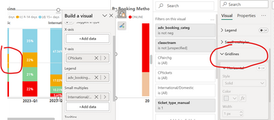
I am doing a 100% stacked bar and I want to hide the gridlines. Is any workaround?
Thank you in advance!
- Mark as New
- Bookmark
- Subscribe
- Mute
- Subscribe to RSS Feed
- Permalink
- Report Inappropriate Content
@Anonymous
Here's a workaround to hide gridlines for a 100% stacked bar chart in Power BI:
Create a Blank Background Image:
- Design a blank image (e.g., a white or transparent rectangle) in an image editing software like Adobe Photoshop, GIMP, or even using PowerPoint or Word.
- Ensure that the image dimensions match your Power BI report page dimensions.
Import the Image into Power BI:
- Go to the "Home" tab in Power BI and select "Enter Data."
- Create a new table with a single column that contains a unique identifier for each row, like numbers from 1 to N, where N is the number of rows and columns in your 100% stacked bar chart.
Create a Relationship:
- Go to the "Model" view in Power BI.
- Create a relationship between the table you just created and the table that contains the data for your 100% stacked bar chart. The relationship should connect the unique identifier in the new table to a suitable field in your data table.
Add a Card Visualization:
- On your report page, add a "Card" visualization.
- Drag the unique identifier field from the table you created in step 2 into the "Values" section of the Card visualization.
Set the Background Image:
- In the Card visualization settings, go to the "Format" tab.
- Under "Background Image," click on the dropdown and select the image you created in step 1.
Adjust Card Visualization Formatting:
- Format the Card visualization to match the size and position of your 100% stacked bar chart.
Place Your 100% Stacked Bar Chart:
- Add your 100% stacked bar chart on top of the Card visualization with the background image.
- Ensure that the chart covers the entire area of the Card visualization.
Format the Chart:
- Format the 100% stacked bar chart by removing any borders, lines, or gridlines.
By using this workaround, you essentially cover the gridlines with a blank background image. This gives the appearance of gridline removal. Make sure to adjust the positioning and sizing of the Card visualization and the 100% stacked bar chart to achieve the desired effect.
- Mark as New
- Bookmark
- Subscribe
- Mute
- Subscribe to RSS Feed
- Permalink
- Report Inappropriate Content
I checked mine, and that section seems to disable when you turn off the Y-axis in settings. So you could probably re-enable the Y-axis temporarily, disable gridlines, then turn it back off. 🙂
- Mark as New
- Bookmark
- Subscribe
- Mute
- Subscribe to RSS Feed
- Permalink
- Report Inappropriate Content
Ok, thank you. Althouh, it appears color white between bars, but it´s better than grey. Is any option to disable?
- Mark as New
- Bookmark
- Subscribe
- Mute
- Subscribe to RSS Feed
- Permalink
- Report Inappropriate Content
It's weird that it's on top of the bars, it should be behind - you might want to submit a screenshot with a bug report 🙂
- Mark as New
- Bookmark
- Subscribe
- Mute
- Subscribe to RSS Feed
- Permalink
- Report Inappropriate Content
I could do it. I need to turn on the gridlines, changed to white color and then, i turned it off.
Helpful resources

Power BI Dataviz World Championships
The Power BI Data Visualization World Championships is back! Get ahead of the game and start preparing now!

| User | Count |
|---|---|
| 39 | |
| 38 | |
| 38 | |
| 28 | |
| 27 |
| User | Count |
|---|---|
| 124 | |
| 88 | |
| 73 | |
| 66 | |
| 65 |


