FabCon is coming to Atlanta
Join us at FabCon Atlanta from March 16 - 20, 2026, for the ultimate Fabric, Power BI, AI and SQL community-led event. Save $200 with code FABCOMM.
Register now!- Power BI forums
- Get Help with Power BI
- Desktop
- Service
- Report Server
- Power Query
- Mobile Apps
- Developer
- DAX Commands and Tips
- Custom Visuals Development Discussion
- Health and Life Sciences
- Power BI Spanish forums
- Translated Spanish Desktop
- Training and Consulting
- Instructor Led Training
- Dashboard in a Day for Women, by Women
- Galleries
- Data Stories Gallery
- Themes Gallery
- Contests Gallery
- QuickViz Gallery
- Quick Measures Gallery
- Visual Calculations Gallery
- Notebook Gallery
- Translytical Task Flow Gallery
- TMDL Gallery
- R Script Showcase
- Webinars and Video Gallery
- Ideas
- Custom Visuals Ideas (read-only)
- Issues
- Issues
- Events
- Upcoming Events
The Power BI Data Visualization World Championships is back! Get ahead of the game and start preparing now! Learn more
- Power BI forums
- Forums
- Get Help with Power BI
- Desktop
- data modeling with multiple format
- Subscribe to RSS Feed
- Mark Topic as New
- Mark Topic as Read
- Float this Topic for Current User
- Bookmark
- Subscribe
- Printer Friendly Page
- Mark as New
- Bookmark
- Subscribe
- Mute
- Subscribe to RSS Feed
- Permalink
- Report Inappropriate Content
data modeling with multiple format
Hello,
please, I need your useful ideas in how to preview a report which its value column have multiple formats. I ask that's the best data modeling to be able getting visual reports.
in recap: I ask if can I use the [Metric Name] column in X-Axis then filter by [Week] or [Skill], or another preview that could show me the value by [Metric] or the value by [Skill]. or get a complete insight which could measure the [metric] by [Skill] and vs
thanks a lot,
- Mark as New
- Bookmark
- Subscribe
- Mute
- Subscribe to RSS Feed
- Permalink
- Report Inappropriate Content
Hi @AAbdelkader,
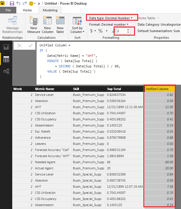
From my point of view, I don't think it is a good practice to put different formats data into a single column. So I would suggest you unify the formats for the column to Decimal Number type in this scenario. The percentage(80%) and integer(66) type data is easy to be changed to decimal number type. For the Time(0:11:00) type data, you can convert it to seconds or minutes first, then change it to decimal number.![]()
The formula below to create new calculate column to unify the formats is for your reference.
Unified Column =
IF (
    Data[Metric Name] = "AHT",
    MINUTE ( Data[Sup Total] )
        + SECOND ( Data[Sup Total] ) / 60,
    VALUE ( Data[Sup Total] )
)
Regards
Helpful resources

Power BI Dataviz World Championships
The Power BI Data Visualization World Championships is back! Get ahead of the game and start preparing now!

| User | Count |
|---|---|
| 40 | |
| 36 | |
| 33 | |
| 29 | |
| 26 |
| User | Count |
|---|---|
| 135 | |
| 103 | |
| 65 | |
| 61 | |
| 55 |


