Join the Fabric User Panel to shape the future of Fabric.
Share feedback directly with Fabric product managers, participate in targeted research studies and influence the Fabric roadmap.
Sign up now- Power BI forums
- Get Help with Power BI
- Desktop
- Service
- Report Server
- Power Query
- Mobile Apps
- Developer
- DAX Commands and Tips
- Custom Visuals Development Discussion
- Health and Life Sciences
- Power BI Spanish forums
- Translated Spanish Desktop
- Training and Consulting
- Instructor Led Training
- Dashboard in a Day for Women, by Women
- Galleries
- Data Stories Gallery
- Themes Gallery
- Contests Gallery
- QuickViz Gallery
- Quick Measures Gallery
- Visual Calculations Gallery
- Notebook Gallery
- Translytical Task Flow Gallery
- TMDL Gallery
- R Script Showcase
- Webinars and Video Gallery
- Ideas
- Custom Visuals Ideas (read-only)
- Issues
- Issues
- Events
- Upcoming Events
Get Fabric certified for FREE! Don't miss your chance! Learn more
- Power BI forums
- Forums
- Get Help with Power BI
- Desktop
- Re: data modeling with multiple format
- Subscribe to RSS Feed
- Mark Topic as New
- Mark Topic as Read
- Float this Topic for Current User
- Bookmark
- Subscribe
- Printer Friendly Page
- Mark as New
- Bookmark
- Subscribe
- Mute
- Subscribe to RSS Feed
- Permalink
- Report Inappropriate Content
data modeling with multiple format
Hello,
please, I need your useful ideas in how to preview a report which its value column have multiple formats. I ask that's the best data modeling to be able getting visual reports.
in recap: I ask if can I use the [Metric Name] column in X-Axis then filter by [Week] or [Skill], or another preview that could show me the value by [Metric] or the value by [Skill]. or get a complete insight which could measure the [metric] by [Skill] and vs
thanks a lot,
- Mark as New
- Bookmark
- Subscribe
- Mute
- Subscribe to RSS Feed
- Permalink
- Report Inappropriate Content
Hi @AAbdelkader,
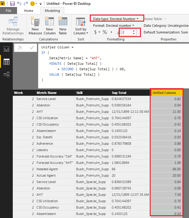
From my point of view, I don't think it is a good practice to put different formats data into a single column. So I would suggest you unify the formats for the column to Decimal Number type in this scenario. The percentage(80%) and integer(66) type data is easy to be changed to decimal number type. For the Time(0:11:00) type data, you can convert it to seconds or minutes first, then change it to decimal number.![]()
The formula below to create new calculate column to unify the formats is for your reference.
Unified Column =
IF (
    Data[Metric Name] = "AHT",
    MINUTE ( Data[Sup Total] )
        + SECOND ( Data[Sup Total] ) / 60,
    VALUE ( Data[Sup Total] )
)
Regards
Helpful resources

Join our Community Sticker Challenge 2026
If you love stickers, then you will definitely want to check out our Community Sticker Challenge!

Power BI Monthly Update - January 2026
Check out the January 2026 Power BI update to learn about new features.

| User | Count |
|---|---|
| 65 | |
| 65 | |
| 45 | |
| 21 | |
| 18 |
| User | Count |
|---|---|
| 115 | |
| 114 | |
| 38 | |
| 36 | |
| 26 |


