Get certified for free when you join Fabric Data Days 2026 and dive into Fabric, Power BI, SQL, AI, and other essential data skills.
Join nowJuly 28 - August 9 | Final Round of the Power BI Dataviz World Championships. This is your chance. Learn more
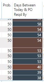
I have a calculated column that just takes the difference of today's data and another date. The output of which is the number of days shown in the 2nd column below. I have a divergent conditional format applied, but for some reason, I get different colors even when the values are exactly the same (and the respective dates are also the same).
And the conditional color does not seem to apply consistently down the data series. You can see below that the 58 is blue, then a dark red 54...followed by a dark blue 54...then another dark red 54, etc....
Any idea why this is happening?
Proud to be a Super User!
Hello,
Unfortunately it's not easy to change my file and send to you.
However, I did change the conditional from summing to instead using an average. This seems to have fixed the problem, although I still don't know why it does that if I use "sum".
But thank you!
If you love stickers, then you will definitely want to check out our community sticker challenge, Barcelona edition!
Check out the July 2026 Power BI update to learn about new features.
| User | Count |
|---|---|
| 29 | |
| 28 | |
| 20 | |
| 20 | |
| 19 |
| User | Count |
|---|---|
| 35 | |
| 28 | |
| 20 | |
| 18 | |
| 17 |