Huge last-minute discounts for FabCon Vienna from September 15-18, 2025
Supplies are limited. Contact info@espc.tech right away to save your spot before the conference sells out.
Get your discount- Power BI forums
- Get Help with Power BI
- Desktop
- Service
- Report Server
- Power Query
- Mobile Apps
- Developer
- DAX Commands and Tips
- Custom Visuals Development Discussion
- Health and Life Sciences
- Power BI Spanish forums
- Translated Spanish Desktop
- Training and Consulting
- Instructor Led Training
- Dashboard in a Day for Women, by Women
- Galleries
- Data Stories Gallery
- Themes Gallery
- Contests Gallery
- Quick Measures Gallery
- Notebook Gallery
- Translytical Task Flow Gallery
- TMDL Gallery
- R Script Showcase
- Webinars and Video Gallery
- Ideas
- Custom Visuals Ideas (read-only)
- Issues
- Issues
- Events
- Upcoming Events
Score big with last-minute savings on the final tickets to FabCon Vienna. Secure your discount
- Power BI forums
- Forums
- Get Help with Power BI
- Desktop
- Re: Waterfall Graph Application
- Subscribe to RSS Feed
- Mark Topic as New
- Mark Topic as Read
- Float this Topic for Current User
- Bookmark
- Subscribe
- Printer Friendly Page
- Mark as New
- Bookmark
- Subscribe
- Mute
- Subscribe to RSS Feed
- Permalink
- Report Inappropriate Content
Waterfall Graph Application
Hi all,
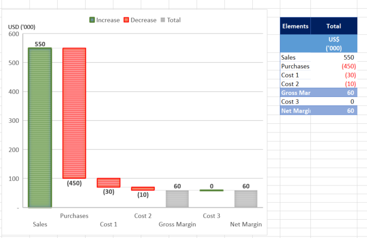
From the Tutorial, the waterfall graph can present the changes over time. But I did something else in excel as below as try to replicate it in Power BI but in vain.
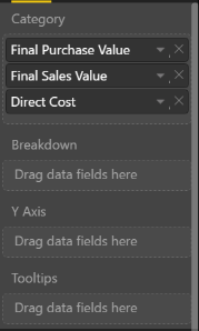
Below, i am showing the breakdown by elements. For those elements, they are different attributes (fields) in the database. Not sure how to put the fields into the visualisation panel (Category, Breakdown, Y Axis).
Solved! Go to Solution.
- Mark as New
- Bookmark
- Subscribe
- Mute
- Subscribe to RSS Feed
- Permalink
- Report Inappropriate Content
@JeffreyLau wrote:
Hi all,
From the Tutorial, the waterfall graph can present the changes over time. But I did something else in excel as below as try to replicate it in Power BI but in vain.
Below, i am showing the breakdown by elements. For those elements, they are different attributes (fields) in the database. Not sure how to put the fields into the visualisation panel (Category, Breakdown, Y Axis).
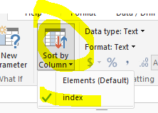
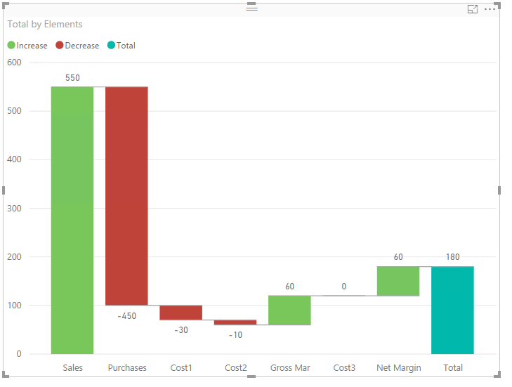
AFAIK, it is not able to create the very equivalent waterfall graph in Power BI. One similar graph as below can be created, however the elements have to be assigned an index to determine the present order in the graph. See more details in the attached pbix file.


