A new Data Days event is coming soon!
This time we’re going bigger than ever. Fabric, Power BI, SQL, AI and more. We're covering it all. You won't want to miss it.
Learn more- Power BI forums
- Get Help with Power BI
- Desktop
- Service
- Report Server
- Power Query
- Mobile Apps
- Developer
- DAX Commands and Tips
- Custom Visuals Development Discussion
- Health and Life Sciences
- Power BI Spanish forums
- Translated Spanish Desktop
- Training and Consulting
- Instructor Led Training
- Dashboard in a Day for Women, by Women
- Galleries
- Data Stories Gallery
- Themes Gallery
- Contests Gallery
- QuickViz Gallery
- Quick Measures Gallery
- Visual Calculations Gallery
- Notebook Gallery
- Translytical Task Flow Gallery
- TMDL Gallery
- R Script Showcase
- Webinars and Video Gallery
- Ideas
- Custom Visuals Ideas (read-only)
- Issues
- Issues
- Events
- Upcoming Events
Level up your Power BI skills this month - build one visual each week and tell better stories with data! Get started
- Power BI forums
- Forums
- Get Help with Power BI
- Desktop
- Re: Waterfall Chart using multiple measures
- Subscribe to RSS Feed
- Mark Topic as New
- Mark Topic as Read
- Float this Topic for Current User
- Bookmark
- Subscribe
- Printer Friendly Page
- Mark as New
- Bookmark
- Subscribe
- Mute
- Subscribe to RSS Feed
- Permalink
- Report Inappropriate Content
Waterfall Chart using multiple measures
Hello,
I know this must've been an old topic in Business Intelligence.
However, I didn't find any idea to realize what I'd like to achieve.
The thing is I'd like to create a Waterfall Chart with multiple measures.
Let's say that there's Fact Table containg accounting data (Revenues, Costs, Profits)
Thus it's a kind of running total, I can expect to draw the chart.
(Which item is main cause of profit decrease e.g., Ads/Logistics)
However, only solution I found at Google is restructuring the dataset like below
I don't think it's a good idea to manipulate the fact table, plus if I create another table, all the current measure refering the Table A would be not working with newly made one.
Is there any way to solve this?
Many thanks,
- Mark as New
- Bookmark
- Subscribe
- Mute
- Subscribe to RSS Feed
- Permalink
- Report Inappropriate Content
Hi,
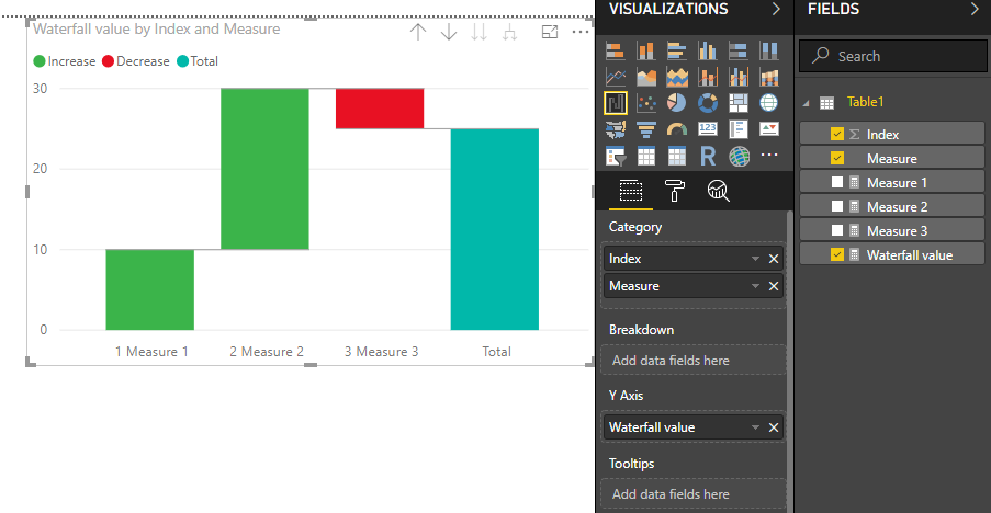
Yes, you can do it via a workaround in DAX formula and a control table.
1. Create a table with matching "measure" name:
2. Create an additional measure for your waterfall chart, you may apply + or - for your measure to get the waterfall sentiment:
Waterfall value =
    SWITCH (
        SELECTEDVALUE ( Table1[Index] );
        1; +[Measure 1];
        2; +[Measure 2];
        3; -[Measure 3];
        BLANK()
    )
3. Apply the new measure in your waterfall chart, with the category based on the table field created (Note that you need to sort it via the category, use hierarchical drill-down if needed):
Cheers!
- Mark as New
- Bookmark
- Subscribe
- Mute
- Subscribe to RSS Feed
- Permalink
- Report Inappropriate Content
Hi!
thank you very much for this solution! it saved my day! I would like to ask if it´s possible to change the column color of just 3 measures. Is it possible? if yes, how? thank you!
- Mark as New
- Bookmark
- Subscribe
- Mute
- Subscribe to RSS Feed
- Permalink
- Report Inappropriate Content
@Anonymous Hi, I know this is really old. Do you have the sample pbix file? I am not following the. Create a table with matching "measure" name. Thank you
- Mark as New
- Bookmark
- Subscribe
- Mute
- Subscribe to RSS Feed
- Permalink
- Report Inappropriate Content
This is amazing. Thank you!
- Mark as New
- Bookmark
- Subscribe
- Mute
- Subscribe to RSS Feed
- Permalink
- Report Inappropriate Content
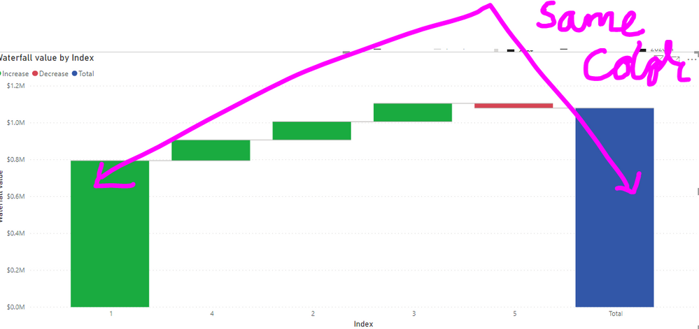
Hi..Thanks for this solution. But how can you remove Total bar?? In my case, total bar is undesirable...moreover, can we change the colour of first and last bars to keep in lookalike?
- Mark as New
- Bookmark
- Subscribe
- Mute
- Subscribe to RSS Feed
- Permalink
- Report Inappropriate Content
this is my question!!
- Mark as New
- Bookmark
- Subscribe
- Mute
- Subscribe to RSS Feed
- Permalink
- Report Inappropriate Content
That's prety cool @Anonymous, thanks
We dont need the column with the measures name in the table, just one with the names that we want in the axis, sorted by the index column.
In the graph we only need that name column, and the graph sorted by that column. No need for drilldown
Any ideas on how to change he colors? Maybe with the breakdown field?
- Mark as New
- Bookmark
- Subscribe
- Mute
- Subscribe to RSS Feed
- Permalink
- Report Inappropriate Content
Thanks a lot for this. How can I make the color of starting bar and end bar same? basically i want to show 1st bar as begining value. then all components and then fianlly end value. I want to set these 2 bars as total and different color from increase/decrease
- Mark as New
- Bookmark
- Subscribe
- Mute
- Subscribe to RSS Feed
- Permalink
- Report Inappropriate Content
I have the same question
- Mark as New
- Bookmark
- Subscribe
- Mute
- Subscribe to RSS Feed
- Permalink
- Report Inappropriate Content
Thank you a lot for this amazing solution!
I have just tried it out and it works perfectly
- Mark as New
- Bookmark
- Subscribe
- Mute
- Subscribe to RSS Feed
- Permalink
- Report Inappropriate Content
Great solution cyongt_bdf,
One small improvement I figued out while trying this is to make an additional column in the new table. You will use this new column field as your Category. This field be whatever you want your X-axis titles to be. For example, "1: Measure 1", "2: Measure 2". This way you do not have to drill down to get the x-axis to look the way you want, and you can still make the order of the items static.
I used a DAX formula like the following to make this new column:
X-Axis Titles = 'Table1'[Index]&": "&'Table 1'[Measure]
- Mark as New
- Bookmark
- Subscribe
- Mute
- Subscribe to RSS Feed
- Permalink
- Report Inappropriate Content
@Stuart_S How does this make it static?
For me based on this methodology, the columns in the waterfall shift based on whether the figures are accending or descrending. Can you share an example?
- Mark as New
- Bookmark
- Subscribe
- Mute
- Subscribe to RSS Feed
- Permalink
- Report Inappropriate Content
@Cali_2020 - My waterfall category table is at the bottom. This table is named 'Waterfall Table'.
I built a custom column in the 'Waterfall Table' I call 'Waterfall Category'. This measure is the first field in my waterfall vizualisation 'Category' section.
| Measure | Gen. Cash Flow Adjustment Order | Waterfall Category | Short Measure Title | # & Short Title |
| EBIT @ Budgeted fx | 1 | 1: EBIT @ Budgeted fx | EBIT | 1-EBIT |
| Restruc. Expense | 2 | 2: Restruc. Expense | Res Exp | 2-Res Exp |
| Currency Impact | 3 | 3: Currency Impact | FX | 3-FX |
| D&A (Now at OPBDA) | 4 | 4: D&A (Now at OPBDA) | D&A | 4-D&A |
| Cash Generated from Change in Restruc. Accrual | 5 | 5: Cash Generated from Change in Restruc. Accrual | Res. Acc. | 5-Res. Acc. |
| Cash Generated from Change in A/P | 6 | 6: Cash Generated from Change in A/P | A/P | 6-A/P |
| Cash Generated from Change in Inventory | 7 | 7: Cash Generated from Change in Inventory | Inv. | 7-Inv. |
| Cash Generated from Change in A/R | 8 | 8: Cash Generated from Change in A/R | A/R | 8-A/R |
| Cash used for Capex | 9 | 9: Cash used for Capex | Capex | 9-Capex |
| Total Generated Cash Flow | 10 | Total Generated Cash Flow | TOT | Total |
Hope that helps.
- Mark as New
- Bookmark
- Subscribe
- Mute
- Subscribe to RSS Feed
- Permalink
- Report Inappropriate Content
hi
regarding the measure such as [fx_impact] where did you calculate them?
in order tables at the model? the Waterfall Table is just for collecting and arranging the data in order to create the waterfall?
- Mark as New
- Bookmark
- Subscribe
- Mute
- Subscribe to RSS Feed
- Permalink
- Report Inappropriate Content
it doesnt change based on values if you create an index. Once you assign order of the index, the chart always dispalys in that order. worked for me.
- Mark as New
- Bookmark
- Subscribe
- Mute
- Subscribe to RSS Feed
- Permalink
- Report Inappropriate Content
Hello,
I have seen that the "total" column can "disappear" by using a breakdown field; however, with this solution, how would you create that breakdown field?
Thanks!
- Mark as New
- Bookmark
- Subscribe
- Mute
- Subscribe to RSS Feed
- Permalink
- Report Inappropriate Content
How could we remove total bar in the end of this chart?
- Mark as New
- Bookmark
- Subscribe
- Mute
- Subscribe to RSS Feed
- Permalink
- Report Inappropriate Content
@Anonymous wrote:How could we remove total bar in the end of this chart?
Have you been able to remove the "total" bar from the chart?
- Mark as New
- Bookmark
- Subscribe
- Mute
- Subscribe to RSS Feed
- Permalink
- Report Inappropriate Content
Really good idea and perfect instructions!
- Mark as New
- Bookmark
- Subscribe
- Mute
- Subscribe to RSS Feed
- Permalink
- Report Inappropriate Content
Are you able to confirm that the idea posted above worked succesfully? I haven't had time to revisit this, but if it worked for you I will mark it as the solution.
Helpful resources

Power BI Monthly Update - April 2026
Check out the April 2026 Power BI update to learn about new features.

Data Days 2026 coming soon!
Sign up to receive a private message when registration opens and key events begin.

New to Fabric Survey
If you have recently started exploring Fabric, we'd love to hear how it's going. Your feedback can help with product improvements.

| User | Count |
|---|---|
| 39 | |
| 28 | |
| 28 | |
| 22 | |
| 18 |
| User | Count |
|---|---|
| 67 | |
| 37 | |
| 32 | |
| 27 | |
| 25 |


