Forum Discussion

Waterfall Chart using Measures
Hi,
I'm trying to reproduce a graph originally built in Excel in PowerBI. The Excel graph uses multiple measures as shown here:
Excel Waterfall
The columns are measures created in PowerBI off a a substantial data set:
Measures
Any attempt to reproduce this in PowerBI has failed. The chart simply does not let me add the different measures anywhere except the "Tooltips" area. For some reason this is not a problem in other types of charts, such as a column chart seen below:
BI Columns
Is there some work around here? Could i somehow modify the column chart to act like a waterfall chart? Do waterfall charts not work with measures?
Edit: Changed the BI Columns image to be more readable.
- Anonymous7 years ago
I wasn't able to find the solution I wanted. I considered building a custom visual with R or Python, but I have no expereince in those. I tried downloading the custom Sunbust visual, but it's got the same problem as the waterfall. I settled on doing a doughnut chart.
It would be great to see these wrinkles sorted out. In my mind, there is no good reason I can do a bar graph with the right data, but not a waterfall.
9 Replies
- AnonymousNot applicable
Hi,
You can do it via a workaround in DAX formula and a control table.
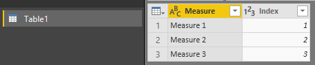
1. Create a table with matching "measure" name:
2. Create an additional measure for your waterfall chart, you may apply + or - for your measure to get the waterfall sentiment:
Waterfall value =
    SWITCH (
        SELECTEDVALUE ( Table1[Index] );
        1; +[Measure 1];
        2; +[Measure 2];
        3; -[Measure 3];
        BLANK()
    )
3. Apply the new measure in your waterfall chart, with the category based on the table field created (Note that you need to sort it via the category, use hierarchical drill-down if needed):
Cheers!
- AnonymousNot applicable
what about a live connection? I have a similar need but can't modify the data model so my only chance is creating custom measures from the live one. Thx!
- AnonymousNot applicable
Hi Cyanva ,
Your solutions worked fine. I need to add product category to the water fall.
Example:
measure 1 then it should show by product category for the measure 1 and so on.
 v-danhe-msftMicrosoft Employee
Hi Anonymous,
Based on my research, I am afraid the Water Fall chart may not support different measures, you could try to ues the Ultimate Waterfall chart to have a try:
https://appsource.microsoft.com/en-us/product/power-bi-visuals/WA104380956
It could allow multiple measures to create a water fall visual:
Regards,
Daniel He
- AnonymousNot applicable
I think you're right v-fanhe-msft. I've been looking into it using R or Python as well. I'll post back here when I find a solution.
- v-danhe-msftMicrosoft Employee
Hi Anonymous,
Ok, if you could find a solution, don't forget to mark an answer to close this topic.
Regards,
Daniel He
 wnichollResolver II
Being able to add multiple measures using this graph is what I needed! Thank you!!
- AnonymousNot applicable
I wasn't able to find the solution I wanted. I considered building a custom visual with R or Python, but I have no expereince in those. I tried downloading the custom Sunbust visual, but it's got the same problem as the waterfall. I settled on doing a doughnut chart.
It would be great to see these wrinkles sorted out. In my mind, there is no good reason I can do a bar graph with the right data, but not a waterfall.  GandharRegular Visitor
Hello Everyone,
I am trying to create a waterfall chart using these values please guide me on how i can create this type of waterfall chart