Forum Discussion

Waterfall Chart using Measures

- Anonymous7 years ago
I wasn't able to find the solution I wanted. I considered building a custom visual with R or Python, but I have no expereince in those. I tried downloading the custom Sunbust visual, but it's got the same problem as the waterfall. I settled on doing a doughnut chart.
It would be great to see these wrinkles sorted out. In my mind, there is no good reason I can do a bar graph with the right data, but not a waterfall.
Hi,
You can do it via a workaround in DAX formula and a control table.
1. Create a table with matching "measure" name:
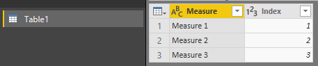
2. Create an additional measure for your waterfall chart, you may apply + or - for your measure to get the waterfall sentiment:
Waterfall value =
    SWITCH (
        SELECTEDVALUE ( Table1[Index] );
        1; +[Measure 1];
        2; +[Measure 2];
        3; -[Measure 3];
        BLANK()
    )
3. Apply the new measure in your waterfall chart, with the category based on the table field created (Note that you need to sort it via the category, use hierarchical drill-down if needed):

Cheers!
- Anonymous4 years agoNot applicable
what about a live connection? I have a similar need but can't modify the data model so my only chance is creating custom measures from the live one. Thx!
- Anonymous7 years agoNot applicable
Hi Cyanva ,
Your solutions worked fine. I need to add product category to the water fall.
Example:
measure 1 then it should show by product category for the measure 1 and so on.