Get Fabric certified for FREE!
Don't miss your chance to take the Fabric Data Engineer (DP-700) exam on us!
Learn more- Power BI forums
- Get Help with Power BI
- Desktop
- Service
- Report Server
- Power Query
- Mobile Apps
- Developer
- DAX Commands and Tips
- Custom Visuals Development Discussion
- Health and Life Sciences
- Power BI Spanish forums
- Translated Spanish Desktop
- Training and Consulting
- Instructor Led Training
- Dashboard in a Day for Women, by Women
- Galleries
- Data Stories Gallery
- Themes Gallery
- Contests Gallery
- QuickViz Gallery
- Quick Measures Gallery
- Visual Calculations Gallery
- Notebook Gallery
- Translytical Task Flow Gallery
- TMDL Gallery
- R Script Showcase
- Webinars and Video Gallery
- Ideas
- Custom Visuals Ideas (read-only)
- Issues
- Issues
- Events
- Upcoming Events
We've captured the moments from FabCon & SQLCon that everyone is talking about, and we are bringing them to the community, live and on-demand. Starts on April 14th. Register now
- Power BI forums
- Forums
- Get Help with Power BI
- Desktop
- Waterfall Chart But In Table
- Subscribe to RSS Feed
- Mark Topic as New
- Mark Topic as Read
- Float this Topic for Current User
- Bookmark
- Subscribe
- Printer Friendly Page
- Mark as New
- Bookmark
- Subscribe
- Mute
- Subscribe to RSS Feed
- Permalink
- Report Inappropriate Content
Waterfall Chart But In Table
Hi,
I would like to display a table that has the similar patterns to waterfall chart. (essentially works in the same way)
Does anyone know if there is such a visualization? I tried the tables but it seems like the only possible way is to do measures if I want it to display values like a waterfall chart.
So essentially the total is a measure a have and usually in a waterfall chart, they will automatically breakdown into the dates such as in this way. But is there a table that can do this?
| Jan | Feb | Mar | Total | |
| Apple | 1 | 2 | 3 | 6 |
| Grape | 2 | 4 | 2 | 8 |
| Orange | 5 | 0 | 0 | 5 |
- Mark as New
- Bookmark
- Subscribe
- Mute
- Subscribe to RSS Feed
- Permalink
- Report Inappropriate Content
Hi, @kitala11
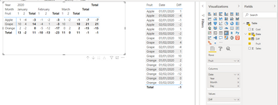
Based on your description, i created data to reproduce your scenario. The pbix file is attached in the end.
Table:
You may create a matrix visual as below.
Best Regards
Allan
If this post helps, then please consider Accept it as the solution to help the other members find it more quickly.
- Mark as New
- Bookmark
- Subscribe
- Mute
- Subscribe to RSS Feed
- Permalink
- Report Inappropriate Content
@kitala11 , Are you looking for Hybrid table. Month on columns and total as onr more value at end ?
if you are looking for a Hybrid display with Matrix Column and measure
https://community.powerbi.com/t5/Community-Blog/Creating-a-custom-or-hybrid-matrix-in-PowerBI/ba-p/1...
https://community.powerbi.com/t5/Quick-Measures-Gallery/The-New-Hotness-Custom-Matrix-Hierarchy/m-p/...
vote for Hybrid Table
https://ideas.powerbi.com/ideas/idea/?ideaid=9bc32b23-1eb1-4e74-8b34-349887b37ebc
Helpful resources

New to Fabric Survey
If you have recently started exploring Fabric, we'd love to hear how it's going. Your feedback can help with product improvements.

Power BI DataViz World Championships - June 2026
A new Power BI DataViz World Championship is coming this June! Don't miss out on submitting your entry.

Join our Fabric User Panel
Share feedback directly with Fabric product managers, participate in targeted research studies and influence the Fabric roadmap.

| User | Count |
|---|---|
| 57 | |
| 38 | |
| 35 | |
| 19 | |
| 17 |
| User | Count |
|---|---|
| 74 | |
| 70 | |
| 37 | |
| 35 | |
| 25 |


