FabCon is coming to Atlanta
Join us at FabCon Atlanta from March 16 - 20, 2026, for the ultimate Fabric, Power BI, AI and SQL community-led event. Save $200 with code FABCOMM.
Register now!- Power BI forums
- Get Help with Power BI
- Desktop
- Service
- Report Server
- Power Query
- Mobile Apps
- Developer
- DAX Commands and Tips
- Custom Visuals Development Discussion
- Health and Life Sciences
- Power BI Spanish forums
- Translated Spanish Desktop
- Training and Consulting
- Instructor Led Training
- Dashboard in a Day for Women, by Women
- Galleries
- Data Stories Gallery
- Themes Gallery
- Contests Gallery
- QuickViz Gallery
- Quick Measures Gallery
- Visual Calculations Gallery
- Notebook Gallery
- Translytical Task Flow Gallery
- TMDL Gallery
- R Script Showcase
- Webinars and Video Gallery
- Ideas
- Custom Visuals Ideas (read-only)
- Issues
- Issues
- Events
- Upcoming Events
The Power BI Data Visualization World Championships is back! Get ahead of the game and start preparing now! Learn more
- Power BI forums
- Forums
- Get Help with Power BI
- Desktop
- Visualize state changes
- Subscribe to RSS Feed
- Mark Topic as New
- Mark Topic as Read
- Float this Topic for Current User
- Bookmark
- Subscribe
- Printer Friendly Page
- Mark as New
- Bookmark
- Subscribe
- Mute
- Subscribe to RSS Feed
- Permalink
- Report Inappropriate Content
Visualize state changes
Hello.
I'd like to visualize changes in a state (as in status). I have items that can move between states. To Do > In progress > Done for example. and i'd like to visualize this flow.
The data looks something like this:
| ID | Date | State | State changed | State Flow |
| 1 | 4/17/2019 12:00:00 AM | To do | FALSE | To do to To do |
| 1 | 4/18/2019 12:00:00 AM | To do | FALSE | To do to To do |
| 1 | 4/19/2019 12:00:00 AM | To do | FALSE | To do to To do |
| 1 | 4/20/2019 12:00:00 AM | In progress | TRUE | To do to In progress |
| 1 | 4/21/2019 12:00:00 AM | In progress | FALSE | In progress to In progress |
| 1 | 4/22/2019 12:00:00 AM | done | TRUE | In progress to done |
| 1 | 4/23/2019 12:00:00 AM | done | FALSE | done to done |
| 1 | 4/24/2019 12:00:00 AM | done | FALSE | done to done |
| 1 | 4/25/2019 12:00:00 AM | done | FALSE | done to done |
Note that State flow i a calculated column and the "to" can be changed. it can also be split to 2 columns if needed.
My desired result would look something like this:
Paint skills ^^
If somebody knows a visual wich is capeable of something like this i'd like to know. Any other ideas to visualize this info is also welcome. Thanks in advance.
Solved! Go to Solution.
- Mark as New
- Bookmark
- Subscribe
- Mute
- Subscribe to RSS Feed
- Permalink
- Report Inappropriate Content
Hi @Anonymous ,
I check custom visual but haven't found any custom visual suitable for your requirement. Maybe you can try to use python visual or r visual to manually draw these graph.
Regards,
Xiaoxin Sheng
- Mark as New
- Bookmark
- Subscribe
- Mute
- Subscribe to RSS Feed
- Permalink
- Report Inappropriate Content
Hi @Anonymous ,
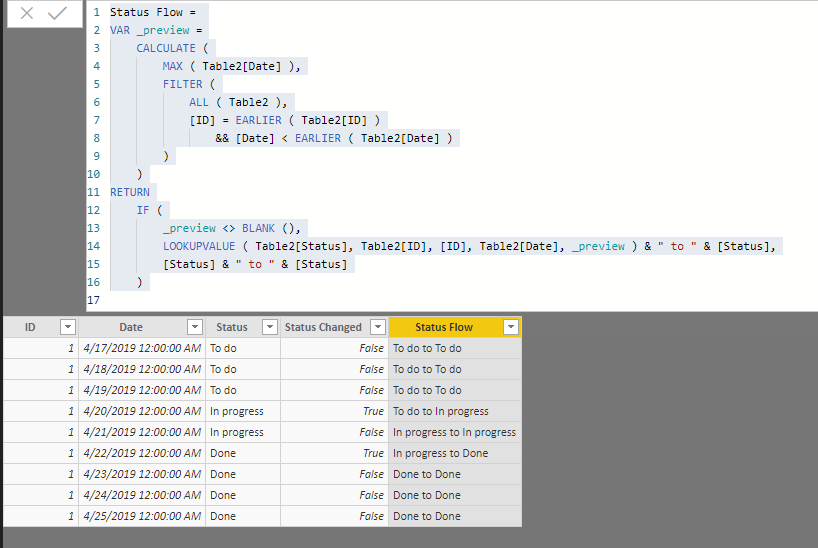
You can use following calculate column formula to achieve your requirement:
Status =
VAR _fDate =
    CALCULATE (
        MIN ( Table2[Date] ),
        FILTER ( ALL ( Table2 ), [ID] = EARLIER ( Table2[ID] ) )
    )
VAR _diff =
    DATEDIFF ( _fDate, Table2[Date], DAY )
RETURN
    IF ( _diff < 3, "To do", IF ( _diff >= 3 && _diff < 5, "In progress", "Done" ) )

Status Changed =
VAR _preview =
    CALCULATE (
        MAX ( Table2[Date] ),
        FILTER (
            ALL ( Table2 ),
            [ID] = EARLIER ( Table2[ID] )
                && [Date] < EARLIER ( Table2[Date] )
        )
    )
RETURN
    IF (
        _preview <> BLANK (),
        [Status]
            <> LOOKUPVALUE ( Table2[Status], Table2[ID], [ID], Table2[Date], _preview )
    )

Status Flow =
VAR _preview =
    CALCULATE (
        MAX ( Table2[Date] ),
        FILTER (
            ALL ( Table2 ),
            [ID] = EARLIER ( Table2[ID] )
                && [Date] < EARLIER ( Table2[Date] )
        )
    )
RETURN
    IF (
        _preview <> BLANK (),
        LOOKUPVALUE ( Table2[Status], Table2[ID], [ID], Table2[Date], _preview ) & " to " & [Status],
        [Status] & " to " & [Status]
    )
Regards,
Xiaoxin Sheng
- Mark as New
- Bookmark
- Subscribe
- Mute
- Subscribe to RSS Feed
- Permalink
- Report Inappropriate Content
I Already have the data as shown. I would like to create a viz something like i showed
- Mark as New
- Bookmark
- Subscribe
- Mute
- Subscribe to RSS Feed
- Permalink
- Report Inappropriate Content
Hi @Anonymous ,
I check custom visual but haven't found any custom visual suitable for your requirement. Maybe you can try to use python visual or r visual to manually draw these graph.
Regards,
Xiaoxin Sheng
Helpful resources

Power BI Dataviz World Championships
The Power BI Data Visualization World Championships is back! Get ahead of the game and start preparing now!

| User | Count |
|---|---|
| 42 | |
| 41 | |
| 33 | |
| 30 | |
| 27 |
| User | Count |
|---|---|
| 134 | |
| 114 | |
| 58 | |
| 57 | |
| 57 |


