This is best Fabric, Power BI, SQL and AI community event. How do we know? The last event sold out! Save €200 with code FABCMTY200.
Register nowA new Data Days event is coming soon! This time we’re going bigger than ever. Fabric, Power BI, SQL, AI and more. Don't miss out.
Hello.
I'd like to visualize changes in a state (as in status). I have items that can move between states. To Do > In progress > Done for example. and i'd like to visualize this flow.
The data looks something like this:
| ID | Date | State | State changed | State Flow |
| 1 | 4/17/2019 12:00:00 AM | To do | FALSE | To do to To do |
| 1 | 4/18/2019 12:00:00 AM | To do | FALSE | To do to To do |
| 1 | 4/19/2019 12:00:00 AM | To do | FALSE | To do to To do |
| 1 | 4/20/2019 12:00:00 AM | In progress | TRUE | To do to In progress |
| 1 | 4/21/2019 12:00:00 AM | In progress | FALSE | In progress to In progress |
| 1 | 4/22/2019 12:00:00 AM | done | TRUE | In progress to done |
| 1 | 4/23/2019 12:00:00 AM | done | FALSE | done to done |
| 1 | 4/24/2019 12:00:00 AM | done | FALSE | done to done |
| 1 | 4/25/2019 12:00:00 AM | done | FALSE | done to done |
Note that State flow i a calculated column and the "to" can be changed. it can also be split to 2 columns if needed.
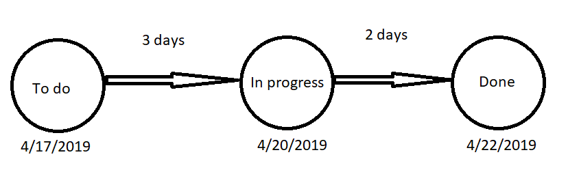
My desired result would look something like this:
Paint skills ^^
If somebody knows a visual wich is capeable of something like this i'd like to know. Any other ideas to visualize this info is also welcome. Thanks in advance.
Solved! Go to Solution.
Hi @Anonymous ,
I check custom visual but haven't found any custom visual suitable for your requirement. Maybe you can try to use python visual or r visual to manually draw these graph.
Regards,
Xiaoxin Sheng
Hi @Anonymous ,
You can use following calculate column formula to achieve your requirement:
Status =
VAR _fDate =
CALCULATE (
MIN ( Table2[Date] ),
FILTER ( ALL ( Table2 ), [ID] = EARLIER ( Table2[ID] ) )
)
VAR _diff =
DATEDIFF ( _fDate, Table2[Date], DAY )
RETURN
IF ( _diff < 3, "To do", IF ( _diff >= 3 && _diff < 5, "In progress", "Done" ) )
Status Changed =
VAR _preview =
CALCULATE (
MAX ( Table2[Date] ),
FILTER (
ALL ( Table2 ),
[ID] = EARLIER ( Table2[ID] )
&& [Date] < EARLIER ( Table2[Date] )
)
)
RETURN
IF (
_preview <> BLANK (),
[Status]
<> LOOKUPVALUE ( Table2[Status], Table2[ID], [ID], Table2[Date], _preview )
)
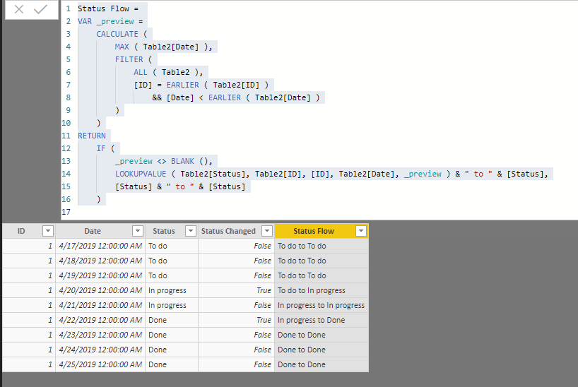
Status Flow =
VAR _preview =
CALCULATE (
MAX ( Table2[Date] ),
FILTER (
ALL ( Table2 ),
[ID] = EARLIER ( Table2[ID] )
&& [Date] < EARLIER ( Table2[Date] )
)
)
RETURN
IF (
_preview <> BLANK (),
LOOKUPVALUE ( Table2[Status], Table2[ID], [ID], Table2[Date], _preview ) & " to " & [Status],
[Status] & " to " & [Status]
)
Regards,
Xiaoxin Sheng
I Already have the data as shown. I would like to create a viz something like i showed
Hi @Anonymous ,
I check custom visual but haven't found any custom visual suitable for your requirement. Maybe you can try to use python visual or r visual to manually draw these graph.
Regards,
Xiaoxin Sheng
Check out the May 2026 Power BI update to learn about new features.
Sign up to receive a private message when registration opens and key events begin.
If you have recently started exploring Fabric, we'd love to hear how it's going. Your feedback can help with product improvements.
| User | Count |
|---|---|
| 29 | |
| 26 | |
| 25 | |
| 22 | |
| 13 |
| User | Count |
|---|---|
| 59 | |
| 50 | |
| 26 | |
| 20 | |
| 19 |