FabCon is coming to Atlanta
Join us at FabCon Atlanta from March 16 - 20, 2026, for the ultimate Fabric, Power BI, AI and SQL community-led event. Save $200 with code FABCOMM.
Register now!- Power BI forums
- Get Help with Power BI
- Desktop
- Service
- Report Server
- Power Query
- Mobile Apps
- Developer
- DAX Commands and Tips
- Custom Visuals Development Discussion
- Health and Life Sciences
- Power BI Spanish forums
- Translated Spanish Desktop
- Training and Consulting
- Instructor Led Training
- Dashboard in a Day for Women, by Women
- Galleries
- Data Stories Gallery
- Themes Gallery
- Contests Gallery
- QuickViz Gallery
- Quick Measures Gallery
- Visual Calculations Gallery
- Notebook Gallery
- Translytical Task Flow Gallery
- TMDL Gallery
- R Script Showcase
- Webinars and Video Gallery
- Ideas
- Custom Visuals Ideas (read-only)
- Issues
- Issues
- Events
- Upcoming Events
Vote for your favorite vizzies from the Power BI Dataviz World Championship submissions. Vote now!
- Power BI forums
- Forums
- Get Help with Power BI
- Desktop
- Visualize data over different ranges
- Subscribe to RSS Feed
- Mark Topic as New
- Mark Topic as Read
- Float this Topic for Current User
- Bookmark
- Subscribe
- Printer Friendly Page
- Mark as New
- Bookmark
- Subscribe
- Mute
- Subscribe to RSS Feed
- Permalink
- Report Inappropriate Content
Visualize data over different ranges
I have two queries
A
| ts | m_id | value |
| 2019-10-17 12:00:00 | P1 | 12 |
| 2019-10-17 12:10:00 | P1 | 11 |
| 2019-10-17 12:05:00 | P2 | 20 |
B
| ts_start | ts_end | type | m_id |
| 2019-10-17 11:30:00 | 2019-10-17 12:30:00 | Direct | P1 |
| 2019-10-17 12:30:00 | 2019-10-17 13:30:00 | Indirect | P1 |
Table A & B m_id is a "many to many" relationship. I use it for filtering (single selection).
I want to visualize table A value by timestamp as a line chart. I want the charts background color to vary depending on table B type for that timestamp range. How do I accomplish this?
I don't know of a way of doing it using matplotlib.
I don't know any R.
I am new to Power Bi.
Is there a better way of visualizing this data?
Solved! Go to Solution.
- Mark as New
- Bookmark
- Subscribe
- Mute
- Subscribe to RSS Feed
- Permalink
- Report Inappropriate Content
Hi @johnerlandsson ,
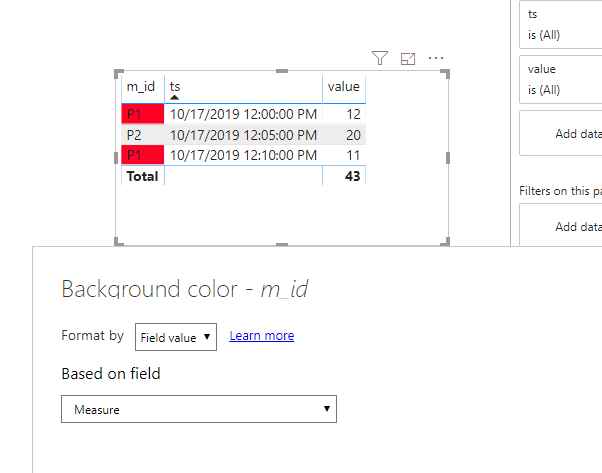
Currently, we cannot set conditional formmating of the background in line chart. We can create a measure and use table visual to work around.
Measure =
VAR ts =
    MAX ( A[ts] )
VAR mid =
    MAX ( A[m_id] )
VAR typ =
    CALCULATE (
        MAX ( B[type] ),
        FILTER ( B, B[ts_start] <= ts && B[ts_end] >= ts && B[m_id] = mid )
    )
RETURN
    IF ( typ = "Direct", "#FF0027", IF ( typ = "Indirect", "#0040FF", BLANK () ) )
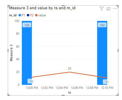
Btw, we can use Line and clustered column chart to work around by a new measure.
Measure 3 =
VAR ts =
    MAX ( A[ts] )
VAR mid =
    MAX ( A[m_id] )
VAR typ =
    CALCULATE (
        MAX ( B[type] ),
        FILTER ( B, B[ts_start] <= ts && B[ts_end] >= ts && B[m_id] = mid )
    )
RETURN
    IF ( typ = "Direct", 100, IF ( typ = "Indirect",200, BLANK () ) )
If this post helps, then please consider Accept it as the solution to help the others find it more quickly.
Helpful resources

Join our Community Sticker Challenge 2026
If you love stickers, then you will definitely want to check out our Community Sticker Challenge!

Power BI Monthly Update - January 2026
Check out the January 2026 Power BI update to learn about new features.

| User | Count |
|---|---|
| 58 | |
| 57 | |
| 44 | |
| 17 | |
| 17 |
| User | Count |
|---|---|
| 114 | |
| 111 | |
| 38 | |
| 36 | |
| 26 |


