FabCon is coming to Atlanta
Join us at FabCon Atlanta from March 16 - 20, 2026, for the ultimate Fabric, Power BI, AI and SQL community-led event. Save $200 with code FABCOMM.
Register now!- Power BI forums
- Get Help with Power BI
- Desktop
- Service
- Report Server
- Power Query
- Mobile Apps
- Developer
- DAX Commands and Tips
- Custom Visuals Development Discussion
- Health and Life Sciences
- Power BI Spanish forums
- Translated Spanish Desktop
- Training and Consulting
- Instructor Led Training
- Dashboard in a Day for Women, by Women
- Galleries
- Data Stories Gallery
- Themes Gallery
- Contests Gallery
- QuickViz Gallery
- Quick Measures Gallery
- Visual Calculations Gallery
- Notebook Gallery
- Translytical Task Flow Gallery
- TMDL Gallery
- R Script Showcase
- Webinars and Video Gallery
- Ideas
- Custom Visuals Ideas (read-only)
- Issues
- Issues
- Events
- Upcoming Events
The Power BI Data Visualization World Championships is back! It's time to submit your entry. Live now!
- Power BI forums
- Forums
- Get Help with Power BI
- Desktop
- Re: Visualization with 3 fields
- Subscribe to RSS Feed
- Mark Topic as New
- Mark Topic as Read
- Float this Topic for Current User
- Bookmark
- Subscribe
- Printer Friendly Page
- Mark as New
- Bookmark
- Subscribe
- Mute
- Subscribe to RSS Feed
- Permalink
- Report Inappropriate Content
Visualization with 3 fields
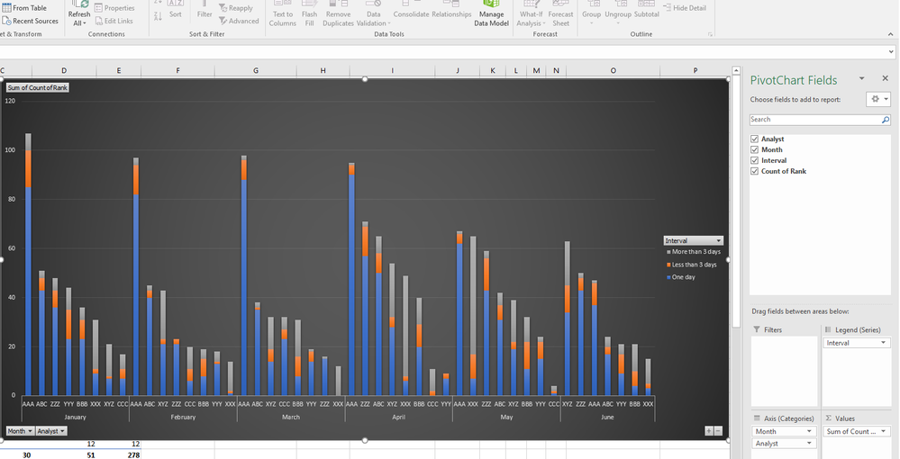
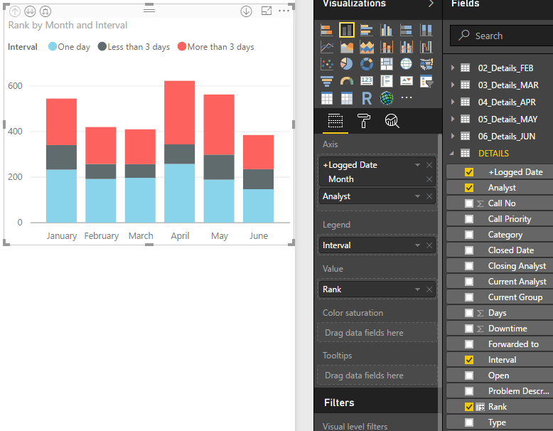
How can I create a visualization having 3 fields and one value to count. In my case, i have month, analyst, interval, and the value to be calculated is count
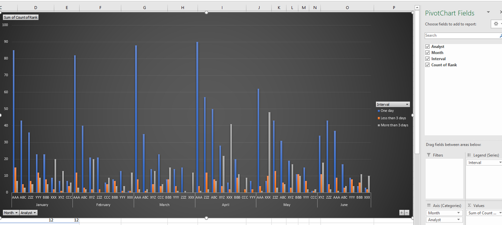
I was able to do it in excel using pivot table and chart. However, I'm not getting the same chart on Power BI. I don't want to use a slicer to filter out each field individually, I need to see all fields at once.
Solved! Go to Solution.
- Mark as New
- Bookmark
- Subscribe
- Mute
- Subscribe to RSS Feed
- Permalink
- Report Inappropriate Content
@imuharram not quite sure i understand what you asking
at the drill down in your chart ie. top left of your power bi chart, there is a down arrow, two down arrows, and then a expanded double arrow, click the expanded double arrow, is that what you asking for?
If I took the time to answer your question and I came up with a solution, please mark my post as a solution and /or give kudos freely for the effort 🙂 Thank you!
Proud to be a Super User!
- Mark as New
- Bookmark
- Subscribe
- Mute
- Subscribe to RSS Feed
- Permalink
- Report Inappropriate Content
Yes, this is what I was looking for. Thank you
However, it still looks better on excel chart, whereit has the month as a seperate block with its own label, then drills down to the second level seperatly. In power bi, it combines the two labels together where it becomes too long and have them all in one row
Power bi
Excel
Helpful resources
| User | Count |
|---|---|
| 49 | |
| 37 | |
| 33 | |
| 22 | |
| 18 |
| User | Count |
|---|---|
| 132 | |
| 99 | |
| 56 | |
| 37 | |
| 37 |


