Fabric Data Days starts November 4th!
Advance your Data & AI career with 50 days of live learning, dataviz contests, hands-on challenges, study groups & certifications and more!
Get registered- Power BI forums
- Get Help with Power BI
- Desktop
- Service
- Report Server
- Power Query
- Mobile Apps
- Developer
- DAX Commands and Tips
- Custom Visuals Development Discussion
- Health and Life Sciences
- Power BI Spanish forums
- Translated Spanish Desktop
- Training and Consulting
- Instructor Led Training
- Dashboard in a Day for Women, by Women
- Galleries
- Data Stories Gallery
- Themes Gallery
- Contests Gallery
- QuickViz Gallery
- Quick Measures Gallery
- Visual Calculations Gallery
- Notebook Gallery
- Translytical Task Flow Gallery
- TMDL Gallery
- R Script Showcase
- Webinars and Video Gallery
- Ideas
- Custom Visuals Ideas (read-only)
- Issues
- Issues
- Events
- Upcoming Events
Get Fabric Certified for FREE during Fabric Data Days. Don't miss your chance! Request now
- Power BI forums
- Forums
- Get Help with Power BI
- Desktop
- Re: Visualisation to Show rows of data in separate...
- Subscribe to RSS Feed
- Mark Topic as New
- Mark Topic as Read
- Float this Topic for Current User
- Bookmark
- Subscribe
- Printer Friendly Page
- Mark as New
- Bookmark
- Subscribe
- Mute
- Subscribe to RSS Feed
- Permalink
- Report Inappropriate Content
Visualisation to Show rows of data in separate Single number tiles
I have a table like this
Measure %
Initiative 67%
Delivery 44%
Management 38%
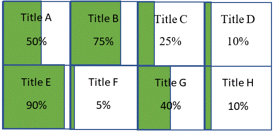
And I would like to show each one on a single report in tile format. Each tile would show the measure as a header. the Percentage central and a bar behind it to show a visual representation of the percentage.
It would be really nice if there was one Visualisation that could do all this. Im stuggling to come up with a way of presenting this data. I cant find a single time that does this and you cant seem to add in the filter for each measure on every tile. (I dont want to do this anyway as its a bit too hardcoded.
Is there anything in the marketplace which could be a good fit for this. Im struggling because Im working with something that the customer wants from another report not from Power BI.
Any help would be really appreciated
Debbie
Solved! Go to Solution.
- Mark as New
- Bookmark
- Subscribe
- Mute
- Subscribe to RSS Feed
- Permalink
- Report Inappropriate Content
I have added my idea for this custom visual
- Mark as New
- Bookmark
- Subscribe
- Mute
- Subscribe to RSS Feed
- Permalink
- Report Inappropriate Content
Hi,
You can play with the Matrix visualization. You would have the measure as a header, percentage central and a bar also.
Ioana
- Mark as New
- Bookmark
- Subscribe
- Mute
- Subscribe to RSS Feed
- Permalink
- Report Inappropriate Content
Is there any decent how to guides on this. Im not sure how to add the bar? I can definitely look into this though
- Mark as New
- Bookmark
- Subscribe
- Mute
- Subscribe to RSS Feed
- Permalink
- Report Inappropriate Content
Ive had a look at the Matrix and It wouldnt be accepted bythe user I dont think. ALl the results would be on one row and they
want it in a block so it looks like tiles. Like this
- Mark as New
- Bookmark
- Subscribe
- Mute
- Subscribe to RSS Feed
- Permalink
- Report Inappropriate Content
I am not sure if there is a visual that would do all this in one go.
If you do not find something suitable and you know how many Measure values you have, you can use more Matrix visuals to create the output you want. It would be filtered indeed but at least not at individual level.
- Mark as New
- Bookmark
- Subscribe
- Mute
- Subscribe to RSS Feed
- Permalink
- Report Inappropriate Content
Im going to put that to them as an option. It would see that Power BI is suited from starting from scratch, Its a bit of a nightmare if the customer has a definite idea of what each tile should look like if they dont exist.
- Mark as New
- Bookmark
- Subscribe
- Mute
- Subscribe to RSS Feed
- Permalink
- Report Inappropriate Content
Hi DebbieE,
I would recommend you to submit your idea here: https://ideas.powerbi.com.
Regards,
Jimmy Tao
- Mark as New
- Bookmark
- Subscribe
- Mute
- Subscribe to RSS Feed
- Permalink
- Report Inappropriate Content
I have added my idea for this custom visual
Helpful resources

Power BI Monthly Update - November 2025
Check out the November 2025 Power BI update to learn about new features.

Fabric Data Days
Advance your Data & AI career with 50 days of live learning, contests, hands-on challenges, study groups & certifications and more!

| User | Count |
|---|---|
| 97 | |
| 71 | |
| 50 | |
| 47 | |
| 44 |

