A new Data Days event is coming soon!
This time we’re going bigger than ever. Fabric, Power BI, SQL, AI and more. We're covering it all. You won't want to miss it.
Learn more- Power BI forums
- Get Help with Power BI
- Desktop
- Service
- Report Server
- Power Query
- Mobile Apps
- Developer
- DAX Commands and Tips
- Custom Visuals Development Discussion
- Health and Life Sciences
- Power BI Spanish forums
- Translated Spanish Desktop
- Training and Consulting
- Instructor Led Training
- Dashboard in a Day for Women, by Women
- Galleries
- Data Stories Gallery
- Themes Gallery
- Contests Gallery
- QuickViz Gallery
- Quick Measures Gallery
- Visual Calculations Gallery
- Notebook Gallery
- Translytical Task Flow Gallery
- TMDL Gallery
- R Script Showcase
- Webinars and Video Gallery
- Ideas
- Custom Visuals Ideas (read-only)
- Issues
- Issues
- Events
- Upcoming Events
Level up your Power BI skills this month - build one visual each week and tell better stories with data! Get started
- Power BI forums
- Forums
- Get Help with Power BI
- Desktop
- Re: Visual Suggestion
- Subscribe to RSS Feed
- Mark Topic as New
- Mark Topic as Read
- Float this Topic for Current User
- Bookmark
- Subscribe
- Printer Friendly Page
- Mark as New
- Bookmark
- Subscribe
- Mute
- Subscribe to RSS Feed
- Permalink
- Report Inappropriate Content
Visual Suggestion
Hi
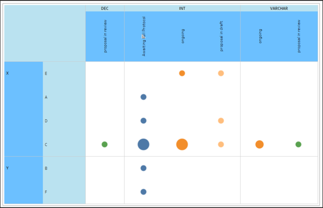
I got a requirement to build a visual like the one below , I tried to do this in PowerBi and was not able to do so we tried in Tableau and we could do the below , Now I want to check with you all to see if this is even possiblke in PBi even with a custom Visual ? We don't want to use new tool for just one report
Thanks
Suresh
- Mark as New
- Bookmark
- Subscribe
- Mute
- Subscribe to RSS Feed
- Permalink
- Report Inappropriate Content
You could use the Matrix visual and some SVGs...
Use SVG Images in Power BI: Part 3 - DataVeld
You'll only be able to have one colour for the row and column headers, and you wont be be to have vertical text but it will get you very close, and will render far quicker than custom visuals...
(can change headers to blue...)
Did I answer your question? Mark my post as a solution!
Proud to be a Super User!
- Mark as New
- Bookmark
- Subscribe
- Mute
- Subscribe to RSS Feed
- Permalink
- Report Inappropriate Content
@venkatasuresh_g , No exact , but with Charticulator I think you can create one
:https://powerbi.microsoft.com/en-us/blog/announcing-the-new-charticulator-visual-public-preview/
Bar and Bar Matrix: https://youtu.be/tKgG0arMaOw
Charticulator Part 2 - Scatter with Shapes: https://www.youtube.com/watch?v=QIPsv5hNbqI
Circular Visual: https://youtu.be/uOaFyg5GsU8
- Mark as New
- Bookmark
- Subscribe
- Mute
- Subscribe to RSS Feed
- Permalink
- Report Inappropriate Content
hi, I tried charticular but couldnt find a way to implement Heirarchial Y axis. If you could help me with any leads, I would really appreciate it.
Helpful resources

Power BI Monthly Update - April 2026
Check out the April 2026 Power BI update to learn about new features.

Data Days 2026 coming soon!
Sign up to receive a private message when registration opens and key events begin.

New to Fabric Survey
If you have recently started exploring Fabric, we'd love to hear how it's going. Your feedback can help with product improvements.

| User | Count |
|---|---|
| 35 | |
| 32 | |
| 26 | |
| 21 | |
| 18 |
| User | Count |
|---|---|
| 68 | |
| 37 | |
| 32 | |
| 25 | |
| 23 |


