FabCon is coming to Atlanta
Join us at FabCon Atlanta from March 16 - 20, 2026, for the ultimate Fabric, Power BI, AI and SQL community-led event. Save $200 with code FABCOMM.
Register now!- Power BI forums
- Get Help with Power BI
- Desktop
- Service
- Report Server
- Power Query
- Mobile Apps
- Developer
- DAX Commands and Tips
- Custom Visuals Development Discussion
- Health and Life Sciences
- Power BI Spanish forums
- Translated Spanish Desktop
- Training and Consulting
- Instructor Led Training
- Dashboard in a Day for Women, by Women
- Galleries
- Data Stories Gallery
- Themes Gallery
- Contests Gallery
- Quick Measures Gallery
- Visual Calculations Gallery
- Notebook Gallery
- Translytical Task Flow Gallery
- TMDL Gallery
- R Script Showcase
- Webinars and Video Gallery
- Ideas
- Custom Visuals Ideas (read-only)
- Issues
- Issues
- Events
- Upcoming Events
Calling all Data Engineers! Fabric Data Engineer (Exam DP-700) live sessions are back! Starting October 16th. Sign up.
- Power BI forums
- Forums
- Get Help with Power BI
- Desktop
- Re: Using 'Forecasting' analytics in Desktop, how ...
- Subscribe to RSS Feed
- Mark Topic as New
- Mark Topic as Read
- Float this Topic for Current User
- Bookmark
- Subscribe
- Printer Friendly Page
- Mark as New
- Bookmark
- Subscribe
- Mute
- Subscribe to RSS Feed
- Permalink
- Report Inappropriate Content
Using 'Forecasting' analytics in Desktop, how can I get the forecasted data in tabular form?
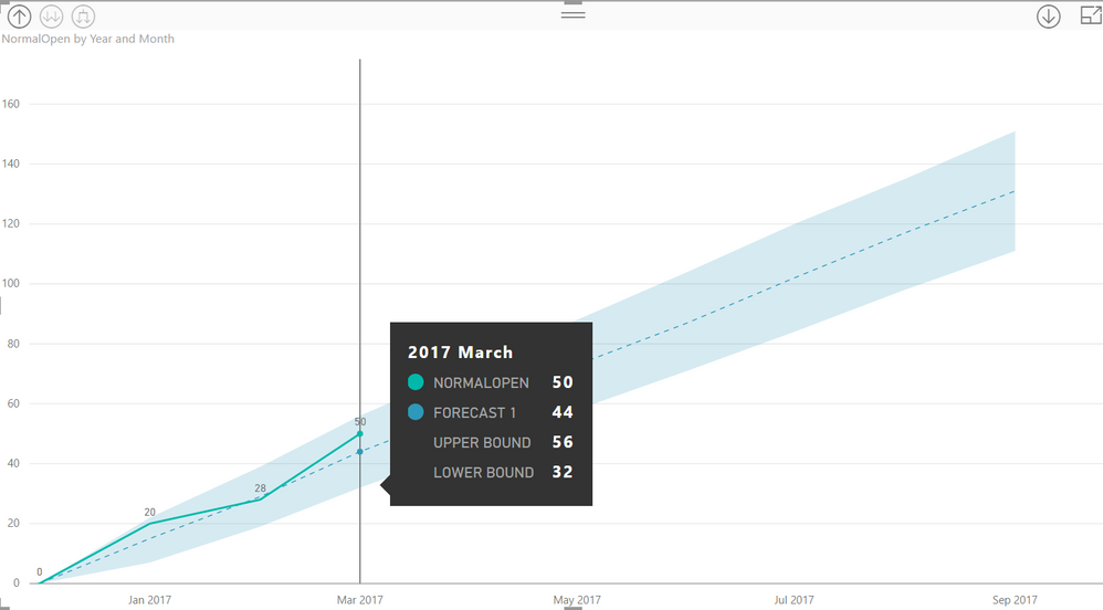
The forecasting function in 'analytics' creates a good graphic as shown below where I can hover over to see 'forecasted' value, upper bound amount and lower bound amounts. I'd like to be able to access this 'forecasted' data in tabular form so that I can use the forecast data in other parts of my report or dashboard. When I select back to a tabular visualization from line graphic, the forecasted data does not appear.
For example, I'd like to complement the graphic below with a card that has the 'forecasted' sales for 3 months out, or a slider that lets me select a future date and see the forecasted sales for that date.
Thanks for the help.
Solved! Go to Solution.
- Mark as New
- Bookmark
- Subscribe
- Mute
- Subscribe to RSS Feed
- Permalink
- Report Inappropriate Content
Have you tried exporting the data from the graph with the forecasts? That is what I have done before to access the forecasted data and brought it back into my Power BI file.
Did I understand what you are trying to do correctly?
- Mark as New
- Bookmark
- Subscribe
- Mute
- Subscribe to RSS Feed
- Permalink
- Report Inappropriate Content
The solution works. I was able to export the data to a CSV and load it back into PowerBI. However, I was hoping there was an automated way to access the forecasted data to avoid export and re-loading.
It would be preferable that the forecast data become part of the data model that I could access. For example, I'd like to create a dashboard that shows the forecast sales line graph the rest of the year and also access key forecasted data for specific calendar dates like year-end and show in a 'card' on the same report. That way, I can see the key forecasted data without hovering over the graphic.
- Mark as New
- Bookmark
- Subscribe
- Mute
- Subscribe to RSS Feed
- Permalink
- Report Inappropriate Content
I agree. It would be nice if we were able to automatically access the forecasted data.
Helpful resources

FabCon Global Hackathon
Join the Fabric FabCon Global Hackathon—running virtually through Nov 3. Open to all skill levels. $10,000 in prizes!

Power BI Monthly Update - October 2025
Check out the October 2025 Power BI update to learn about new features.


