Fabric Data Days starts November 4th!
Advance your Data & AI career with 50 days of live learning, dataviz contests, hands-on challenges, study groups & certifications and more!
Get registered- Power BI forums
- Get Help with Power BI
- Desktop
- Service
- Report Server
- Power Query
- Mobile Apps
- Developer
- DAX Commands and Tips
- Custom Visuals Development Discussion
- Health and Life Sciences
- Power BI Spanish forums
- Translated Spanish Desktop
- Training and Consulting
- Instructor Led Training
- Dashboard in a Day for Women, by Women
- Galleries
- Data Stories Gallery
- Themes Gallery
- Contests Gallery
- Quick Measures Gallery
- Visual Calculations Gallery
- Notebook Gallery
- Translytical Task Flow Gallery
- TMDL Gallery
- R Script Showcase
- Webinars and Video Gallery
- Ideas
- Custom Visuals Ideas (read-only)
- Issues
- Issues
- Events
- Upcoming Events
Join us at FabCon Atlanta from March 16 - 20, 2026, for the ultimate Fabric, Power BI, AI and SQL community-led event. Save $200 with code FABCOMM. Register now.
- Power BI forums
- Forums
- Get Help with Power BI
- Desktop
- Using 'Forecasting' analytics in Desktop, how can ...
- Subscribe to RSS Feed
- Mark Topic as New
- Mark Topic as Read
- Float this Topic for Current User
- Bookmark
- Subscribe
- Printer Friendly Page
- Mark as New
- Bookmark
- Subscribe
- Mute
- Subscribe to RSS Feed
- Permalink
- Report Inappropriate Content
Using 'Forecasting' analytics in Desktop, how can I get the forecasted data in tabular form?
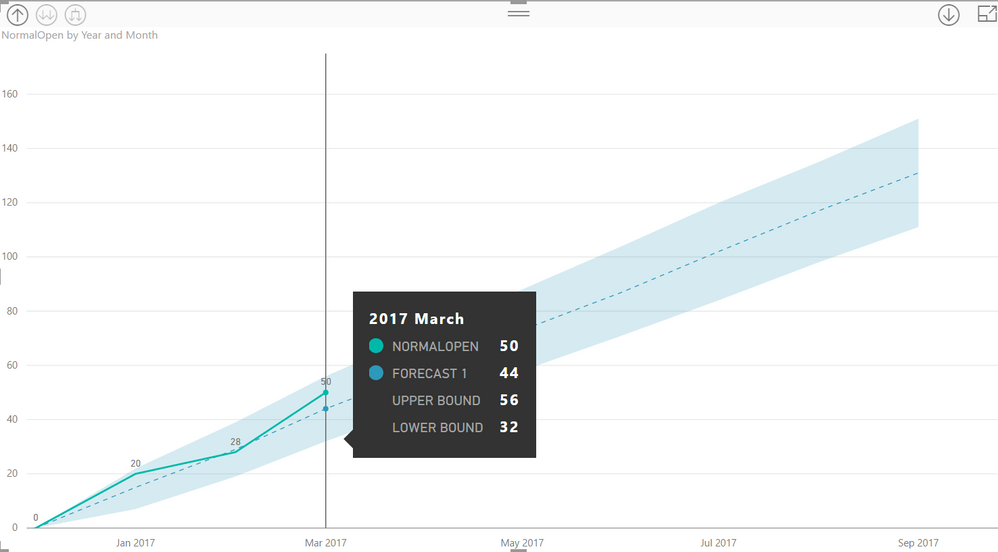
The forecasting function in 'analytics' creates a good graphic as shown below where I can hover over to see 'forecasted' value, upper bound amount and lower bound amounts. I'd like to be able to access this 'forecasted' data in tabular form so that I can use the forecast data in other parts of my report or dashboard. When I select back to a tabular visualization from line graphic, the forecasted data does not appear.
For example, I'd like to complement the graphic below with a card that has the 'forecasted' sales for 3 months out, or a slider that lets me select a future date and see the forecasted sales for that date.
Thanks for the help.
Solved! Go to Solution.
- Mark as New
- Bookmark
- Subscribe
- Mute
- Subscribe to RSS Feed
- Permalink
- Report Inappropriate Content
Have you tried exporting the data from the graph with the forecasts? That is what I have done before to access the forecasted data and brought it back into my Power BI file.
Did I understand what you are trying to do correctly?
- Mark as New
- Bookmark
- Subscribe
- Mute
- Subscribe to RSS Feed
- Permalink
- Report Inappropriate Content
The solution works. I was able to export the data to a CSV and load it back into PowerBI. However, I was hoping there was an automated way to access the forecasted data to avoid export and re-loading.
It would be preferable that the forecast data become part of the data model that I could access. For example, I'd like to create a dashboard that shows the forecast sales line graph the rest of the year and also access key forecasted data for specific calendar dates like year-end and show in a 'card' on the same report. That way, I can see the key forecasted data without hovering over the graphic.
- Mark as New
- Bookmark
- Subscribe
- Mute
- Subscribe to RSS Feed
- Permalink
- Report Inappropriate Content
I agree. It would be nice if we were able to automatically access the forecasted data.
Helpful resources
| User | Count |
|---|---|
| 76 | |
| 36 | |
| 31 | |
| 29 | |
| 26 |


