Join us at FabCon Vienna from September 15-18, 2025
The ultimate Fabric, Power BI, SQL, and AI community-led learning event. Save €200 with code FABCOMM.
Get registered- Power BI forums
- Get Help with Power BI
- Desktop
- Service
- Report Server
- Power Query
- Mobile Apps
- Developer
- DAX Commands and Tips
- Custom Visuals Development Discussion
- Health and Life Sciences
- Power BI Spanish forums
- Translated Spanish Desktop
- Training and Consulting
- Instructor Led Training
- Dashboard in a Day for Women, by Women
- Galleries
- Data Stories Gallery
- Themes Gallery
- Contests Gallery
- Quick Measures Gallery
- Notebook Gallery
- Translytical Task Flow Gallery
- TMDL Gallery
- R Script Showcase
- Webinars and Video Gallery
- Ideas
- Custom Visuals Ideas (read-only)
- Issues
- Issues
- Events
- Upcoming Events
Enhance your career with this limited time 50% discount on Fabric and Power BI exams. Ends August 31st. Request your voucher.
- Power BI forums
- Forums
- Get Help with Power BI
- Desktop
- Re: Use measure as chart legend
- Subscribe to RSS Feed
- Mark Topic as New
- Mark Topic as Read
- Float this Topic for Current User
- Bookmark
- Subscribe
- Printer Friendly Page
- Mark as New
- Bookmark
- Subscribe
- Mute
- Subscribe to RSS Feed
- Permalink
- Report Inappropriate Content
Use measure as chart legend
Hello Power BI super heroes!
I'd like to use 'Retail Excess' measure as a legend for a chart, but having trouble with it. May I know how I can make it?
I tried to find solutions from articles in ommunity, but couldn't.
Measures
Solved! Go to Solution.
- Mark as New
- Bookmark
- Subscribe
- Mute
- Subscribe to RSS Feed
- Permalink
- Report Inappropriate Content
First, measure can be affected by filter/slicer, so you can use it to get dynamic summary result in a visual by its row context. So you could not put it into Legend of a visual.
https://www.sqlbi.com/articles/calculated-columns-and-measures-in-dax/
Second, for your case, you could this way as below:
Step1:
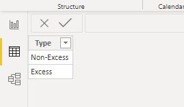
You need a table that contains all the result of this measure, for example:
Step2:
Create a measure like this logic:
Measure 3 = var _table=FILTER(CROSSJOIN(ADDCOLUMNS('Fact',"_type",[Measure]),'Type'),[_type]=[Type]) return
COUNTROWS(_table)
You could also use SUMX/MAXX/MINX instead of COUNTROWS in the formula
Result:
here is sample pbix file, please try it.
Regards,
Lin
If this post helps, then please consider Accept it as the solution to help the other members find it more quickly.
- Mark as New
- Bookmark
- Subscribe
- Mute
- Subscribe to RSS Feed
- Permalink
- Report Inappropriate Content
HI @Junminkim0214 ,
You can never use a MEASURE as a legend in the charts. They have to be always COLUMNS.
Convert your measure as a calculated column, then use it as a legend in your chart.
Thanks,
Pragati
- Mark as New
- Bookmark
- Subscribe
- Mute
- Subscribe to RSS Feed
- Permalink
- Report Inappropriate Content
Hi @Pragati11
Thanks for your advice!
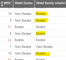
I created a column like below, but the results are not correct. May I know a reason for this?
Column
Retail Excess column = if([Retail WOC]>=12,"Excess","Non-Excess")
Measure
Retail Excess = if([Retail WOC]>=12,"Excess","Non-Excess")
Best regards,
Jun
- Mark as New
- Bookmark
- Subscribe
- Mute
- Subscribe to RSS Feed
- Permalink
- Report Inappropriate Content
First, measure can be affected by filter/slicer, so you can use it to get dynamic summary result in a visual by its row context. So you could not put it into Legend of a visual.
https://www.sqlbi.com/articles/calculated-columns-and-measures-in-dax/
Second, for your case, you could this way as below:
Step1:
You need a table that contains all the result of this measure, for example:
Step2:
Create a measure like this logic:
Measure 3 = var _table=FILTER(CROSSJOIN(ADDCOLUMNS('Fact',"_type",[Measure]),'Type'),[_type]=[Type]) return
COUNTROWS(_table)
You could also use SUMX/MAXX/MINX instead of COUNTROWS in the formula
Result:
here is sample pbix file, please try it.
Regards,
Lin
If this post helps, then please consider Accept it as the solution to help the other members find it more quickly.
- Mark as New
- Bookmark
- Subscribe
- Mute
- Subscribe to RSS Feed
- Permalink
- Report Inappropriate Content
Hi @Junminkim0214 ,
How is your following measure caluclated?
Retail WOC = [CY RCS (qty)]/[Avg CS Last 4 Weeks]
It uses 2 more measures, how are they calculated?
Thanks,
Pragati
Helpful resources
| User | Count |
|---|---|
| 79 | |
| 74 | |
| 42 | |
| 30 | |
| 28 |
| User | Count |
|---|---|
| 108 | |
| 96 | |
| 53 | |
| 48 | |
| 47 |


