Get Fabric certified for FREE!
Don't miss your chance to take the Fabric Data Engineer (DP-700) exam on us!
Learn more- Power BI forums
- Get Help with Power BI
- Desktop
- Service
- Report Server
- Power Query
- Mobile Apps
- Developer
- DAX Commands and Tips
- Custom Visuals Development Discussion
- Health and Life Sciences
- Power BI Spanish forums
- Translated Spanish Desktop
- Training and Consulting
- Instructor Led Training
- Dashboard in a Day for Women, by Women
- Galleries
- Data Stories Gallery
- Themes Gallery
- Contests Gallery
- QuickViz Gallery
- Quick Measures Gallery
- Visual Calculations Gallery
- Notebook Gallery
- Translytical Task Flow Gallery
- TMDL Gallery
- R Script Showcase
- Webinars and Video Gallery
- Ideas
- Custom Visuals Ideas (read-only)
- Issues
- Issues
- Events
- Upcoming Events
The FabCon + SQLCon recap series starts April 14th at 8am Pacific. If you’re tracking where AI is going inside Fabric, this first session is a can't miss. Register now
- Power BI forums
- Forums
- Get Help with Power BI
- Desktop
- Time Duration and Time Graph Plotting
- Subscribe to RSS Feed
- Mark Topic as New
- Mark Topic as Read
- Float this Topic for Current User
- Bookmark
- Subscribe
- Printer Friendly Page
- Mark as New
- Bookmark
- Subscribe
- Mute
- Subscribe to RSS Feed
- Permalink
- Report Inappropriate Content
Time Duration and Time Graph Plotting
Hello Everyone,
I am new to Power BI. Looking for some help. Earlier I use Excel and Power Point to present Weekly Report. Now i have started in Power BI. I use to compare average resolve time weekly.
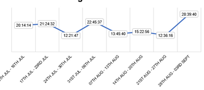
So First I need duration in hh:mm:ss format which includes more that 24 hour (Example 28:40:32). Second I need to plot bar graph with respect to time.
I am attaching screenshot 1 how it use to be appear in Excel.
Problem I am facing if in case I convert duration in HH:MM:SS format then it is in text format so when plotting graph then it take count.
Please help.
Solved! Go to Solution.
- Mark as New
- Bookmark
- Subscribe
- Mute
- Subscribe to RSS Feed
- Permalink
- Report Inappropriate Content
Hi @Avichal ,
You can try this:
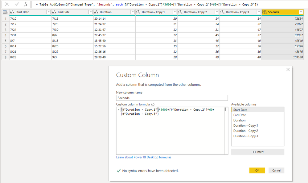
1. Duplicate column of ‘Duration’.
2. Split ‘Duration – Copy’ with ‘:’.
3. Add a custom column.
=[#"Duration - Copy.1"]*3600+[#"Duration - Copy.2"]*60+[#"Duration - Copy.3"]
4. Remove columns.
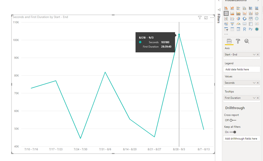
5. Create a line chart, put ‘Seconds’ in ‘Values’ and ‘Duration’ in ‘Tooltips’.
Best Regards,
Icey
If this post helps, then please consider Accept it as the solution to help the other members find it more quickly.
- Mark as New
- Bookmark
- Subscribe
- Mute
- Subscribe to RSS Feed
- Permalink
- Report Inappropriate Content
Hello,
I have the same problem: anyone can help please?
- Mark as New
- Bookmark
- Subscribe
- Mute
- Subscribe to RSS Feed
- Permalink
- Report Inappropriate Content
I have the same problem: anyone can help ?
- Mark as New
- Bookmark
- Subscribe
- Mute
- Subscribe to RSS Feed
- Permalink
- Report Inappropriate Content
Hi @Avichal ,
You can try this:
1. Duplicate column of ‘Duration’.
2. Split ‘Duration – Copy’ with ‘:’.
3. Add a custom column.
=[#"Duration - Copy.1"]*3600+[#"Duration - Copy.2"]*60+[#"Duration - Copy.3"]
4. Remove columns.
5. Create a line chart, put ‘Seconds’ in ‘Values’ and ‘Duration’ in ‘Tooltips’.
Best Regards,
Icey
If this post helps, then please consider Accept it as the solution to help the other members find it more quickly.
- Mark as New
- Bookmark
- Subscribe
- Mute
- Subscribe to RSS Feed
- Permalink
- Report Inappropriate Content
Hi Icey,
Thank you for your response. It work for me just if you can help me with one more thing :- Is there a way I can show data label with duration value ?
- Mark as New
- Bookmark
- Subscribe
- Mute
- Subscribe to RSS Feed
- Permalink
- Report Inappropriate Content
- Mark as New
- Bookmark
- Subscribe
- Mute
- Subscribe to RSS Feed
- Permalink
- Report Inappropriate Content
Hello Amit,
Thanks for your help but it doesn't work 😞
@amitchandak wrote:Have you tried time on the axis? By dragging it into the axis property of the graph and it still shows count.
Helpful resources

New to Fabric Survey
If you have recently started exploring Fabric, we'd love to hear how it's going. Your feedback can help with product improvements.

Power BI DataViz World Championships - June 2026
A new Power BI DataViz World Championship is coming this June! Don't miss out on submitting your entry.

Join our Fabric User Panel
Share feedback directly with Fabric product managers, participate in targeted research studies and influence the Fabric roadmap.

| User | Count |
|---|---|
| 53 | |
| 40 | |
| 38 | |
| 19 | |
| 18 |
| User | Count |
|---|---|
| 70 | |
| 69 | |
| 34 | |
| 33 | |
| 30 |


