FabCon is coming to Atlanta
Join us at FabCon Atlanta from March 16 - 20, 2026, for the ultimate Fabric, Power BI, AI and SQL community-led event. Save $200 with code FABCOMM.
Register now!- Power BI forums
- Get Help with Power BI
- Desktop
- Service
- Report Server
- Power Query
- Mobile Apps
- Developer
- DAX Commands and Tips
- Custom Visuals Development Discussion
- Health and Life Sciences
- Power BI Spanish forums
- Translated Spanish Desktop
- Training and Consulting
- Instructor Led Training
- Dashboard in a Day for Women, by Women
- Galleries
- Data Stories Gallery
- Themes Gallery
- Contests Gallery
- QuickViz Gallery
- Quick Measures Gallery
- Visual Calculations Gallery
- Notebook Gallery
- Translytical Task Flow Gallery
- TMDL Gallery
- R Script Showcase
- Webinars and Video Gallery
- Ideas
- Custom Visuals Ideas (read-only)
- Issues
- Issues
- Events
- Upcoming Events
The Power BI Data Visualization World Championships is back! Get ahead of the game and start preparing now! Learn more
- Power BI forums
- Forums
- Get Help with Power BI
- Desktop
- Re: Sunburst with two circles representing actual ...
- Subscribe to RSS Feed
- Mark Topic as New
- Mark Topic as Read
- Float this Topic for Current User
- Bookmark
- Subscribe
- Printer Friendly Page
- Mark as New
- Bookmark
- Subscribe
- Mute
- Subscribe to RSS Feed
- Permalink
- Report Inappropriate Content
Sunburst with two circles representing actual progress vs planned progress
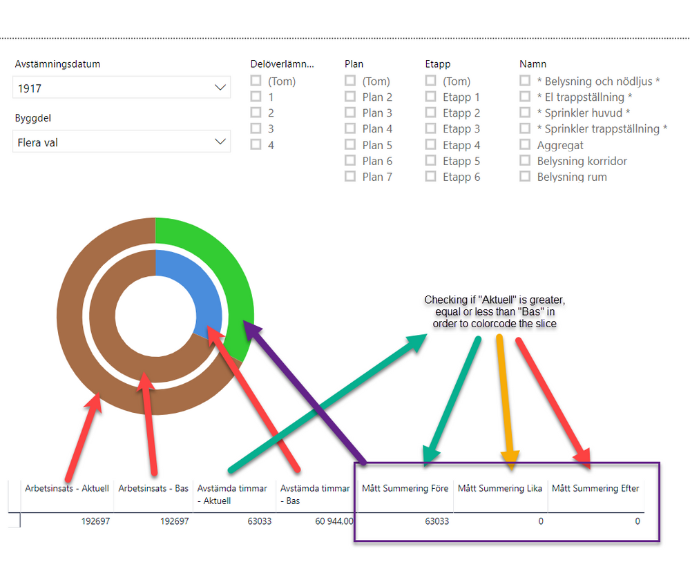
I have multiple sharts/reports that I whant do present on a dashboard but I can't figure out how to solve this problem I have with the sunburstdiagrams.
In my reports I tweeked this by adding two diffrent sunbursts and laying them above each other. And I can't do that on a dashboard.
This is what it looks like 
Solved! Go to Solution.
- Mark as New
- Bookmark
- Subscribe
- Mute
- Subscribe to RSS Feed
- Permalink
- Report Inappropriate Content
Hey @TommyMossberg
You can use SVG for that.
Please look at this video, there are more/others, just search for it.
For example:
I have a table with 2 columns, radius 1 and radius 2.
I have added 2 custom columns with the svg/html code.
The only property that is dynamically changed, in this example, is the radius, but any property can be controled and chnaged the same.
Circle1 = "<svg xmlns='http://www/w3/org/200/svg' viewBox='0 0 20 20'>
<circle  fill=' blue '  r='"& Table1[R2] &"' cx='5' cy='5'>
</svg>"

Circle2 = "
<svg xmlns='http://www/w3/org/200/svg' viewBox='0 0 20 20'>
<circle  fill=' green '  r='"& Table1[R1] &"' cx='5' cy='5'>
</svg>"
Add a HTML viewer and show the columns, should show you circles.
Place the HTML containers on top of each other, so circles will show one on top the other.
This is how it looks (Circle1 on top of Circle2) -->
You can add more HTML tags like opacity, stroke, sizes, colors and more.
Examples of SVG properties - https://www.w3schools.com/html/html5_svg.asp
Good luck!
A
- Mark as New
- Bookmark
- Subscribe
- Mute
- Subscribe to RSS Feed
- Permalink
- Report Inappropriate Content
- Mark as New
- Bookmark
- Subscribe
- Mute
- Subscribe to RSS Feed
- Permalink
- Report Inappropriate Content
Hi @Anonymous
I've tried with that sunburst visualization but with no luck.
The problem, as I see it, is that the outer circle is still based on the values in the inner circle.
What I want is two circles where the inner circle is based on som columns and the outer circel is based on other columns whitout any dataconecctions between the circles.
They are only for visualization to show actual progress (outer) and planned progress (inner).
- Mark as New
- Bookmark
- Subscribe
- Mute
- Subscribe to RSS Feed
- Permalink
- Report Inappropriate Content
Hey @TommyMossberg
You can use SVG for that.
Please look at this video, there are more/others, just search for it.
For example:
I have a table with 2 columns, radius 1 and radius 2.
I have added 2 custom columns with the svg/html code.
The only property that is dynamically changed, in this example, is the radius, but any property can be controled and chnaged the same.
Circle1 = "<svg xmlns='http://www/w3/org/200/svg' viewBox='0 0 20 20'>
<circle  fill=' blue '  r='"& Table1[R2] &"' cx='5' cy='5'>
</svg>"

Circle2 = "
<svg xmlns='http://www/w3/org/200/svg' viewBox='0 0 20 20'>
<circle  fill=' green '  r='"& Table1[R1] &"' cx='5' cy='5'>
</svg>"
Add a HTML viewer and show the columns, should show you circles.
Place the HTML containers on top of each other, so circles will show one on top the other.
This is how it looks (Circle1 on top of Circle2) -->
You can add more HTML tags like opacity, stroke, sizes, colors and more.
Examples of SVG properties - https://www.w3schools.com/html/html5_svg.asp
Good luck!
A
- Mark as New
- Bookmark
- Subscribe
- Mute
- Subscribe to RSS Feed
- Permalink
- Report Inappropriate Content
@Anonymous Thank you!
svg will solve this specific problem for me and give me completely different toolbox to tweak the presentation of different data.
This will be fun!
Helpful resources

Power BI Dataviz World Championships
The Power BI Data Visualization World Championships is back! Get ahead of the game and start preparing now!

| User | Count |
|---|---|
| 39 | |
| 38 | |
| 38 | |
| 28 | |
| 27 |
| User | Count |
|---|---|
| 124 | |
| 88 | |
| 73 | |
| 66 | |
| 65 |


