- Subscribe to RSS Feed
- Mark Topic as New
- Mark Topic as Read
- Float this Topic for Current User
- Bookmark
- Subscribe
- Printer Friendly Page
- Mark as New
- Bookmark
- Subscribe
- Mute
- Subscribe to RSS Feed
- Permalink
- Report Inappropriate Content

Summary Table, Unique Counts, Graphs and Averages - How to incorporate them all?
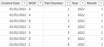
In my PowerBI dataset I have many columns, but I am trying to build a graph using three columns from my dataset (Created Date, WO# and Part Number. I basically want to be able to show a graph that shows for any given year and month how many unique "WO#"s there were and the average "Part Number Count" per "WO#" for that month.
Does anyone have any ideas on how to easily do this in PowerBI? I could easy do this in PivotTable, but I want this to be automated. The goal would be to answer the following questions.
1. How many unique WO#s were there for a given year/month
2. For a given year/month, what was the average Part Number count per WO#?
Ultimately we want to track " Average Part Numbner Count per WO#" and see it go down month over month.
Hopefully this makes sense!
Thanks!
Solved! Go to Solution.
- Mark as New
- Bookmark
- Subscribe
- Mute
- Subscribe to RSS Feed
- Permalink
- Report Inappropriate Content

I appreciate the help. I don't think I explained myself fully, but after looking at what you did in your example, I realized I was over thinking the whole thing, was making it more difficult than it needed to be and was able to solve it using just a couple measures and some math.
Thanks for getting me to think differently!
- Mark as New
- Bookmark
- Subscribe
- Mute
- Subscribe to RSS Feed
- Permalink
- Report Inappropriate Content

Hi @Anonymous ,
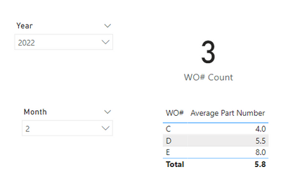
According to your description, I create a sample.
Maybe I didn't fully understand. When we put the year and month in the slicer, the measures created can dynamically change by the slicer.
WO# Count = DISTINCTCOUNT('Table'[WO#])Average Part Number = AVERAGE('Table'[Part Number])
If the problem is not like this, please feel free to let me know.
Best Regards,
Community Support Team _ kalyj
If this post helps, then please considerAccept it as the solution to help the other members find it more quickly.
- Mark as New
- Bookmark
- Subscribe
- Mute
- Subscribe to RSS Feed
- Permalink
- Report Inappropriate Content

I appreciate the help. I don't think I explained myself fully, but after looking at what you did in your example, I realized I was over thinking the whole thing, was making it more difficult than it needed to be and was able to solve it using just a couple measures and some math.
Thanks for getting me to think differently!
Helpful resources
| Subject | Author | Posted | |
|---|---|---|---|
|
Anonymous
| 03-07-2024 08:14 AM | ||
| 05-16-2023 05:38 AM | |||
| 11-08-2023 12:45 AM | |||
| 05-27-2024 03:26 PM | |||
|
Anonymous
| 06-15-2023 11:04 AM |
| User | Count |
|---|---|
| 132 | |
| 105 | |
| 85 | |
| 55 | |
| 46 |


