This is best Fabric, Power BI, SQL and AI community event. How do we know? The last event sold out! Save €200 with code FABCMTY200.
Register nowJuly 28 - August 9 | Final Round of the Power BI Dataviz World Championships. This is your chance. Learn more
Hi all,
I am fairly new to Power BI and currently struggling to create a visualization.
The data I am visualizing is about insurances and Risks associated to these insurances. For this we have a Summary table where each unique insurance represents a row. The first column is the unique identifier (insurance number) and the following columns are the risk columns. For each insurance, the risk is flagged via a 1 or 0 (1 = flag set, 0 = no flag) in each risk column.
I am looking to visualize via:
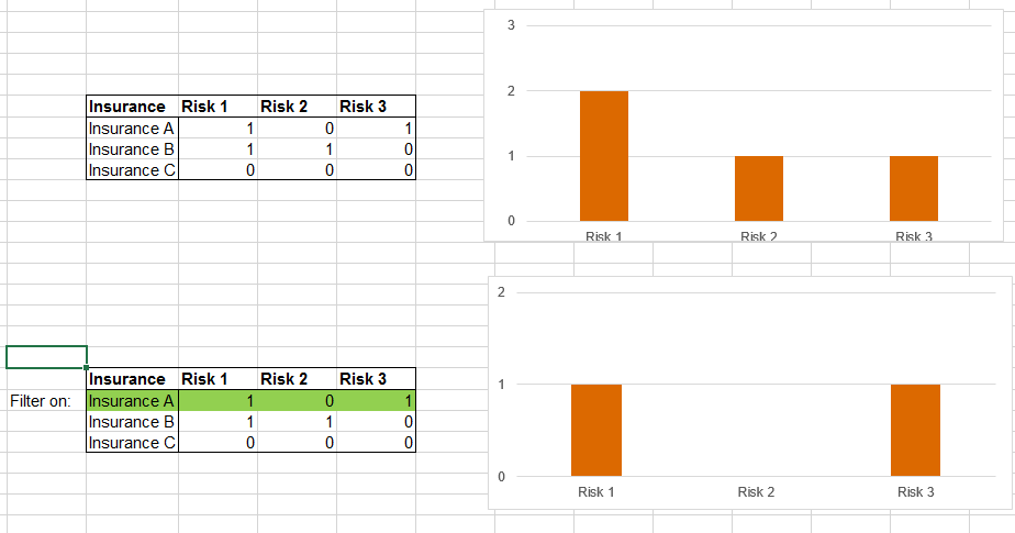
A bar chart where each value on the X-axis is a risk and the bar itself should represent the number of insurances that have this specific risk.
But there is a catch to it: If I select a specific insurance (e.g. from a table) I want this bar chart to visualize the specific risks that were flagged for that insurance. So, this has to be visualized based on my Summary Table (not via an intermediary table where the totals for each risk are calculated, since this does not allow me to filter down any further based on an individual (or group of) insurance(s) ).
Refer to the image below for a basic example done in Excel:
Thanks a lot in advance guys!
Solved! Go to Solution.
Hi
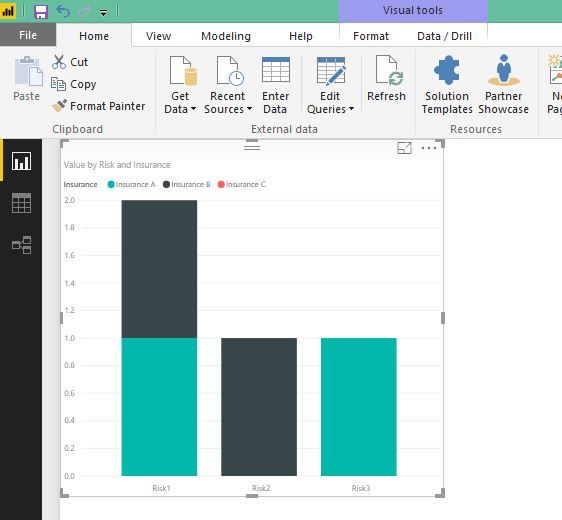
If you are looking for somthing like this,
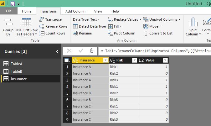
you can use unpivot columns in power query and then use that as a source for this chart.
Hi
If you are looking for somthing like this,
you can use unpivot columns in power query and then use that as a source for this chart.
Thanks a lot dilumd!
The problem is indeed solved by pivotting the table and building the visualization based on the new source.
Yours best,
JP
Join us in Barcelona for FabCon and SQLCon, the Fabric, Power BI, SQL, and AI community event. Save €200 with code FABCMTY200.
If you love stickers, then you will definitely want to check out our community sticker challenge, Barcelona edition!
Check out the July 2026 Power BI update to learn about new features.
| User | Count |
|---|---|
| 25 | |
| 23 | |
| 19 | |
| 17 | |
| 14 |
| User | Count |
|---|---|
| 24 | |
| 20 | |
| 20 | |
| 19 | |
| 19 |