Join us at FabCon Vienna from September 15-18, 2025
The ultimate Fabric, Power BI, SQL, and AI community-led learning event. Save €200 with code FABCOMM.
Get registered- Power BI forums
- Get Help with Power BI
- Desktop
- Service
- Report Server
- Power Query
- Mobile Apps
- Developer
- DAX Commands and Tips
- Custom Visuals Development Discussion
- Health and Life Sciences
- Power BI Spanish forums
- Translated Spanish Desktop
- Training and Consulting
- Instructor Led Training
- Dashboard in a Day for Women, by Women
- Galleries
- Data Stories Gallery
- Themes Gallery
- Contests Gallery
- Quick Measures Gallery
- Notebook Gallery
- Translytical Task Flow Gallery
- TMDL Gallery
- R Script Showcase
- Webinars and Video Gallery
- Ideas
- Custom Visuals Ideas (read-only)
- Issues
- Issues
- Events
- Upcoming Events
Enhance your career with this limited time 50% discount on Fabric and Power BI exams. Ends August 31st. Request your voucher.
- Power BI forums
- Forums
- Get Help with Power BI
- Desktop
- Re: Subtracting one element from another and displ...
- Subscribe to RSS Feed
- Mark Topic as New
- Mark Topic as Read
- Float this Topic for Current User
- Bookmark
- Subscribe
- Printer Friendly Page
- Mark as New
- Bookmark
- Subscribe
- Mute
- Subscribe to RSS Feed
- Permalink
- Report Inappropriate Content
Subtracting one element from another and displaying % Mix for that difference over time period
Hey Everyone,
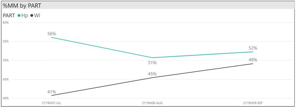
I have created a graph showing how "Mix" (Y Units/Total Units) is changing over a three month period for Wi and Hp.
What I would like to do next is to show how "Mix" changes over the same three month period for Wi - Hp.
PBIX file / Fact / Dim files shared here
All data is fabricated for purposes of this exercise.
Feel free to edit PBIX file with solution(s).
Thanks you in advance for your assistance.
best,
mibu
- Mark as New
- Bookmark
- Subscribe
- Mute
- Subscribe to RSS Feed
- Permalink
- Report Inappropriate Content
Hi @mibu,
kudos for posting with pbix and dataset included, great.
But I am not sure what you to do:
What I would like to do next is to show how "Mix" changes over the same three month period for Wi - Hp.
Could you elaborate a bit on this?
Cheers,
Sturla
- Mark as New
- Bookmark
- Subscribe
- Mute
- Subscribe to RSS Feed
- Permalink
- Report Inappropriate Content
Hi @sturlaws! Thanks for the reply.
In the PBIX file... I graph Hp and Wi %MM change over time, see graph below.
What I am trying to do next is graph Wi-Hp %MM as it changes over time using formula or measure.
Thanks in advance for your assistance.
best, mibu
Helpful resources
| User | Count |
|---|---|
| 77 | |
| 75 | |
| 36 | |
| 31 | |
| 28 |
| User | Count |
|---|---|
| 95 | |
| 81 | |
| 55 | |
| 48 | |
| 48 |


