FabCon is coming to Atlanta
Join us at FabCon Atlanta from March 16 - 20, 2026, for the ultimate Fabric, Power BI, AI and SQL community-led event. Save $200 with code FABCOMM.
Register now!- Power BI forums
- Get Help with Power BI
- Desktop
- Service
- Report Server
- Power Query
- Mobile Apps
- Developer
- DAX Commands and Tips
- Custom Visuals Development Discussion
- Health and Life Sciences
- Power BI Spanish forums
- Translated Spanish Desktop
- Training and Consulting
- Instructor Led Training
- Dashboard in a Day for Women, by Women
- Galleries
- Data Stories Gallery
- Themes Gallery
- Contests Gallery
- Quick Measures Gallery
- Visual Calculations Gallery
- Notebook Gallery
- Translytical Task Flow Gallery
- TMDL Gallery
- R Script Showcase
- Webinars and Video Gallery
- Ideas
- Custom Visuals Ideas (read-only)
- Issues
- Issues
- Events
- Upcoming Events
Calling all Data Engineers! Fabric Data Engineer (Exam DP-700) live sessions are back! Starting October 16th. Sign up.
- Power BI forums
- Forums
- Get Help with Power BI
- Desktop
- Subtracting one element from another and displayin...
- Subscribe to RSS Feed
- Mark Topic as New
- Mark Topic as Read
- Float this Topic for Current User
- Bookmark
- Subscribe
- Printer Friendly Page
- Mark as New
- Bookmark
- Subscribe
- Mute
- Subscribe to RSS Feed
- Permalink
- Report Inappropriate Content
Subtracting one element from another and displaying % Mix for that difference over time period
Hey Everyone,
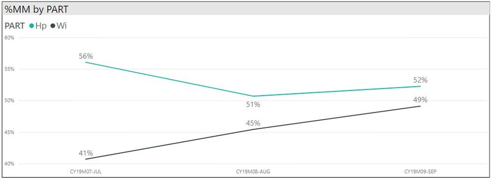
I have created a graph showing how "Mix" (Y Units/Total Units) is changing over a three month period for Wi and Hp.
What I would like to do next is to show how "Mix" changes over the same three month period for Wi - Hp.
PBIX file / Fact / Dim files shared here
All data is fabricated for purposes of this exercise.
Feel free to edit PBIX file with solution(s).
Thanks you in advance for your assistance.
best,
mibu
- Mark as New
- Bookmark
- Subscribe
- Mute
- Subscribe to RSS Feed
- Permalink
- Report Inappropriate Content
Hi @mibu,
kudos for posting with pbix and dataset included, great.
But I am not sure what you to do:
What I would like to do next is to show how "Mix" changes over the same three month period for Wi - Hp.
Could you elaborate a bit on this?
Cheers,
Sturla
- Mark as New
- Bookmark
- Subscribe
- Mute
- Subscribe to RSS Feed
- Permalink
- Report Inappropriate Content
Hi @sturlaws! Thanks for the reply.
In the PBIX file... I graph Hp and Wi %MM change over time, see graph below.
What I am trying to do next is graph Wi-Hp %MM as it changes over time using formula or measure.
Thanks in advance for your assistance.
best, mibu
Helpful resources

FabCon Global Hackathon
Join the Fabric FabCon Global Hackathon—running virtually through Nov 3. Open to all skill levels. $10,000 in prizes!

Power BI Monthly Update - October 2025
Check out the October 2025 Power BI update to learn about new features.


