Fabric Data Days starts November 4th!
Advance your Data & AI career with 50 days of live learning, dataviz contests, hands-on challenges, study groups & certifications and more!
Get registered- Power BI forums
- Get Help with Power BI
- Desktop
- Service
- Report Server
- Power Query
- Mobile Apps
- Developer
- DAX Commands and Tips
- Custom Visuals Development Discussion
- Health and Life Sciences
- Power BI Spanish forums
- Translated Spanish Desktop
- Training and Consulting
- Instructor Led Training
- Dashboard in a Day for Women, by Women
- Galleries
- Data Stories Gallery
- Themes Gallery
- Contests Gallery
- QuickViz Gallery
- Quick Measures Gallery
- Visual Calculations Gallery
- Notebook Gallery
- Translytical Task Flow Gallery
- TMDL Gallery
- R Script Showcase
- Webinars and Video Gallery
- Ideas
- Custom Visuals Ideas (read-only)
- Issues
- Issues
- Events
- Upcoming Events
Get Fabric Certified for FREE during Fabric Data Days. Don't miss your chance! Request now
- Power BI forums
- Forums
- Get Help with Power BI
- Desktop
- Re: Stacked column graph not showing accurate % to...
- Subscribe to RSS Feed
- Mark Topic as New
- Mark Topic as Read
- Float this Topic for Current User
- Bookmark
- Subscribe
- Printer Friendly Page
- Mark as New
- Bookmark
- Subscribe
- Mute
- Subscribe to RSS Feed
- Permalink
- Report Inappropriate Content
Stacked column graph not showing accurate % tooltip when sorted
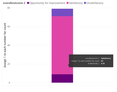
I have a stacked column graph with a tooltip that shows the % of the value compared to the total. This is created by a measure. In the graph you can see that the proportion of the pink is 0.78 (78%)
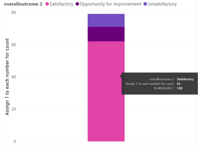
I also created a new table to order the graph so that the pink portion is on the bottom. However, once it got sorted, the % tooltip now shows 100% instead of 78%. Can anyone assist with this? Thanks
Below is the sample data:
The measure for % calculation for tooltip:
% MEASURE 2 =
DIVIDE(SUM('table1[Assign 1 to each number for count]),
CALCULATE(SUM(‘table1'[Assign 1 to each number for count]),ALL(‘table1’[overalloutcome 2])),0)
The table I created to order the graph:
Solved! Go to Solution.
- Mark as New
- Bookmark
- Subscribe
- Mute
- Subscribe to RSS Feed
- Permalink
- Report Inappropriate Content
Try update formula
% MEASURE 2 =

DIVIDE(SUM('table1[Assign 1 to each number for count]),

CALCULATE(SUM(‘table1'[Assign 1 to each number for count]),ALL(‘table1’)),0)
Did I answer your question? Mark my post as a solution! Appreciate your Kudos!!
Proud to be a Super User!
- Mark as New
- Bookmark
- Subscribe
- Mute
- Subscribe to RSS Feed
- Permalink
- Report Inappropriate Content
Can you please share the sample data and dax of the measure that you are referencing.
Did I answer your question? Mark my post as a solution! Appreciate your Kudos!!
Proud to be a Super User!
- Mark as New
- Bookmark
- Subscribe
- Mute
- Subscribe to RSS Feed
- Permalink
- Report Inappropriate Content
Sure.
Below is the sample data:
The measure for % calculation for tooltip:
% MEASURE 2 =
DIVIDE(SUM('table1[Assign 1 to each number for count]),
CALCULATE(SUM(‘table1'[Assign 1 to each number for count]),ALL(‘table1’[overalloutcome 2])),0)
The table I created to order the graph:
- Mark as New
- Bookmark
- Subscribe
- Mute
- Subscribe to RSS Feed
- Permalink
- Report Inappropriate Content
Try update formula
% MEASURE 2 =

DIVIDE(SUM('table1[Assign 1 to each number for count]),

CALCULATE(SUM(‘table1'[Assign 1 to each number for count]),ALL(‘table1’)),0)
Did I answer your question? Mark my post as a solution! Appreciate your Kudos!!
Proud to be a Super User!
- Mark as New
- Bookmark
- Subscribe
- Mute
- Subscribe to RSS Feed
- Permalink
- Report Inappropriate Content
Yes this worked, thank you very much!
Helpful resources

Fabric Data Days
Advance your Data & AI career with 50 days of live learning, contests, hands-on challenges, study groups & certifications and more!

Power BI Monthly Update - October 2025
Check out the October 2025 Power BI update to learn about new features.


