Party with Power BI’s own Guy in a Cube
Power BI is turning 10! Tune in for a special live episode on July 24 with behind-the-scenes stories, product evolution highlights, and a sneak peek at what’s in store for the future.
Save the date- Power BI forums
- Get Help with Power BI
- Desktop
- Service
- Report Server
- Power Query
- Mobile Apps
- Developer
- DAX Commands and Tips
- Custom Visuals Development Discussion
- Health and Life Sciences
- Power BI Spanish forums
- Translated Spanish Desktop
- Training and Consulting
- Instructor Led Training
- Dashboard in a Day for Women, by Women
- Galleries
- Webinars and Video Gallery
- Data Stories Gallery
- Themes Gallery
- Contests Gallery
- Quick Measures Gallery
- Notebook Gallery
- Translytical Task Flow Gallery
- R Script Showcase
- Ideas
- Custom Visuals Ideas (read-only)
- Issues
- Issues
- Events
- Upcoming Events
Enhance your career with this limited time 50% discount on Fabric and Power BI exams. Ends August 31st. Request your voucher.
- Power BI forums
- Forums
- Get Help with Power BI
- Desktop
- Stacked column graph not showing accurate % toolti...
- Subscribe to RSS Feed
- Mark Topic as New
- Mark Topic as Read
- Float this Topic for Current User
- Bookmark
- Subscribe
- Printer Friendly Page
- Mark as New
- Bookmark
- Subscribe
- Mute
- Subscribe to RSS Feed
- Permalink
- Report Inappropriate Content
Stacked column graph not showing accurate % tooltip when sorted
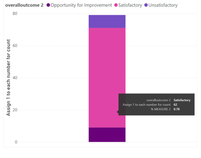
I have a stacked column graph with a tooltip that shows the % of the value compared to the total. This is created by a measure. In the graph you can see that the proportion of the pink is 0.78 (78%)
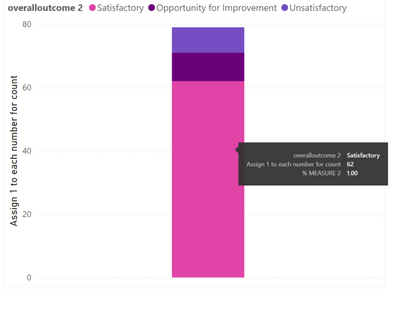
I also created a new table to order the graph so that the pink portion is on the bottom. However, once it got sorted, the % tooltip now shows 100% instead of 78%. Can anyone assist with this? Thanks
Below is the sample data:
The measure for % calculation for tooltip:
% MEASURE 2 =
DIVIDE(SUM('table1[Assign 1 to each number for count]),
CALCULATE(SUM(‘table1'[Assign 1 to each number for count]),ALL(‘table1’[overalloutcome 2])),0)
The table I created to order the graph:
Solved! Go to Solution.
- Mark as New
- Bookmark
- Subscribe
- Mute
- Subscribe to RSS Feed
- Permalink
- Report Inappropriate Content
Try update formula
% MEASURE 2 =

DIVIDE(SUM('table1[Assign 1 to each number for count]),

CALCULATE(SUM(‘table1'[Assign 1 to each number for count]),ALL(‘table1’)),0)
Did I answer your question? Mark my post as a solution! Appreciate your Kudos!!
Proud to be a Super User!
- Mark as New
- Bookmark
- Subscribe
- Mute
- Subscribe to RSS Feed
- Permalink
- Report Inappropriate Content
Can you please share the sample data and dax of the measure that you are referencing.
Did I answer your question? Mark my post as a solution! Appreciate your Kudos!!
Proud to be a Super User!
- Mark as New
- Bookmark
- Subscribe
- Mute
- Subscribe to RSS Feed
- Permalink
- Report Inappropriate Content
Sure.
Below is the sample data:
The measure for % calculation for tooltip:
% MEASURE 2 =
DIVIDE(SUM('table1[Assign 1 to each number for count]),
CALCULATE(SUM(‘table1'[Assign 1 to each number for count]),ALL(‘table1’[overalloutcome 2])),0)
The table I created to order the graph:
- Mark as New
- Bookmark
- Subscribe
- Mute
- Subscribe to RSS Feed
- Permalink
- Report Inappropriate Content
Try update formula
% MEASURE 2 =

DIVIDE(SUM('table1[Assign 1 to each number for count]),

CALCULATE(SUM(‘table1'[Assign 1 to each number for count]),ALL(‘table1’)),0)
Did I answer your question? Mark my post as a solution! Appreciate your Kudos!!
Proud to be a Super User!
- Mark as New
- Bookmark
- Subscribe
- Mute
- Subscribe to RSS Feed
- Permalink
- Report Inappropriate Content
Yes this worked, thank you very much!
Helpful resources

Power BI Monthly Update - July 2025
Check out the July 2025 Power BI update to learn about new features.

Join our Fabric User Panel
This is your chance to engage directly with the engineering team behind Fabric and Power BI. Share your experiences and shape the future.

| User | Count |
|---|---|
| 71 | |
| 67 | |
| 51 | |
| 39 | |
| 26 |
| User | Count |
|---|---|
| 87 | |
| 54 | |
| 45 | |
| 40 | |
| 36 |


