A new Data Days event is coming soon!
This time we’re going bigger than ever. Fabric, Power BI, SQL, AI and more. We're covering it all. You won't want to miss it.
Learn more- Power BI forums
- Get Help with Power BI
- Desktop
- Service
- Report Server
- Power Query
- Mobile Apps
- Developer
- DAX Commands and Tips
- Custom Visuals Development Discussion
- Health and Life Sciences
- Power BI Spanish forums
- Translated Spanish Desktop
- Training and Consulting
- Instructor Led Training
- Dashboard in a Day for Women, by Women
- Galleries
- Data Stories Gallery
- Themes Gallery
- Contests Gallery
- QuickViz Gallery
- Quick Measures Gallery
- Visual Calculations Gallery
- Notebook Gallery
- Translytical Task Flow Gallery
- TMDL Gallery
- R Script Showcase
- Webinars and Video Gallery
- Ideas
- Custom Visuals Ideas (read-only)
- Issues
- Issues
- Events
- Upcoming Events
Level up your Power BI skills this month - build one visual each week and tell better stories with data! Get started
- Power BI forums
- Forums
- Get Help with Power BI
- Desktop
- Re: Small Multiples - Issue with bars scaling (dis...
- Subscribe to RSS Feed
- Mark Topic as New
- Mark Topic as Read
- Float this Topic for Current User
- Bookmark
- Subscribe
- Printer Friendly Page
- Mark as New
- Bookmark
- Subscribe
- Mute
- Subscribe to RSS Feed
- Permalink
- Report Inappropriate Content
Small multiples feedback thread
Hi all,
This month marks the release of the public preview version of small multiples! We're excited for you to try it out, and we look forward to hearing your thoughts and opinions on the feature.
If you haven't already, check out the blog post here to learn more about how to use small multiples and what we have planned for the feature. Then let us know here or via this survey what you think of the feature!
- the Power BI small multiples squad
- Mark as New
- Bookmark
- Subscribe
- Mute
- Subscribe to RSS Feed
- Permalink
- Report Inappropriate Content
It would be really great to be able to make analytics work with small multiples, such as median or average lines. Even if I calculate a measure in context of the small multiples (with ALLEXCEPT) it uses the overall measure. It would be great to be able to present distribution AND central tendency on one chart, such as bin counts and medians/means.
- Mark as New
- Bookmark
- Subscribe
- Mute
- Subscribe to RSS Feed
- Permalink
- Report Inappropriate Content
@msftrien is there any progress on getting concatenate labels to work with small multiples? A lot of my charts use concatenate labels (it was even made a default recently) but this then means small multiples can't be used as they look so bad.
- Mark as New
- Bookmark
- Subscribe
- Mute
- Subscribe to RSS Feed
- Permalink
- Report Inappropriate Content
Is there something being worked on?
We gradually stopped recommending this feature in our Organization! Tiles with smaller data is literally impossible to compare and ananlyis.
- Mark as New
- Bookmark
- Subscribe
- Mute
- Subscribe to RSS Feed
- Permalink
- Report Inappropriate Content
@msftrien is this feature no longer being developed? Are the gaps still being worked on? Thanks
- Mark as New
- Bookmark
- Subscribe
- Mute
- Subscribe to RSS Feed
- Permalink
- Report Inappropriate Content
Since small multiples was made generally available, we've moved the additional features to the broader visuals backlog. The top feature of these is unsynchronized y axes, which we hope to have for you soon, but I don't have any more specific of an ETA than that!
- Mark as New
- Bookmark
- Subscribe
- Mute
- Subscribe to RSS Feed
- Permalink
- Report Inappropriate Content
Is there any ETA for when concatenate labels will be supported with small multiples? The issue is described perfectly in this thread: https://community.powerbi.com/t5/Desktop/Small-Multiples-Disable-Concatenate-Label/td-p/1862867
- Mark as New
- Bookmark
- Subscribe
- Mute
- Subscribe to RSS Feed
- Permalink
- Report Inappropriate Content
@msftrien I'm still waiting for milestones as listed here https://powerbi.microsoft.com/en-us/blog/announcing-small-multiples-public-preview/
Is there some kind of ETA? Thanks.
- Mark as New
- Bookmark
- Subscribe
- Mute
- Subscribe to RSS Feed
- Permalink
- Report Inappropriate Content
It would be nice to be able to make the grid dimension dynamic. Per example, if the small multiples are years, the grid dimension is set to 2x2 and only one specific year is selected, it will show the visual in 2x2 with values only on one of the multiple. I would like to be able to see only the selected years without seeing blank multiple in the visual.
- Mark as New
- Bookmark
- Subscribe
- Mute
- Subscribe to RSS Feed
- Permalink
- Report Inappropriate Content
Hi,
Just discovered an issue when copying the visual to put in a word or PowerPoint doc. Any small multiples graph just comes up blank. Normal graphs working fine
- Mark as New
- Bookmark
- Subscribe
- Mute
- Subscribe to RSS Feed
- Permalink
- Report Inappropriate Content
We have also noticed this issue.
- Mark as New
- Bookmark
- Subscribe
- Mute
- Subscribe to RSS Feed
- Permalink
- Report Inappropriate Content
We have noticed the same.
- Mark as New
- Bookmark
- Subscribe
- Mute
- Subscribe to RSS Feed
- Permalink
- Report Inappropriate Content
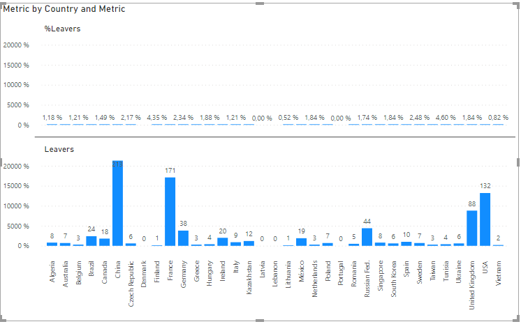
Hello, I am experiencing the following issue with a bar chart when using small multiples.
The bars showing the values of different amounts are out of proportion, unless the Start of the X-axis is set to 0.
The scale of the bars appears normal once the small multiples field is removed.
View below the first chart (with Currency as the Small multiple) showing disproportionate bar sizes for different fields (all with same format) and the 2nd chart with the removal of the small multiples show the proper scaling for the bars.
Does any one have any idea on how to fix it without setting the X-axis Start to 0 (since negative values are also applicable)?
Thank you very much in advance!
- Mark as New
- Bookmark
- Subscribe
- Mute
- Subscribe to RSS Feed
- Permalink
- Report Inappropriate Content
This is another more outstanding example of the disproportion of the bar charts under small multiples
Has anyone else faced something similar?
- Mark as New
- Bookmark
- Subscribe
- Mute
- Subscribe to RSS Feed
- Permalink
- Report Inappropriate Content
Do you mind sending me a PBIX w/ repro of this issue? Looks like a bug.
- Mark as New
- Bookmark
- Subscribe
- Mute
- Subscribe to RSS Feed
- Permalink
- Report Inappropriate Content
It should not always share the axis. There should be an option. The idea of sharing axis value is good. But sometimes we just want to see trends, some windows look good while others cannot be seen because value difference is large. In that case, we want to turn off shared axis value.
- Mark as New
- Bookmark
- Subscribe
- Mute
- Subscribe to RSS Feed
- Permalink
- Report Inappropriate Content
Thank you for the feedback. Yes, unshared/unsynchronized Y axis is high on our backlog of features to add. Although we're stretched thin with commitments to many other high-priority features, do know that this is something we find important for small multiples.
- Mark as New
- Bookmark
- Subscribe
- Mute
- Subscribe to RSS Feed
- Permalink
- Report Inappropriate Content
Hi,
I just tried to use small multiple with a calculation group and the result it's not as i expected.
In my calculation group, i have 2 items. 1 item formatted in percent and the other as a whole number.
as you can see in the picture below, The Y axis is formatted in percent for the both items. Ideally it should follow the Format String Expression of the item. Also if the ranges for each multiple can be unsynchronized it will give a better display.
Hope this feedback is clear.
Cedric
- Mark as New
- Bookmark
- Subscribe
- Mute
- Subscribe to RSS Feed
- Permalink
- Report Inappropriate Content
I have the exact same requirement. However I have three different formats. $, Count and %
Eg:
1. Total Sales Amount ($)
2. Total Orders (#)
3. Percentage Change over time (%)
All three share same X Axis, tell the same story with different data point. Hence a good candidate to be added in Calculation Group and Small Multiple.
Wish each cell uses Formating String defined in the Calculation Group
- Mark as New
- Bookmark
- Subscribe
- Mute
- Subscribe to RSS Feed
- Permalink
- Report Inappropriate Content
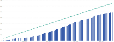
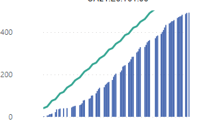
I'm using the line & stacked column chart type with no secondary Y-axis, and the Auto Y-axis scaling doesn't behave properly for small multiples. Here's the chart with small multiples disabled:
and here's the same chart with small multiples enabled:
With small multiples, the values for the line don't seem to be considered when generating the Auto Y-axis; the line is cut off at the top and does not cover the entire X-axis.
- Mark as New
- Bookmark
- Subscribe
- Mute
- Subscribe to RSS Feed
- Permalink
- Report Inappropriate Content
Sorry for the late reply -- is this still an issue? If so, I'll bring it up with the dev team.
Helpful resources

Power BI Monthly Update - April 2026
Check out the April 2026 Power BI update to learn about new features.

Data Days 2026 coming soon!
Sign up to receive a private message when registration opens and key events begin.

New to Fabric Survey
If you have recently started exploring Fabric, we'd love to hear how it's going. Your feedback can help with product improvements.

| User | Count |
|---|---|
| 35 | |
| 32 | |
| 25 | |
| 22 | |
| 18 |
| User | Count |
|---|---|
| 68 | |
| 36 | |
| 32 | |
| 25 | |
| 23 |


