FabCon is coming to Atlanta
Join us at FabCon Atlanta from March 16 - 20, 2026, for the ultimate Fabric, Power BI, AI and SQL community-led event. Save $200 with code FABCOMM.
Register now!- Power BI forums
- Get Help with Power BI
- Desktop
- Service
- Report Server
- Power Query
- Mobile Apps
- Developer
- DAX Commands and Tips
- Custom Visuals Development Discussion
- Health and Life Sciences
- Power BI Spanish forums
- Translated Spanish Desktop
- Training and Consulting
- Instructor Led Training
- Dashboard in a Day for Women, by Women
- Galleries
- Data Stories Gallery
- Themes Gallery
- Contests Gallery
- QuickViz Gallery
- Quick Measures Gallery
- Visual Calculations Gallery
- Notebook Gallery
- Translytical Task Flow Gallery
- TMDL Gallery
- R Script Showcase
- Webinars and Video Gallery
- Ideas
- Custom Visuals Ideas (read-only)
- Issues
- Issues
- Events
- Upcoming Events
The Power BI Data Visualization World Championships is back! It's time to submit your entry. Live now!
- Power BI forums
- Forums
- Get Help with Power BI
- Desktop
- Re: Slicer Using Multiple Variables
- Subscribe to RSS Feed
- Mark Topic as New
- Mark Topic as Read
- Float this Topic for Current User
- Bookmark
- Subscribe
- Printer Friendly Page
- Mark as New
- Bookmark
- Subscribe
- Mute
- Subscribe to RSS Feed
- Permalink
- Report Inappropriate Content
Slicer Using Multiple Variables
All,
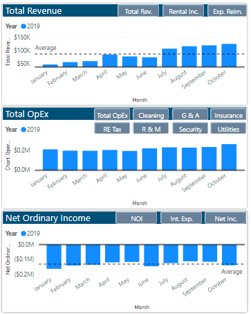
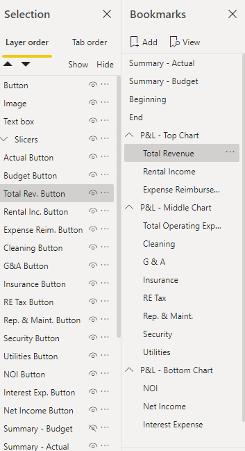
I have created a chart that, through buttons and bookmarks, changes to the variable chart I would like. While the buttons fuction properly and get the job done, I would like to convert the buttons into slicers so I can select the graph of my choosing. I have tried multiple suggested solutions from the community, including creating new columns/queries and downloading the hierarchy slicer, but have yet to resolve my question.
I would greatly appreciate someone helping.


Thanks,
Adam
Solved! Go to Solution.
- Mark as New
- Bookmark
- Subscribe
- Mute
- Subscribe to RSS Feed
- Permalink
- Report Inappropriate Content
I Think your are looking for something like this.
https://www.fourmoo.com/2017/11/21/power-bi-using-a-slicer-to-show-different-measures/
Did I answer your question? Mark my post as a solution! Appreciate with a Kudos!! (Click the Thumbs Up Button)
- Mark as New
- Bookmark
- Subscribe
- Mute
- Subscribe to RSS Feed
- Permalink
- Report Inappropriate Content
Hi,
have you try creating a table with a row for each button and then a measure switching showing different measures by new table selection?
Lorenzo
Helpful resources
| User | Count |
|---|---|
| 51 | |
| 40 | |
| 35 | |
| 23 | |
| 22 |
| User | Count |
|---|---|
| 134 | |
| 103 | |
| 57 | |
| 43 | |
| 38 |

