FabCon is coming to Atlanta
Join us at FabCon Atlanta from March 16 - 20, 2026, for the ultimate Fabric, Power BI, AI and SQL community-led event. Save $200 with code FABCOMM.
Register now!- Power BI forums
- Get Help with Power BI
- Desktop
- Service
- Report Server
- Power Query
- Mobile Apps
- Developer
- DAX Commands and Tips
- Custom Visuals Development Discussion
- Health and Life Sciences
- Power BI Spanish forums
- Translated Spanish Desktop
- Training and Consulting
- Instructor Led Training
- Dashboard in a Day for Women, by Women
- Galleries
- Data Stories Gallery
- Themes Gallery
- Contests Gallery
- QuickViz Gallery
- Quick Measures Gallery
- Visual Calculations Gallery
- Notebook Gallery
- Translytical Task Flow Gallery
- TMDL Gallery
- R Script Showcase
- Webinars and Video Gallery
- Ideas
- Custom Visuals Ideas (read-only)
- Issues
- Issues
- Events
- Upcoming Events
The Power BI Data Visualization World Championships is back! Get ahead of the game and start preparing now! Learn more
- Power BI forums
- Forums
- Get Help with Power BI
- Desktop
- Slicer Using Multiple Variables
- Subscribe to RSS Feed
- Mark Topic as New
- Mark Topic as Read
- Float this Topic for Current User
- Bookmark
- Subscribe
- Printer Friendly Page
- Mark as New
- Bookmark
- Subscribe
- Mute
- Subscribe to RSS Feed
- Permalink
- Report Inappropriate Content
Slicer Using Multiple Variables
All,
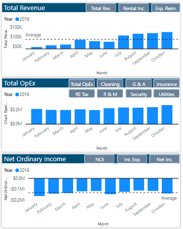
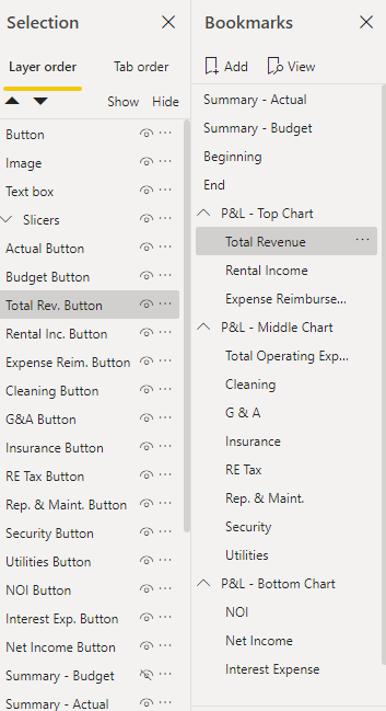
I have created a chart that, through buttons and bookmarks, changes to the variable chart I would like. While the buttons fuction properly and get the job done, I would like to convert the buttons into slicers so I can select the graph of my choosing. I have tried multiple suggested solutions from the community, including creating new columns/queries and downloading the hierarchy slicer, but have yet to resolve my question.
I would greatly appreciate someone helping.


Thanks,
Adam
Solved! Go to Solution.
- Mark as New
- Bookmark
- Subscribe
- Mute
- Subscribe to RSS Feed
- Permalink
- Report Inappropriate Content
I Think your are looking for something like this.
https://www.fourmoo.com/2017/11/21/power-bi-using-a-slicer-to-show-different-measures/
Did I answer your question? Mark my post as a solution! Appreciate with a Kudos!! (Click the Thumbs Up Button)
- Mark as New
- Bookmark
- Subscribe
- Mute
- Subscribe to RSS Feed
- Permalink
- Report Inappropriate Content
Hi,
have you try creating a table with a row for each button and then a measure switching showing different measures by new table selection?
Lorenzo
Helpful resources

Power BI Dataviz World Championships
The Power BI Data Visualization World Championships is back! Get ahead of the game and start preparing now!

| User | Count |
|---|---|
| 40 | |
| 37 | |
| 33 | |
| 29 | |
| 27 |
| User | Count |
|---|---|
| 131 | |
| 104 | |
| 61 | |
| 57 | |
| 55 |

