FabCon is coming to Atlanta
Join us at FabCon Atlanta from March 16 - 20, 2026, for the ultimate Fabric, Power BI, AI and SQL community-led event. Save $200 with code FABCOMM.
Register now!- Power BI forums
- Get Help with Power BI
- Desktop
- Service
- Report Server
- Power Query
- Mobile Apps
- Developer
- DAX Commands and Tips
- Custom Visuals Development Discussion
- Health and Life Sciences
- Power BI Spanish forums
- Translated Spanish Desktop
- Training and Consulting
- Instructor Led Training
- Dashboard in a Day for Women, by Women
- Galleries
- Data Stories Gallery
- Themes Gallery
- Contests Gallery
- QuickViz Gallery
- Quick Measures Gallery
- Visual Calculations Gallery
- Notebook Gallery
- Translytical Task Flow Gallery
- TMDL Gallery
- R Script Showcase
- Webinars and Video Gallery
- Ideas
- Custom Visuals Ideas (read-only)
- Issues
- Issues
- Events
- Upcoming Events
The Power BI Data Visualization World Championships is back! Get ahead of the game and start preparing now! Learn more
- Power BI forums
- Forums
- Get Help with Power BI
- Desktop
- Re: Share your thoughts on the new On-Object Inter...
- Subscribe to RSS Feed
- Mark Topic as New
- Mark Topic as Read
- Float this Topic for Current User
- Bookmark
- Subscribe
- Printer Friendly Page
- Mark as New
- Bookmark
- Subscribe
- Mute
- Subscribe to RSS Feed
- Permalink
- Report Inappropriate Content
Share your thoughts on the new On-Object Interaction feature (preview)
Hit Reply to tell us what you think about the new On-Object Interaction feature so we can continue to improve.
For example:
- What changes would you like to see?
- If you turned off the preview switch, why?
- Any suggestions for addititional settings or capabilities?
Thanks,
-Power BI team
To read more about the feature, see the announcement in the Power BI Product Blog or our documentation on how to Use on-object interaction
FAQs:
- Q: How can I open multiple panes at once?
- A: You can CTRL + click or right click on the unselected pane you wish to open and choose "Open in new pane"
- Q: Where did aggregations move to?
- A: It's still on right click of a field, or you can use the new flyout aggregations dropdown while choosing or swapping a field.
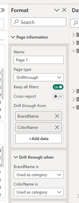
- Q: Where did drillthrough and tooltip page setup move to?
- A: Drillthrough is now in the page settings of the format pane under Page Information > Page type > Drillthrough or Tooltip.
- Mark as New
- Bookmark
- Subscribe
- Mute
- Subscribe to RSS Feed
- Permalink
- Report Inappropriate Content
I really hope this feature is optional, even after it's finalized.
- Mark as New
- Bookmark
- Subscribe
- Mute
- Subscribe to RSS Feed
- Permalink
- Report Inappropriate Content
The July 2023 update is getting closer to being acceptable. One thing that really, really needs to be put back is the chevrons << and >> to expand and collapse the panes. The current method of selecting the dropdown arrow makes this process cumbersome.
Either that or have an option in the 'Customize Pane Switcher' (+) which would allow us to open multiple panes by single clicking on them instead of having to CTRL clicking them. This would be a slider like the other options in the pane switcher which would say something like "Allow single click to select multiple panes and expand or colapse them once open'
- Mark as New
- Bookmark
- Subscribe
- Mute
- Subscribe to RSS Feed
- Permalink
- Report Inappropriate Content
Hi JohnF1966,
I'm glad to see you are still sticking around. This feedback is getting more positive than the last time we spoke. Though positive or negative it is appreciated. We still have more releases to come in preview until this is the full experience we want for y'all. Please stay tuned for the Sept and Oct releases I'm hopeful they will help you with some of the issues you are having, but please let me know if that isn't the case.
Thanks,
Ewan
- Mark as New
- Bookmark
- Subscribe
- Mute
- Subscribe to RSS Feed
- Permalink
- Report Inappropriate Content
I agree
- Mark as New
- Bookmark
- Subscribe
- Mute
- Subscribe to RSS Feed
- Permalink
- Report Inappropriate Content
Hi,
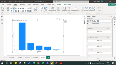
Issue 1: I have started using On object interaction. But when I click on add data, I am getting this kind of popup where I am not able to select the first data table as shown below.
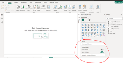
Issue 2: Not able to see the drill through option. Please look at below screenshots of both the versions (Prior to On object interaction and post Object interaction).
Thank you
Hiren Kakkad
Stat Modeller
- Mark as New
- Bookmark
- Subscribe
- Mute
- Subscribe to RSS Feed
- Permalink
- Report Inappropriate Content
Hi hirenkakkad,
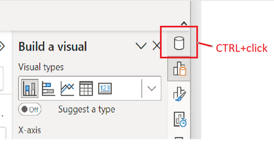
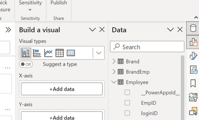
We're working to make the menus easier to use with more options. You could continue to using the menu that comes from the +Add data button, but if you would like to drag and drop like you did previously. You can Ctrl+click the Data icon in the pane switcher. This will open the Data pane with the Build a visual
Drill-through has moved under Page information in the Format pane. You can find it here:
Thanks for trying the preview feature. If you need help or have more feedback to share please let us know.
Thanks,
Ewan
- Mark as New
- Bookmark
- Subscribe
- Mute
- Subscribe to RSS Feed
- Permalink
- Report Inappropriate Content
While we appreciate efforts to make the menus easier to access, like others have said, it does feel like more clicks.
I have an idea, what if the search capability was added to the ribbon instead? Constantly having to go to the viz pane and then search has its challenges and involves a lot of clicking which is why some of us doing use another tool out there. I've come to grow accustomed to using the search but wished it was not based on clicking within the format pane.
- Mark as New
- Bookmark
- Subscribe
- Mute
- Subscribe to RSS Feed
- Permalink
- Report Inappropriate Content
Things feel more hidden, takes more clicks, navigating otions is clunky, and adding data to visuals is much worse.
- Mark as New
- Bookmark
- Subscribe
- Mute
- Subscribe to RSS Feed
- Permalink
- Report Inappropriate Content
- What changes would you like to see? I'm not sure if this is the properly solution that we users are looking for, It really looks like an "adapted Excel solution". I think the current solution to change charts' form and populate with data and feeds is good.
- If you turned off the preview switch, why? Needed a lot of clicks to change simple things (my hands and fist after start to heart, something that never happened with the current solution), and I find a bug (sudentilly stop to return basics functionalities such as changing the Title and Color)
- Any suggestions for additional settings or capabilities? I think someone tried to reduce the complexity creating something more "minimalisty" .
- Too many click to find
- Missing format functions (bugs - I tried to change a card name using the option and the title name disappeared)
- Not very intuitive
- Mark as New
- Bookmark
- Subscribe
- Mute
- Subscribe to RSS Feed
- Permalink
- Report Inappropriate Content
I tried it, I hate it. I need to see the full visualization pane with all fields AND the full data pane with all fields to choose from. Anything less is kneecapping my work, as a painter I need both the palette (data fields) AND the paintbrush (formatting) to work on the canvas. So the feature is back off and please NEVER make this mandatory.
Separately the right click choices at the side of the visual I might well like, and valued it in Excel. But at the cost of my visualization AND data panes? No, bleep no, and many cuss words ensue.
- Mark as New
- Bookmark
- Subscribe
- Mute
- Subscribe to RSS Feed
- Permalink
- Report Inappropriate Content
Unfortunately, I cannot use this feature its a massive step back on the previous visualisation pane navigation format.
It is complicated and takes longer to achieve the same outcome as there are so many clicks and menus to navigate.
Please don't make this a mandatory change!
- Mark as New
- Bookmark
- Subscribe
- Mute
- Subscribe to RSS Feed
- Permalink
- Report Inappropriate Content
I wholeheartedly agree.
- Mark as New
- Bookmark
- Subscribe
- Mute
- Subscribe to RSS Feed
- Permalink
- Report Inappropriate Content
I had to turn this off. Too many clicks to do accomplish what I want. Need a way to just "pin" the panels, and that method is just turning it off. I wanted to create a drill through, and couldn't figure it out. Searching for PowerBI drill through, guess what I got? 6 years worth of videos and articles that didn't matter because I had this option turned on.
- Mark as New
- Bookmark
- Subscribe
- Mute
- Subscribe to RSS Feed
- Permalink
- Report Inappropriate Content
While Converting to PDF, I get some line in the right edge of the cornor,
where I could be change or other solution?
- Mark as New
- Bookmark
- Subscribe
- Mute
- Subscribe to RSS Feed
- Permalink
- Report Inappropriate Content
I find this feature difficult to use as I don't have the possibility to pin the Bookmarks and Selection at the same time (which previously wasn't the case). And that is crucial for me being able to build reports.
- Mark as New
- Bookmark
- Subscribe
- Mute
- Subscribe to RSS Feed
- Permalink
- Report Inappropriate Content
@monika_todor @wjkolesar I just found out that you can right click and expand to an extra pane. So you can open the bookmark en selection pane together. @RosieL This is hard to find and not intuitive
- Mark as New
- Bookmark
- Subscribe
- Mute
- Subscribe to RSS Feed
- Permalink
- Report Inappropriate Content
The problem is that it only opens one panel at a time, you have to use a lot of clicks and open and close panels, nothing productive.
- Mark as New
- Bookmark
- Subscribe
- Mute
- Subscribe to RSS Feed
- Permalink
- Report Inappropriate Content
I just experienced the same pain point - managing bookmarks that use selected visuals is extremely difficult using the new experience, where only the bookmark pane or the selection pane is visible at one time. Having these both visible while you set your bookmarks is critical.
- Mark as New
- Bookmark
- Subscribe
- Mute
- Subscribe to RSS Feed
- Permalink
- Report Inappropriate Content
Hello Power BI Team,
I have tried the new On-Object formatting for some time now en here is some feedback:
+ I like it when you click on for example a title you as adjust this directly.
- I don't like the on object formatting pane is on top of everything else, this is something very, and I mean very, annoying and leads to a whole lot of extra clicks. This is for me a giant set back form the old situation. For example when I have the pane open en I switch the visual to focus mode the pane is on top of the menu bar and DAX query bar.
- It is not possible to make the on object pane wider so you can read the name of measures and columns with a longer name.
- It would be a great improvement when it is possible to disconnect the formatting pane and move to wherever it is not in the way at that moment. Even better when it is possible to drag it to a second screen if you have it.
I hope this helps you further improve this new feature. Thanks for making is doing great stuff with Power BI 🙂
Kind regards,
Tiemen
- Mark as New
- Bookmark
- Subscribe
- Mute
- Subscribe to RSS Feed
- Permalink
- Report Inappropriate Content
After 3 month of use the On-object interaction I give it 1 month extra before switch back to the old version. The interaction between the sections is not 100% workable for me. I keep clicking on the visual builder icon which it needed all the time in combination with the data where you can easily drag an drop this is something I miss at the moment.
If I had more options to fix or modify my layout every time I start Power BI Desktop would be nice. When you work on a large screen you can have everything open. Visual builder and format and data next to each other. Also have the visual builder on-object enabled and on the right would be great. When you are in de visuals builder mode you want to switch as fast as possible. Then you would like to use the build visual on the right rather than first click the visual and then the builder.
Regards, Rik
- Mark as New
- Bookmark
- Subscribe
- Mute
- Subscribe to RSS Feed
- Permalink
- Report Inappropriate Content
In the old system, deleting the customised name of a data placed on a visual would return it to it's default value. This isn't the case with the new on object interaction which is a step backwards in my opinion. I also find it much slower to not be able to drag data fields onto the relevant part of a visualisation - the click and search just doubles the time.
The build pane also keeps disappearing even when supposedly added to the "pane switcher"
Helpful resources

Power BI Dataviz World Championships
The Power BI Data Visualization World Championships is back! Get ahead of the game and start preparing now!

| User | Count |
|---|---|
| 40 | |
| 38 | |
| 36 | |
| 29 | |
| 28 |
| User | Count |
|---|---|
| 127 | |
| 88 | |
| 78 | |
| 66 | |
| 65 |

