Join us at FabCon Vienna from September 15-18, 2025
The ultimate Fabric, Power BI, SQL, and AI community-led learning event. Save €200 with code FABCOMM.
Get registered- Power BI forums
- Get Help with Power BI
- Desktop
- Service
- Report Server
- Power Query
- Mobile Apps
- Developer
- DAX Commands and Tips
- Custom Visuals Development Discussion
- Health and Life Sciences
- Power BI Spanish forums
- Translated Spanish Desktop
- Training and Consulting
- Instructor Led Training
- Dashboard in a Day for Women, by Women
- Galleries
- Data Stories Gallery
- Themes Gallery
- Contests Gallery
- Quick Measures Gallery
- Notebook Gallery
- Translytical Task Flow Gallery
- TMDL Gallery
- R Script Showcase
- Webinars and Video Gallery
- Ideas
- Custom Visuals Ideas (read-only)
- Issues
- Issues
- Events
- Upcoming Events
Enhance your career with this limited time 50% discount on Fabric and Power BI exams. Ends August 31st. Request your voucher.
- Power BI forums
- Forums
- Get Help with Power BI
- Desktop
- Re: Share your thoughts on the new On-Object Inter...
- Subscribe to RSS Feed
- Mark Topic as New
- Mark Topic as Read
- Float this Topic for Current User
- Bookmark
- Subscribe
- Printer Friendly Page
- Mark as New
- Bookmark
- Subscribe
- Mute
- Subscribe to RSS Feed
- Permalink
- Report Inappropriate Content
Share your thoughts on the new On-Object Interaction feature (preview)
Hit Reply to tell us what you think about the new On-Object Interaction feature so we can continue to improve.
For example:
- What changes would you like to see?
- If you turned off the preview switch, why?
- Any suggestions for addititional settings or capabilities?
Thanks,
-Power BI team
To read more about the feature, see the announcement in the Power BI Product Blog or our documentation on how to Use on-object interaction
FAQs:
- Q: How can I open multiple panes at once?
- A: You can CTRL + click or right click on the unselected pane you wish to open and choose "Open in new pane"
- Q: Where did aggregations move to?
- A: It's still on right click of a field, or you can use the new flyout aggregations dropdown while choosing or swapping a field.
- Q: Where did drillthrough and tooltip page setup move to?
- A: Drillthrough is now in the page settings of the format pane under Page Information > Page type > Drillthrough or Tooltip.
- Mark as New
- Bookmark
- Subscribe
- Mute
- Subscribe to RSS Feed
- Permalink
- Report Inappropriate Content
You're halfway there, but I think you are missing the point of having the panes on the right-hand side which is to always have ALL of them open when needed without the additional step of right clicking. Once again you are adding extra steps to something that was easier previously. I suggest you please consider adding a menu item toggle which says "keep all panes open" that allows us to always leave panes open when we click on another in the pane switcher.
- Mark as New
- Bookmark
- Subscribe
- Mute
- Subscribe to RSS Feed
- Permalink
- Report Inappropriate Content
I fully agree. In the June update, we had an improvement in being able to have the panels open completely on the right side, but only one at a time in an alternating way, which does not help, for example, with dragging and dropping from tables. My suggestion is that the 3 panels have the option of being open at the same time, one next to the other, as is the previous pattern.
- Mark as New
- Bookmark
- Subscribe
- Mute
- Subscribe to RSS Feed
- Permalink
- Report Inappropriate Content
Hello, it is possible to open multiple panes side by side by right clicking an unselected pane in the pane switcher and choosing "open in new pane", next month we're making this even easier by allowing this gesture with CTRL click.
We're also currently in the works for allowing you to "bind panes" so if you prefer 2 or more panes to always open together you can also configure that. Thanks for continued feedback on the preview!
- Mark as New
- Bookmark
- Subscribe
- Mute
- Subscribe to RSS Feed
- Permalink
- Report Inappropriate Content
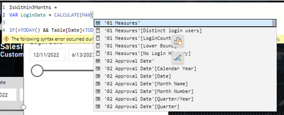
The small icons that appear when selecting a visual should not remain on top at all times. Example: if you select a visual, then decide to write a measure, the icons stay on top of that space, which is super annoying. See screenshot.
- Mark as New
- Bookmark
- Subscribe
- Mute
- Subscribe to RSS Feed
- Permalink
- Report Inappropriate Content
This is fixed for the upcoming July release! Appreciate your patience.
- Mark as New
- Bookmark
- Subscribe
- Mute
- Subscribe to RSS Feed
- Permalink
- Report Inappropriate Content
We need the option to pin a pane - especially the data pane. It's extremely annoying when we select a visual and the visual pane takes the place of the data pane. The filters pane is always on, there's no reason to not have the ability to let the data pane always on as well.
Unfortunatelly I'm disabling the feature because I can no longer keep right-clicking on the data pane icon and then clicking on "Open in new pane". It's very frustrating when you're trying hard to think on what to do next, then you find a measure you were looking for, then it's "gone" because you had to select the visual and the data pane gives place to the visual pane. Please fix this, and do not make this new way of working mandatory without fixing, because it totally kills the end-user experience.
- Mark as New
- Bookmark
- Subscribe
- Mute
- Subscribe to RSS Feed
- Permalink
- Report Inappropriate Content
Hi @RosieL ,
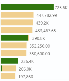
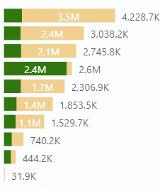
On-Object Interaction is great, but formatting of Total Lables in stacked bar chart is not working propally such as it sometimes formats the lables wrong or not at all. This is only for Total Lables, Data Lables works so far.
I tried with and without dynamic formating of measure, neighter works (with and without Display units set to auto and none).
- Mark as New
- Bookmark
- Subscribe
- Mute
- Subscribe to RSS Feed
- Permalink
- Report Inappropriate Content
Thanks for catching this! We have fixed this for the upcoming August release.
- Mark as New
- Bookmark
- Subscribe
- Mute
- Subscribe to RSS Feed
- Permalink
- Report Inappropriate Content
Great step in the right direction. That said, why can't you make the formatting/data etc. icons persistent in the right column? You have enough real estate there. As it is, when I click on a visual to make a change, I now have to jump through more hoops than before to bring it up.
- Mark as New
- Bookmark
- Subscribe
- Mute
- Subscribe to RSS Feed
- Permalink
- Report Inappropriate Content
Keep a look out for the July blog, we've added the ability for you to customize what panes you want in the pane switcher so you can choose to have both data and formatting always on across reports if you prefer.
Just want to double check on the current behavior though, once open, the format pane should stay on the pane switcher as you work across visuals, are you finding that to not be the case?
- Mark as New
- Bookmark
- Subscribe
- Mute
- Subscribe to RSS Feed
- Permalink
- Report Inappropriate Content
I'll wait for the July update to confirm usability. Grateful
- Mark as New
- Bookmark
- Subscribe
- Mute
- Subscribe to RSS Feed
- Permalink
- Report Inappropriate Content
Hi,
This is great but have some limitations like if i want to show values as agregated (% row Total, % of Coloumn Total Or % Of Grand Total) It does not let us do these thing even in matrix. Please Fix That.
New Development suggesion - Please develope gradient option for Background colours like PPT.
Thanks ..
- Mark as New
- Bookmark
- Subscribe
- Mute
- Subscribe to RSS Feed
- Permalink
- Report Inappropriate Content
This is a great help : In a visual such as a clustered bar chart, when you select an element ( data label, axis, data series ) the visualization pane automatically scrolls and opens the corresponding format cards.
I just hope that this feature will quickly be extended to all visual types. As an example, the waterfall chart does not feature this behaviour yet.
- Mark as New
- Bookmark
- Subscribe
- Mute
- Subscribe to RSS Feed
- Permalink
- Report Inappropriate Content
Would be great if by default all different panes are already selected:
Even with a new object-level interaction we often need to work with "Data" and "Format" panes. Making them available on the right side by default would make it easier to work otherwise I need to open all of them every time I launch PowerBI Desktop.
Thanks!
- Mark as New
- Bookmark
- Subscribe
- Mute
- Subscribe to RSS Feed
- Permalink
- Report Inappropriate Content
Hi
The May 2023 update of formatting the matrix by right clicking now working for certain elements like column headers, individual columns. But it is working for title, entire matrix background.
How to fix it.
Thanks.
Thulasiraman
- Mark as New
- Bookmark
- Subscribe
- Mute
- Subscribe to RSS Feed
- Permalink
- Report Inappropriate Content
Hi Thulasiraman,
Thank you for trying out the preview feature. Some elements like title and background are standard across visuals so you can access on-object formatting for these elements. At the moment the Matrix isn't supported at the level you are looking to format. Please stay tuned for a future release
For now you will need to format in the pane like before. I have heard from some users that finding the Format pane is harder now. Just in case, here are some options to make it appear:
- Double click on a visual
- Right click a visual and select Format
- Select a visual, go to the Add to your visual button on the side of the visual container, and press More options button
- Go to the View tab in the ribbon and select the Format button
- Mark as New
- Bookmark
- Subscribe
- Mute
- Subscribe to RSS Feed
- Permalink
- Report Inappropriate Content
My general comments are that I'd like to have both enabled so I can decide when I want to use the On visual formatting and the format pane as usual. I like new things but this makes it hard to explain to others or even document what is going on if on-visual formatting is the only method to get to this pane. This method seems to introduce too many clicks by having to click More Options virtually all the time.
Also: Is it me but am also noticing that things like title are now under Visual and not under Properties. Not a big deal but would have liked to know this was happening. FYI, when we work on visuals, it helps toknow where things are so we can move fast as formatting tends to be a time bog on most visualization projects.
- Mark as New
- Bookmark
- Subscribe
- Mute
- Subscribe to RSS Feed
- Permalink
- Report Inappropriate Content
Hi datawailor,
Thanks fo the feedback. Please check out this post for some ways to make the format pane appear: Re: Share your thoughts on the new On-Object Inter... - Microsoft Fabric Community
Please stay tuned for our June and July releases. We will be introducing options to set up the panes you would like quick access to as part of the pane switcher and you'll be able to persist these options so they will be available to you when you open Power BI each time.
I'll share your feedback with the team about Title moving unexpectedly and its effect on your productivity
- Mark as New
- Bookmark
- Subscribe
- Mute
- Subscribe to RSS Feed
- Permalink
- Report Inappropriate Content
I've turned off the preview, I didn't like the feature at all, having the drawer allows me to have the Visualation data available on demand and close to the mouse, to add or rename fields required a lot of mouse miles especially on a large monitor, it also lacked many of the functions like reordering fields and many functions where hidden under seperate menus.
The icon would also get stuck when dealing with a large visual.
It would make more sense to allow all the drawers to be undocked, so they can be moved around independantly and then docked again if needed rather than redesign the menu.
- Mark as New
- Bookmark
- Subscribe
- Mute
- Subscribe to RSS Feed
- Permalink
- Report Inappropriate Content
Hi trevrobwhite,
Please stay tuned for our June release. We will be introducing options for you to move the menus closer together.
For reordering there may be two things happening:
- Suggest a type toggle is on. Since this feature looks at the data added and not the order, reordering is turned off. If you disable this toggle you will be able to reorder.
- We have a bug right now with a fix on the way. This makes the drop zones so small they are harder to hit. If the toogle is off and you drag a field, it has to be dragged to the small area between the the field or the +Add data button until the fix is in
Could you let me know which functions we less discoverable for you? I'd like to make sure that Power BI has a full list of things that are harder to find so we can address them
Can you let me know in more detail what you mean by, "stuck when dealing with large visual."? I would need this information to look into a fix for this
Please stay tuned for our June and July releases. We will be adding options that will allow you to dock the Build a visual menu on the side and move it back to a visual if you choose
- Mark as New
- Bookmark
- Subscribe
- Mute
- Subscribe to RSS Feed
- Permalink
- Report Inappropriate Content
- ***Allow all side panels to be open as new panels at all times***
- Seperate On-Object as a new feature on it's own, panel and ribbon changes are seperate items
- Automatically open the build a vis panel when you click a visual
- Place the build a vis panel so I don't have to scroll, this is a benefit of the side panels
- Consider extra clicks as very bad when making improvements
In general the combined changes require more clicks, many of which are redundant. Simply adding on-object editing is a great change. However, it's come with data and vis changes that slow us down. For example, I may have a few data tables expanded on the side which I use most frequently. Adding data via on object requires me to re-expand these in each field for each visual which is added clicks vs just dragging and dropping from the data panel. Build a visual also requires scrolling more often if you are working on a visual at the bottom of the view. Other comments are spot on in that having things in consistent locations is easier to keep track of. It's also very Microsoft like to have multiple ways to do things. In Excel you can right click but sometimes it's easier or more advanced to use the side panel. Why can't we have both in PBI? Why does on-object ineration cuase us to lose side panel options? What I really want is to have the data, format, AND visualization panels open all at once. Building new visuals is easier this way. Making edits to existing visuals may be easier with On-Object. Something else that may reduce clicks is to auto open build a visual when you click the visual. Now you have to click the vis, then click again to open the build panel.
Helpful resources
| User | Count |
|---|---|
| 78 | |
| 74 | |
| 43 | |
| 32 | |
| 28 |
| User | Count |
|---|---|
| 104 | |
| 95 | |
| 51 | |
| 50 | |
| 46 |


