FabCon is coming to Atlanta
Join us at FabCon Atlanta from March 16 - 20, 2026, for the ultimate Fabric, Power BI, AI and SQL community-led event. Save $200 with code FABCOMM.
Register now!- Power BI forums
- Get Help with Power BI
- Desktop
- Service
- Report Server
- Power Query
- Mobile Apps
- Developer
- DAX Commands and Tips
- Custom Visuals Development Discussion
- Health and Life Sciences
- Power BI Spanish forums
- Translated Spanish Desktop
- Training and Consulting
- Instructor Led Training
- Dashboard in a Day for Women, by Women
- Galleries
- Data Stories Gallery
- Themes Gallery
- Contests Gallery
- QuickViz Gallery
- Quick Measures Gallery
- Visual Calculations Gallery
- Notebook Gallery
- Translytical Task Flow Gallery
- TMDL Gallery
- R Script Showcase
- Webinars and Video Gallery
- Ideas
- Custom Visuals Ideas (read-only)
- Issues
- Issues
- Events
- Upcoming Events
The Power BI Data Visualization World Championships is back! Get ahead of the game and start preparing now! Learn more
- Power BI forums
- Forums
- Get Help with Power BI
- Desktop
- Re: Share your thoughts on the new On-Object Inter...
- Subscribe to RSS Feed
- Mark Topic as New
- Mark Topic as Read
- Float this Topic for Current User
- Bookmark
- Subscribe
- Printer Friendly Page
- Mark as New
- Bookmark
- Subscribe
- Mute
- Subscribe to RSS Feed
- Permalink
- Report Inappropriate Content
Share your thoughts on the new On-Object Interaction feature (preview)
Hit Reply to tell us what you think about the new On-Object Interaction feature so we can continue to improve.
For example:
- What changes would you like to see?
- If you turned off the preview switch, why?
- Any suggestions for addititional settings or capabilities?
Thanks,
-Power BI team
To read more about the feature, see the announcement in the Power BI Product Blog or our documentation on how to Use on-object interaction
FAQs:
- Q: How can I open multiple panes at once?
- A: You can CTRL + click or right click on the unselected pane you wish to open and choose "Open in new pane"
- Q: Where did aggregations move to?
- A: It's still on right click of a field, or you can use the new flyout aggregations dropdown while choosing or swapping a field.
- Q: Where did drillthrough and tooltip page setup move to?
- A: Drillthrough is now in the page settings of the format pane under Page Information > Page type > Drillthrough or Tooltip.
- Mark as New
- Bookmark
- Subscribe
- Mute
- Subscribe to RSS Feed
- Permalink
- Report Inappropriate Content
Hi tvav,
Thank you for the feedback. Could you let me know specifically what about it is awkward? Then we can try to address it. Also please stay tuned for our June and July releases. Hopefully you will find some of the options you are looking for.
- Mark as New
- Bookmark
- Subscribe
- Mute
- Subscribe to RSS Feed
- Permalink
- Report Inappropriate Content
For the love of God Microsoft please cut your loss and stop this useless "feature"!
As a huge PBI fan and exprienced/daily user, this is the most anti-productivity thing I have ever seen. I tried twice: when it first came out, and after May PBI release. Unlike many preview features in the past, it is downright stupid: it makes simple things convoluted, what used to take 1-click, now requires 1~2 more per metric -> that is (n reports) x (m pages) x (k visuals) x (h metrics) more clicks! All for what? To make it more like Excel?
The question is: despite overwhelming feedback from community of this "preview" feature, would Microsoft really listen?
- Mark as New
- Bookmark
- Subscribe
- Mute
- Subscribe to RSS Feed
- Permalink
- Report Inappropriate Content
Hi QC,
Thanks for the feedback. Hopefully, I can entice you to check out the June and July releases. They should give you some options that the community has been mentioning.
We do investigate the feedback that we get in the community here. Though we also look at many other sources whether internal or external and telemetry. We aggregate all this information to guide our planning. Our goals are not to be like Excel, but we have found in our research that using familiar patterns from other Microsoft products helps to onboard inexperienced users quicker.
I do not want you to think that we are not listening to your feedback. If anything, you have validated things that we knew would need to be fixed as we progressed in the project. Even though you are not seeing exactly something that you need in the first releases of a public preview, we will be make this easier for you to use as time goes on
- Mark as New
- Bookmark
- Subscribe
- Mute
- Subscribe to RSS Feed
- Permalink
- Report Inappropriate Content
Ewan wrote: "but we have found in our research that using familiar patterns from other Microsoft products helps to onboard inexperienced users quicker."
Ewan - I came to Power BI from an Excel and Microsoft Office background and I can tell you that your research is flawed when it comes to using Power BI. I find this On-Object experience does not fit into quickly onboarding from MS Office to PBI, it hinders it. The old interface was/is much more intuitive and that made it very easy to learn.
- Mark as New
- Bookmark
- Subscribe
- Mute
- Subscribe to RSS Feed
- Permalink
- Report Inappropriate Content
Hi JohnF1966,
Thanks for the feedback. I should have chosen my words a bit wiser. I should have said, "helps to onboard a high percentage of inexperienced users quicker." Inevitably, this would mean that a percentage of user this won't be the ideal.
We do have planned releases for this feature that will give you options to work closer to the way that you would want. Though the reason I am so thankful in my messages to the community is that y'all's feedback helps us to reprioritize some of those releases, as well as add some features that may be missing from our plans.
The June release should be out soon, which should give some extra flexibility with the menu's placement. The July release will have some more.
If you are a fan of the previous layout for the Build a visual menu, there are Global Report settings in the Options dialog that will turn of some of the options for this feature. If you uncheck "Suggest a visual by default" and check "In the Build a visual menu, always show all of the visualization types.
This will make the menu look similar to what you have used in the past
- Mark as New
- Bookmark
- Subscribe
- Mute
- Subscribe to RSS Feed
- Permalink
- Report Inappropriate Content
Hello Evan, glad to hear from MS directly:
"using familiar patterns from other Microsoft products helps to onboard inexperienced users quicker"
It confirms what I thought, the feature is designed for who has little to no experience to get onboard quickly. I appreciate the strategy, but it shouldn't come at expense of experienced users, who took a lot of time & pain to learn, use it every day to manage work.
There is a reason for the overwhelming negative feedback from the community, because this new function adds too many clicks and slows down work significantly. Everything from adding data fields, re-arranging, choosing visual, grouping, renaming, formatting, or simply showing existing fields becomes "right-clicks" + more clicks, it is NOT productive at all. I don't mind bugs because I know MS will fix them, but this has to do with UI choice. As it stands now, it punishes those of us who use it the most, who are likely the most enthusiastic PBI/DAX/M fans/advocates, unironically. This leaves a bad taste in the mouth.
I sincerely hope MS would seriously consider our feedback, and re-design it in a much more intuitive and productive way.
- Mark as New
- Bookmark
- Subscribe
- Mute
- Subscribe to RSS Feed
- Permalink
- Report Inappropriate Content
Hi QC,
I fully agree with you that any featureshouldn't come at the expense of our current users. Y'all are who helped us get to where we are today. From the start of the project, we've planned to have options to adjust the UI. A lot of these just couldn't be ready at the exact time of the earlier release and are coming out in stages.
I am getting a better understanding the more we talk which is great. We have run into bugs that could be seen as UI choices, which are getting fixed now. Some of these bugs have caused the productivity of the feature to be worse than planned. You have given a lot of valuable information already, but if you have time, can help me by letting me know what parts of the project you consider bugs vs what you consider to be a UI choice?
Sometimes responses from me can sound like a rebuttal, but I want to make sure that you know they are not. I believe we are on the same page about things that need to be fixed here. The last thing I want is to leave y'all with a bad taste in your mouth.
- Mark as New
- Bookmark
- Subscribe
- Mute
- Subscribe to RSS Feed
- Permalink
- Report Inappropriate Content
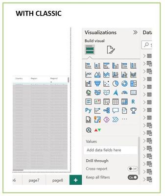
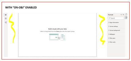
Hi Ewan, I am using one of my reports as real example to show how unproductive the new feature is comparing to classic:
1) Crammed space: with classic, I see all visuals & data fields next to data pane, allow 1-click to change chart type/add/remove/rearrange/rename fields; with new "on-obj", the pop-up window is literally 1.5-inch tall, I had to scroll up & down like crazy to do what used to be effortless. It is especially painful when traveling/working on laptop, or when visual is placed close to bottom screen
2) Not data-friendly: when working with SAP (or other data-warehouse), user gets technical, long field names. The pop-up window is so narrow (and can't be resized), vast majority of my field names are now cut off
3) Unintuitive design: classic puts everything in 1 place, easy to grab-n-go. "On-obj" shifts & duplicates things all around the screen, in screenshot below, "Visuals" are duplicated in home menu and pop-up, why?
4) Nested menu: in screenshot below, even on a small laptop there are enough white space on both sides of canvas to allow 2~3 panes expanding at once. There is no need to nest/fold data/format/visuals all in, which not only requires a lot more clicks, but also takes away user's ability to see everything at once
5) Right-click move field up/down is useless: b/c it moves 1 field 1 position at a time, if I want to move column 20 to 10 on a table visual, that is 30 more clicks. Dont' bother, just make sure drag-drop is working as intended
6) "Suggest a visual type" is useless: the same data can be interpreted on pip/bar/card, no amount of AI will fix it, b/c there is no right/wrong answer
Right-click in office apps such as Excel are well-done to add value, but not in PBI. The current “On-obj” function is simply duplicating good, existing functions without providing any real values to users at all, other than the face-value of claiming “similar experience”.
For example, when you click “Add/rmv visual elements” button > More options, it guides user to the original format pane anyway, so why waste all this time and energy to add 6-more clicks in between?
I don’t think right-click in PBI is a bad idea, but it needs to focus on providing ADDITIONAL functions that were not available in classic, not messing with what was already well-done
- Mark as New
- Bookmark
- Subscribe
- Mute
- Subscribe to RSS Feed
- Permalink
- Report Inappropriate Content
I agree completely. My impression is that this feature has been thought up by some product managers who themselves do not work productively with Power BI, but only occasionally with some demo data. As if someone "from above" has given the order, or as if someone has such a fixed idea in his head, wants to "delight" others with these ideas and unfortunately also has the power to enforce this against any feedback.
Normally, a new feature should have the goal of making work easier and adding functionality. Here we see the opposite. Against feedback from experienced users and against common sense, they are trying to change something by force. There are parts of the idea that make it better. But they are incidental. The basic idea of attaching actions directly to the object via a context menu is the real evil.
Why not do it in addition to the existing way? Then one can continue to work productively with the existing functionality. And you could gradually add more object interactions. The problem is that it is currently an "either - or". That frustrates us! Because they want to take away something that works.
- Mark as New
- Bookmark
- Subscribe
- Mute
- Subscribe to RSS Feed
- Permalink
- Report Inappropriate Content
A bunch of additional clicks to do the same as before. Absolutely unproductive and counterintuitive.
- Mark as New
- Bookmark
- Subscribe
- Mute
- Subscribe to RSS Feed
- Permalink
- Report Inappropriate Content
I would rather lose some screen space to a side panel than deal with that box.
Having it in the sidebar means I seldom have to scroll to see all of the selections.
- Mark as New
- Bookmark
- Subscribe
- Mute
- Subscribe to RSS Feed
- Permalink
- Report Inappropriate Content
Hi Nic14,
Please stay tuned for our June and July releases. I have a feeling there will be some options that you are looking for.
- Mark as New
- Bookmark
- Subscribe
- Mute
- Subscribe to RSS Feed
- Permalink
- Report Inappropriate Content
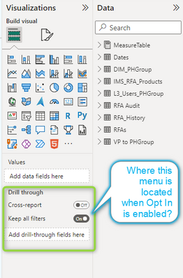
Please see enclosed image, where I can find this menu (or it equivavelent) when using this feature?
- Mark as New
- Bookmark
- Subscribe
- Mute
- Subscribe to RSS Feed
- Permalink
- Report Inappropriate Content
Hi sabiadut,
You can find the drill-through options in the Format pane under Page information. Select Page type dropdown menu to select drill-through.
- Mark as New
- Bookmark
- Subscribe
- Mute
- Subscribe to RSS Feed
- Permalink
- Report Inappropriate Content
On desktop - when On-object interaction is switched on, and I am wanting to edit a measure, I must be in the "Model" view. And can no longer edit a measure from "Report" or "Data" views.
This appears unecessarily restrictive, and requires additional clicks to go and edit my measure.
In summary, the behaviour wasn't intuitive and - I was expecting the behaviour to be the same between Model/Data/Report view.
- Mark as New
- Bookmark
- Subscribe
- Mute
- Subscribe to RSS Feed
- Permalink
- Report Inappropriate Content
Hi eddiel,
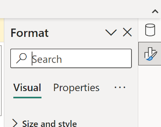
Hopefully I can help here, since you should be able to edit measures in Report view. There is a new UI that switches the panes and you may have hidden the Data pane(Previous called Fields pane). Do you see this UI?
If you select the cylinder icon(Data) then you will be able to select your measure to edit it in the formula bar
If you do not see that UI, the Data pane may be dismissed. To bring it back you can go to the View tab in the Ribbon. There you can select the Data in the show panes section. It will have the same the same icon
Please let me know if this didn't solve your issue. Happy to help futher
- Mark as New
- Bookmark
- Subscribe
- Mute
- Subscribe to RSS Feed
- Permalink
- Report Inappropriate Content
I turned if off once I found out I cannot see the full names of fields because I cannot expand - widen the pop up. If I am working with the fields, I need to see them. Some of the features may be ok, but this put me off early so I did not get to try more.
- Mark as New
- Bookmark
- Subscribe
- Mute
- Subscribe to RSS Feed
- Permalink
- Report Inappropriate Content
Hi Jan_jurik
Thanks for the feedback. This is something that is part of a future planned release. Though which release is TBD.
Apologies if this sounds like an excuse. This is not my intent. This is me trying to be more transparent around how we work. One of Microsoft's values is to Empower everyone(paraphasing a bit). So we trying to not work on features that either aren't accessible or don't have a plan to be accessible. This caused us to hold off on implementing resizing. That way an engineer could work on an accessible solution all at once.
Please check back on our blog for the month release notes. Here is the link in case you don't already have it Power BI Blog—Updates and News | Microsoft Power BI Once this ability is available, I hope that you will give it another try.
- Mark as New
- Bookmark
- Subscribe
- Mute
- Subscribe to RSS Feed
- Permalink
- Report Inappropriate Content
For goodness sake please abandon any further development on this!
I turned it off a few days ago after struggling for weeks to get used to it and I just turned it on again to see if it would be easier to use, but it wasn't.
- The Build a visual box is always in the way of either the current visual it's attached to, other visuals or the formula bar when I'm creating or editing measures. Put it back next to the Filters pane like it used to be.
- The Data pane is cumbersome to collapse now that you have that option in the drop down menu. You should put back the << and >> symbols like you do with the Filters pane.
- The format pane should also do away with the drop down menu and have the << and >> symbols to expand and collapse.
These and the many, many other comments you have received on how frustrating and time consuming it is to work with this feature should convince you to stop further development on it.
- Mark as New
- Bookmark
- Subscribe
- Mute
- Subscribe to RSS Feed
- Permalink
- Report Inappropriate Content
Hi JohnF1966,
Thanks for the feedback. I'm still working my way through all the comments, but I saw that I've replied to one of your more recent comments. Please check out my response from that post here
Though I can address things here that weren't part of the other post
- Please look for the June release, this will let you move the Build a visual box to the left side of the screen as part of the pane switcher
- There is also a bug right now that the menus are showing above the formula. The solution is in the works though you may have to wait for the July release for this.
- Unfortunately the only workaround now is to deselect the visual when editing measures or reposition the visual and more it back after
- There is also a bug right now that the menus are showing above the formula. The solution is in the works though you may have to wait for the July release for this.
- It sounds like you are already using the new pane switcher UI. Though please let me know if I'm interupting that wrong. The collapsing of a pane when a singular pane is present was not an elegant interim solution. The pane switcher UI will allow you to collapse panes
- As a workaround If you do have the pane switcher open you can collapse the panes by cicking the icon of the visible pane.
Please keep an eye out for the release notes on our blog here. Once we have implemented more features and fixed some bugs, I hope you will give the feature another try
- Mark as New
- Bookmark
- Subscribe
- Mute
- Subscribe to RSS Feed
- Permalink
- Report Inappropriate Content
I used the On-Object Interaction feature for over two weeks before I gave up and turned off the preview. It was always a struggle to figure out where formatting functions were hidden. It took me 2X to 3X as much time to create a new visual. I finally disabled the feature when I spent 45 minutes looking for and googling for the On Object method for changing a visual type from one visual to another. (Stacked Bar to Stacked Column). This is trivial in the standard (not On Object) interface. When I got back to the standard interface and finished the report, I realized just how frustrating the On-Object tool really is.
Helpful resources

Power BI Dataviz World Championships
The Power BI Data Visualization World Championships is back! Get ahead of the game and start preparing now!

| User | Count |
|---|---|
| 40 | |
| 38 | |
| 36 | |
| 28 | |
| 28 |
| User | Count |
|---|---|
| 124 | |
| 88 | |
| 74 | |
| 66 | |
| 65 |


