FabCon is coming to Atlanta
Join us at FabCon Atlanta from March 16 - 20, 2026, for the ultimate Fabric, Power BI, AI and SQL community-led event. Save $200 with code FABCOMM.
Register now!- Power BI forums
- Get Help with Power BI
- Desktop
- Service
- Report Server
- Power Query
- Mobile Apps
- Developer
- DAX Commands and Tips
- Custom Visuals Development Discussion
- Health and Life Sciences
- Power BI Spanish forums
- Translated Spanish Desktop
- Training and Consulting
- Instructor Led Training
- Dashboard in a Day for Women, by Women
- Galleries
- Data Stories Gallery
- Themes Gallery
- Contests Gallery
- QuickViz Gallery
- Quick Measures Gallery
- Visual Calculations Gallery
- Notebook Gallery
- Translytical Task Flow Gallery
- TMDL Gallery
- R Script Showcase
- Webinars and Video Gallery
- Ideas
- Custom Visuals Ideas (read-only)
- Issues
- Issues
- Events
- Upcoming Events
The Power BI Data Visualization World Championships is back! Get ahead of the game and start preparing now! Learn more
- Power BI forums
- Forums
- Get Help with Power BI
- Desktop
- Re: Share your thoughts on the new On-Object Inter...
- Subscribe to RSS Feed
- Mark Topic as New
- Mark Topic as Read
- Float this Topic for Current User
- Bookmark
- Subscribe
- Printer Friendly Page
- Mark as New
- Bookmark
- Subscribe
- Mute
- Subscribe to RSS Feed
- Permalink
- Report Inappropriate Content
Share your thoughts on the new On-Object Interaction feature (preview)
Hit Reply to tell us what you think about the new On-Object Interaction feature so we can continue to improve.
For example:
- What changes would you like to see?
- If you turned off the preview switch, why?
- Any suggestions for addititional settings or capabilities?
Thanks,
-Power BI team
To read more about the feature, see the announcement in the Power BI Product Blog or our documentation on how to Use on-object interaction
FAQs:
- Q: How can I open multiple panes at once?
- A: You can CTRL + click or right click on the unselected pane you wish to open and choose "Open in new pane"
- Q: Where did aggregations move to?
- A: It's still on right click of a field, or you can use the new flyout aggregations dropdown while choosing or swapping a field.
- Q: Where did drillthrough and tooltip page setup move to?
- A: Drillthrough is now in the page settings of the format pane under Page Information > Page type > Drillthrough or Tooltip.
- Mark as New
- Bookmark
- Subscribe
- Mute
- Subscribe to RSS Feed
- Permalink
- Report Inappropriate Content
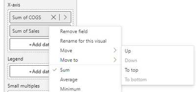
Thanks for this detailed feedback. We already have a bug tracking the tooltip getting in the way of drag/drop and should have a fix out soon. We are also improving the drag/drop zones to be larger so less precision will be needed. As a workaround, you can use this right click option to "move" items up/down within the same field well or the "move to" option to move items to a different field well.
- Mark as New
- Bookmark
- Subscribe
- Mute
- Subscribe to RSS Feed
- Permalink
- Report Inappropriate Content
I turned it on, tested it on a few graphs, and turned it back off - for the reasons already all mentioned above. What I find most annoying is that you need to chose between the Data panel and the Visualizations panel when you want to quickly review your individual graphs. Cumbersome and not user-friendly imho.
- Mark as New
- Bookmark
- Subscribe
- Mute
- Subscribe to RSS Feed
- Permalink
- Report Inappropriate Content
I really like where this is heading. I have 1 feature request and 1 (maybe 2) bug(s):
Feature: Add the ability to multi-select fields when adding to the visual from the on-object field selector
Bug: when I have a table and add a field to it from the on-object field selector, the visual will change the field that the visual is sorting on. Also with the table visual, when I've added a handful of measures, the ability to drag and drop measures to rearrange the columns breaks - the system will not allow me to grab a measure in the on-object field well which means I can't drag it into a different position.
- Mark as New
- Bookmark
- Subscribe
- Mute
- Subscribe to RSS Feed
- Permalink
- Report Inappropriate Content
Thanks for the feedback. We have just begun looking into multi-select for a future update
Unfortunately for your first bug I wasn't able to see this happening. If you could share your repro steps from the start of creating a new visual, I can share that with the engineering team to investigate.
For your second bug, two things could be happening:
- The "Suggest a visual" toggle is on
- If this toggle is on then drag and drop is disabled. Please try turning this off to reorder
- The suggest a visual toggle is off, then the drag and drop zones are hard to use
- We have logged a bug around the drag and drop being too hard. We are working on a fix that will increase the size, but as of right now the drop zones are only the space between fields which makes it hard to use. Please use right-click on the field name and use the menu options for "Move" until we have a fix for this bug
- We have logged a bug around the drag and drop being too hard. We are working on a fix that will increase the size, but as of right now the drop zones are only the space between fields which makes it hard to use. Please use right-click on the field name and use the menu options for "Move" until we have a fix for this bug
- Mark as New
- Bookmark
- Subscribe
- Mute
- Subscribe to RSS Feed
- Permalink
- Report Inappropriate Content
@EwanT For #2, turning off the suggest visual worked. When it was on, I couldn't even grab the measure to try and move it but when it's off I could. #1 is likely related to it - when you sort by a column other than the first column in a table then turn on or off the suggest a Visual feature - PBI changes the sort column back to the first column. It doesn't do that when you have Suggest Visual turned off and move columns around.
- Mark as New
- Bookmark
- Subscribe
- Mute
- Subscribe to RSS Feed
- Permalink
- Report Inappropriate Content
Thanks for clarifying that for me. I see what you mean now. You are spot on with your statement.
For the Suggest a type feature, with the toggle on Power BI will keep updating the visual type as you add data, remove data, change aggregations.
We automatically turn the toggle off, if you do something like rename the visual, change background color, etc because we use this as an indicator that you are happy with the visual type and want to keep it.
Would you consider changing the sort of a column in a table, an indicator that you would like to keep the visual type as a table(In this case, we would turn the suggest a type toggle off)?
- Mark as New
- Bookmark
- Subscribe
- Mute
- Subscribe to RSS Feed
- Permalink
- Report Inappropriate Content
Hi,
This is just my personal preference but here are two suggestions:
1. Allow user to drag the width of the "Build a Visual" floating pane for the visual. For me, it is so narrow that it is not efficient to use as I have to hover over each measure / column to see what's in there (as the names are cut-off due to the narrow width). Allowing the user to click this pane and drag it wider (or allow a user-selected preferred width setting so it is always as wide as the user would like) of these panes would be helpful.
2. Allow the user to toggle the "Visualizations" pane on/off via the "View" menu in the ribbon at the top (just like you allow the Data and Formatting panes to be toggled on/off) so the user could either click on the the visual to get the "Build a Visual" floating pane or retain the original pane on the right-hand side of the screen (as it has always been).
I actually turned this preview off for now but it was a good start!
- Mark as New
- Bookmark
- Subscribe
- Mute
- Subscribe to RSS Feed
- Permalink
- Report Inappropriate Content
Thank you for this feedback. We are definitely looking at #1, to be able to resize the build menu. #2 should be coming with the June release, stay tuned!
- Mark as New
- Bookmark
- Subscribe
- Mute
- Subscribe to RSS Feed
- Permalink
- Report Inappropriate Content
I try to adjust some visuals that I switch with bookmark navigation: moving from switch buttons to format pane is somehow strange, I need to click outside visuals (deselect visuals) to be able to display formatting details for a specific visual, after I format another visual - the selection pane is not helping, even if I click on the second visual title in the selection pane.
The visuals are grouped, I know I need to click twice... I'm inclined to believe it's related to the new features...
- Mark as New
- Bookmark
- Subscribe
- Mute
- Subscribe to RSS Feed
- Permalink
- Report Inappropriate Content
Interesting, but... I need to disable it 😞
Not an MVP yet, a lot of features are not mature enough, and overall productivity is worse.
Especially when reordering columns in a table, it breaks (strange behavior like action on the wrong column or a different column jumping with the chosen one), jumps to the beginning and forces me to do a lot of scroll.
All panes are flying like a hell, I need to adjust width frequently because I remove them by mistake, and the contextual pane for the visual is not wide enough, too short (at the bottom of the page).
I would keep the panes on the right, sticky (influenced by the options menu), or make them harder to disappear by mistake. 😄
Do not close the project, but it is not ready yet for testing.
- Mark as New
- Bookmark
- Subscribe
- Mute
- Subscribe to RSS Feed
- Permalink
- Report Inappropriate Content
Thank you for the feedback. We are looking into making the contextual panes easier to work with and reduce scrolling, but I don't have a timeline to share on these improvements
For moving the Build pane to the right with the other panes, please stay tuned. This should be coming in the June update
- Mark as New
- Bookmark
- Subscribe
- Mute
- Subscribe to RSS Feed
- Permalink
- Report Inappropriate Content
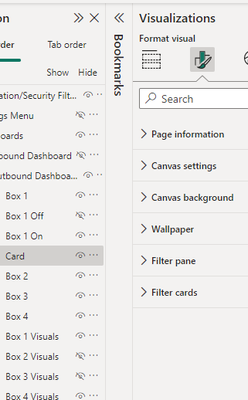
This update introduced a bug I keep sporadically running into which is giving me great pain. When despite clearly having an object selected (which I can confirm when toggling over to the "Build Visual" panel and see the metric on the card selected) the formatting menu acts like there is no object selected and instead gives me the page formatting options.
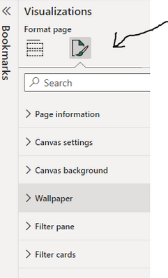
Another clear indicator this is a bug is look how it says "format visual" and gives me the page formatting options. When no visual is selected it says "format page" (see 2nd snippet).
I am unable to reproduce consistently but it is occuring multiple times a day.
- Mark as New
- Bookmark
- Subscribe
- Mute
- Subscribe to RSS Feed
- Permalink
- Report Inappropriate Content
Yup, I can confirm. I noticed that too. I need to switch to other report card, and then back to be able to format visual again.
PS. I have on-object interaction switched off.
- Mark as New
- Bookmark
- Subscribe
- Mute
- Subscribe to RSS Feed
- Permalink
- Report Inappropriate Content
Will this On-Object editing ability be availlable to end users in Service or in Teams?
For example, can a user add/edit a title in the same way that this feature works in desktop?
- Mark as New
- Bookmark
- Subscribe
- Mute
- Subscribe to RSS Feed
- Permalink
- Report Inappropriate Content
This feature is only supported in the Desktop, so we can gather your feedback during our public preview.
Please let us know if this is something you would expect in the Service or in Teams. Also if you have any additional feedback on the feature, please feel free to share
- Mark as New
- Bookmark
- Subscribe
- Mute
- Subscribe to RSS Feed
- Permalink
- Report Inappropriate Content
I would also like to be able to right click in a cell, header, total field,... and have the format panel open to that location, similar to excel.
- Mark as New
- Bookmark
- Subscribe
- Mute
- Subscribe to RSS Feed
- Permalink
- Report Inappropriate Content
I keep my repley simple
I would like to have both option: one, have the right click on the object, or have it in the right panel, like what you can do with the formating.
- Mark as New
- Bookmark
- Subscribe
- Mute
- Subscribe to RSS Feed
- Permalink
- Report Inappropriate Content
I was trying the new On-object feature and managed to get into a death spiral that forced me to crash out of Power BI. This is repeatable in my file, which is demo data for testing Incremental Refresh and does not contain confidential data. The Power BI Desktop file is connected live to a Power BI dataset with incremental refresh.
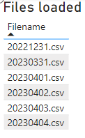
I have a simple table visual that has a list of the files loaded by incremental refresh.
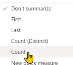
Using On-object, I was trying to add a row count to the table. Without on object, I would just re-add the Filename column, and then change the setting to do a Count on the column.
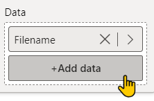
I clicked +Add data, picked the same Filename column and nothing happened.
(In further testing, it seems like I can always add another Filename column OK the first time. But if I delete it and immediately re-add it, that's when nothing happens.)
Because it didn't work, I tried dragging the field from the Data pane to the +Add data button.
It had an odd result of adding a blank field to the list with no change to the visual:
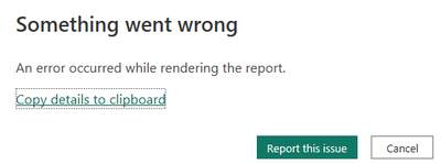
If I hover over the blank field, it repeatedly pops up this error until I kill Power BI from Task Manager:
Error details are below. Let me know if you need anything else. I can reproduce this at will in this file.
Mike
Feedback Type:
Frown (Error)
Error Message:
An error occurred while rendering the report.
Stack Trace:
Javascript: TypeError
at PbiDragDropPickerComponent_ng_template_3_ng_container_2_ng_template_8_Template (https://ms-pbi.pbi.microsoft.com/minerva/scripts/desktop.field-picker-modern.min.js:1473:163)
at executeTemplate (https://ms-pbi.pbi.microsoft.com/minerva/scripts/desktop.js:104007:63)
at refreshView (https://ms-pbi.pbi.microsoft.com/minerva/scripts/desktop.js:103932:121)
at https://ms-pbi.pbi.microsoft.com/minerva/scripts/desktop.js:103950:80
at refreshView (https://ms-pbi.pbi.microsoft.com/minerva/scripts/desktop.js:103952:26)
at https://ms-pbi.pbi.microsoft.com/minerva/scripts/desktop.js:103950:80
at refreshView (https://ms-pbi.pbi.microsoft.com/minerva/scripts/desktop.js:103952:26)
at refreshComponent (https://ms-pbi.pbi.microsoft.com/minerva/scripts/desktop.js:104247:45)
at https://ms-pbi.pbi.microsoft.com/minerva/scripts/desktop.js:103977:73
at refreshView (https://ms-pbi.pbi.microsoft.com/minerva/scripts/desktop.js:103978:26)
Stack Trace Message:
An error occurred while rendering the report.
Invocation Stack Trace:
at Microsoft.Mashup.Host.Document.ExceptionExtensions.GetCurrentInvocationStackTrace()
at Microsoft.Mashup.Client.UI.Shared.StackTraceInfo..ctor(String exceptionStackTrace, String invocationStackTrace, String exceptionMessage)
at Microsoft.PowerBI.Client.Windows.Telemetry.PowerBIUserFeedbackServices.GetStackTraceInfo(Exception e)
at Microsoft.PowerBI.Client.Windows.Telemetry.PowerBIUserFeedbackServices.ReportException(IWindowHandle activeWindow, IUIHost uiHost, FeedbackPackageInfo feedbackPackageInfo, Exception e, Boolean useGDICapture)
at Microsoft.Mashup.Client.UI.Shared.UnexpectedExceptionHandler.<>c__DisplayClass14_0.<HandleException>b__0()
at Microsoft.Mashup.Client.UI.Shared.UnexpectedExceptionHandler.HandleException(Exception e)
at Microsoft.PowerBI.Client.PowerBIUnexpectedExceptionHandler.HandleException(Exception e)
at Microsoft.PowerBI.Client.Windows.Utilities.PowerBIFormUnexpectedExceptionHandler.HandleException(Exception e)
at System.RuntimeMethodHandle.InvokeMethod(Object target, Object[] arguments, Signature sig, Boolean constructor)
at System.Reflection.RuntimeMethodInfo.UnsafeInvokeInternal(Object obj, Object[] parameters, Object[] arguments)
at System.Reflection.RuntimeMethodInfo.Invoke(Object obj, BindingFlags invokeAttr, Binder binder, Object[] parameters, CultureInfo culture)
at Microsoft.PowerBI.Client.Windows.WebView2.WebView2Interop.InvokeCs(InteropCall call)
at Microsoft.Mashup.Host.Document.ExceptionHandlerExtensions.HandleExceptions(IExceptionHandler exceptionHandler, Action action)
at System.EventHandler`1.Invoke(Object sender, TEventArgs e)
at System.Windows.Forms.UnsafeNativeMethods.DispatchMessageW(MSG& msg)
at System.Windows.Forms.UnsafeNativeMethods.DispatchMessageW(MSG& msg)
at System.Windows.Forms.Application.ComponentManager.System.Windows.Forms.UnsafeNativeMethods.IMsoComponentManager.FPushMessageLoop(IntPtr dwComponentID, Int32 reason, Int32 pvLoopData)
at System.Windows.Forms.Application.ThreadContext.RunMessageLoopInner(Int32 reason, ApplicationContext context)
at System.Windows.Forms.Application.ThreadContext.RunMessageLoop(Int32 reason, ApplicationContext context)
at System.Windows.Forms.Form.ShowDialog(IWin32Window owner)
at Microsoft.Mashup.Client.UI.Shared.WindowManager.ShowModal[T](T dialog, Func`1 showModalFunction)
at Microsoft.PowerBI.Client.Program.<>c__DisplayClass5_1.<RunApplication>b__4()
at Microsoft.PowerBI.Client.Windows.IExceptionHandlerExtensions.<>c__DisplayClass3_0.<HandleExceptionsWithNestedTasks>b__0()
at Microsoft.Mashup.Host.Document.ExceptionHandlerExtensions.HandleExceptions(IExceptionHandler exceptionHandler, Action action)
at Microsoft.PowerBI.Client.Program.RunApplication(String[] args)
at Microsoft.PowerBI.Client.Program.Main(String[] args)
JS Error Message:
Cannot read properties of undefined (reading 'title')
PowerBINonFatalError:
{"AppName":"PBIDesktop","AppVersion":"2.115.663.0","ModuleName":"https://ms-pbi.pbi.microsoft.com/minerva/scripts/desktop.field-picker-modern.min.js","Component":"","Error":"TypeError","MethodDef":"PbiDragDropPickerComponent_ng_template_3_ng_container_2_ng_template_8_Template","ErrorOffset":"1473:163"}
AS Live Connection:
True
Performance Trace Logs:
C:\Users\rudzimj\AppData\Local\Microsoft\Power BI Desktop\PerformanceTraces.zip
Enabled Preview Features:
PBI_shapeMapVisualEnabled
PBI_qnaLiveConnect
PBI_azureMapVisual
PBI_compositeModelsOverAS
PBI_b2bExternalDatasetSharing
PBI_enhancedTooltips
PBI_enableWebView2
PQ_WebView2Connector
PBI_sparklines
PBI_scorecardVisual
PBI_NlToDax
PBI_fieldParametersSuperSwitch
PBI_horizontalFusion
PBI_optimizeTabRibbon
PBI_relationshipEditPane
PBI_angularRls
PBI_onObject
PBI_setLabelOnExportPdf
Disabled Preview Features:
PBI_SpanishLinguisticsEnabled
Disabled DirectQuery Options:
TreatHanaAsRelationalSource
Cloud:
GlobalCloud
Recent Actions:
AddVisualContainer, DeleteVisualContainer, AddFieldToVisual, RemoveFieldFromAllRoles
PowerBIUserFeedbackServices_IsReported:
True
Formulas:
section Section1;
Active Section Contract:
{"id":50975359,"name":"ReportSection","displayName":"Load check","filters":"[]","ordinal":0,"visualContainers":[{"id":2543226486,"x":0,"y":0,"z":0,"width":1279.5979899497486,"height":720,"config":{"name":"7141b36e1be5294cb678","layouts":[{"id":0,"position":{"x":0,"y":0,"z":0,"width":1279.5979899497486,"height":720,"tabOrder":0}}],"singleVisual":{"visualType":"tableEx","projections":{"Values":[{"queryRef":"Currency (SP).Filename"}]},"prototypeQuery":{"Version":2,"From":[{"Name":"c","Entity":"Currency (SP)","Type":0}],"Select":[{"Column":{"Expression":{"SourceRef":{"Source":"c"}},"Property":"Filename"},"Name":"Currency (SP).Filename"}],"OrderBy":[{"Direction":1,"Expression":{"Column":{"Expression":{"SourceRef":{"Source":"c"}},"Property":"Filename"}}}]},"autoSelectVisualType":true,"drillFilterOtherVisuals":true,"vcObjects":{"title":[{"properties":{"show":{"expr":{"Literal":{"Value":"true"}}},"text":{"expr":{"Literal":{"Value":"'Files loaded'"}}},"fontSize":{"expr":{"Literal":{"Value":"17D"}}}}}]}}},"filters":"[]"}],"objectId":"b6bf3e22-80a9-440f-a55d-fdef534d51ba","config":{},"displayOption":1,"width":1280,"height":720}
- Mark as New
- Bookmark
- Subscribe
- Mute
- Subscribe to RSS Feed
- Permalink
- Report Inappropriate Content
Thank you for reporting and providing great detail. We're taking a look at this ASAP.
- Mark as New
- Bookmark
- Subscribe
- Mute
- Subscribe to RSS Feed
- Permalink
- Report Inappropriate Content
😎 Suggestions - Some of which are already mentioned in other peoples replies but want to crystallise them into a list:
- Have the option to pin pane icons to side bar for all reports opened regardless of report menu selections.
- Have the ability to open these in new pane by double clicking the pane icons (and have another double-click to close the pane) rather than having to use the pop up menu to open in a new pane which is a pain.
- Make the selection of on object visuals clearer with dotted line in a user chosen highlight colour rather than just blue line which may be used in the report already. This could be set per report to contrast for that report's look and feel.
- Allow for multiple selection of visuals to also benefit from on object selection for shared properties.
- When choosing the on object "more options" button have the full format pane show as an additional floating pane with all options rather then replace the first pinned pane shown.
- Also have an on-object option for the visual to be added to be hidden/visible in some of the existing bookmarks - will save a of time to trying to update bookmarks with multiple objects especially if a visual has been pasted into the page.
- Similar to last point, have an on-object option to place the visual into a selection Group and in the right selection order.
- I use a lot of neutral pale colours in reports. Therefore it would be easier to have the on-object development icons and pop up menus be more stand-out using the chosen highlight colour mention in point 3 above.
- Mark as New
- Bookmark
- Subscribe
- Mute
- Subscribe to RSS Feed
- Permalink
- Report Inappropriate Content
There is another problem with the open panes not sticking:
If I want to use another pane from the view menu e.g. to display the Sync Slicers, it closes all active panes only displays the new single pane at the side. This means I have to reopen previous ones I want to display side by side again.
Helpful resources

Power BI Dataviz World Championships
The Power BI Data Visualization World Championships is back! Get ahead of the game and start preparing now!

| User | Count |
|---|---|
| 41 | |
| 38 | |
| 36 | |
| 30 | |
| 28 |
| User | Count |
|---|---|
| 128 | |
| 88 | |
| 79 | |
| 67 | |
| 62 |
