- Power BI forums
- Updates
- News & Announcements
- Get Help with Power BI
- Desktop
- Service
- Report Server
- Power Query
- Mobile Apps
- Developer
- DAX Commands and Tips
- Custom Visuals Development Discussion
- Health and Life Sciences
- Power BI Spanish forums
- Translated Spanish Desktop
- Power Platform Integration - Better Together!
- Power Platform Integrations (Read-only)
- Power Platform and Dynamics 365 Integrations (Read-only)
- Training and Consulting
- Instructor Led Training
- Dashboard in a Day for Women, by Women
- Galleries
- Community Connections & How-To Videos
- COVID-19 Data Stories Gallery
- Themes Gallery
- Data Stories Gallery
- R Script Showcase
- Webinars and Video Gallery
- Quick Measures Gallery
- 2021 MSBizAppsSummit Gallery
- 2020 MSBizAppsSummit Gallery
- 2019 MSBizAppsSummit Gallery
- Events
- Ideas
- Custom Visuals Ideas
- Issues
- Issues
- Events
- Upcoming Events
- Community Blog
- Power BI Community Blog
- Custom Visuals Community Blog
- Community Support
- Community Accounts & Registration
- Using the Community
- Community Feedback
Register now to learn Fabric in free live sessions led by the best Microsoft experts. From Apr 16 to May 9, in English and Spanish.
- Power BI forums
- Forums
- Get Help with Power BI
- Desktop
- Re: Share your thoughts on the new On-Object Inter...
- Subscribe to RSS Feed
- Mark Topic as New
- Mark Topic as Read
- Float this Topic for Current User
- Bookmark
- Subscribe
- Printer Friendly Page
- Mark as New
- Bookmark
- Subscribe
- Mute
- Subscribe to RSS Feed
- Permalink
- Report Inappropriate Content
Share your thoughts on the new On-Object Interaction feature (preview)
Hit Reply to tell us what you think about the new On-Object Interaction feature so we can continue to improve.
For example:
- What changes would you like to see?
- If you turned off the preview switch, why?
- Any suggestions for addititional settings or capabilities?
Thanks,
-Power BI team
To read more about the feature, see the announcement in the Power BI Product Blog or our documentation on how to Use on-object interaction
FAQs:
- Q: How can I open multiple panes at once?
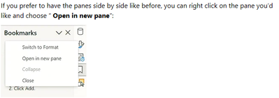
- A: You can CTRL + click or right click on the unselected pane you wish to open and choose "Open in new pane"
- Q: Where did aggregations move to?
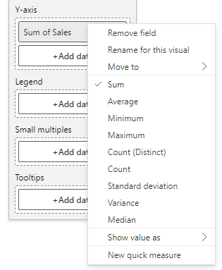
- A: It's still on right click of a field, or you can use the new flyout aggregations dropdown while choosing or swapping a field.
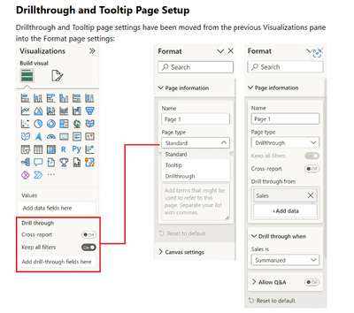
- Q: Where did drillthrough and tooltip page setup move to?
- A: Drillthrough is now in the page settings of the format pane under Page Information > Page type > Drillthrough or Tooltip.
- Mark as New
- Bookmark
- Subscribe
- Mute
- Subscribe to RSS Feed
- Permalink
- Report Inappropriate Content
I've found two really annoying bugs so far with the "On object interaction" enabled:
- In my report I sometimes add a blank row to my table, to make it look better. I've done this by creating a blank measure. In my visual I could rename that measure to a space, so there is no visible measure name in the report. This is however no longer possible.
- In the title and subtitle of a visual you can now use conditional formatting, so use a value to give you the title of the visual. If you work in a file which contains the model, you can select measures. If you however connect to a dataset, selecting measures is not possible. It would be great if that could also be enabled.
- Mark as New
- Bookmark
- Subscribe
- Mute
- Subscribe to RSS Feed
- Permalink
- Report Inappropriate Content
I have found a bug in the new on-object interaction feature.
Bug: if you make a change to the reports current theme (and by this I mean the customizing option for the current theme) - the format panel seems to get stuck on the page options. Even completely closing the format pane (by clicking the show/hide option in the ribbon) - does not fix this. Reopening from a visual does not fix this. The only solution appears to be - restart the report, without the customized theme.
NOTES: It took some time to find the format pane option - but once I did I thought I could get used to the way the feature works (although I echo the sentiment of those who don't like the way we add data to the new layout). Unfortunately, I found the bug mentioned above within a day - had to revert.
- Mark as New
- Bookmark
- Subscribe
- Mute
- Subscribe to RSS Feed
- Permalink
- Report Inappropriate Content
I think the functionality is a nice added option to what we have already when you need to make a quick change to a chart that is already set up.
I however did not like that you have now hidden the format bar and data bar by default. I miss the quick overview of what is in a chart.
So for me ideally you have both in, or at least in the option menu a way to turn back on the old visualization and format bar.
Based on the above I had to turn off this feature and was reducing my working efficiency.
- Mark as New
- Bookmark
- Subscribe
- Mute
- Subscribe to RSS Feed
- Permalink
- Report Inappropriate Content
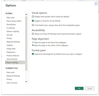
Love where this is going, much more intuitive design. Please give us the option to turn off the "Suggest a type" option as default. It's trying to help but it's more annoying than Word in that regard.
- Mark as New
- Bookmark
- Subscribe
- Mute
- Subscribe to RSS Feed
- Permalink
- Report Inappropriate Content
You can turn it off by default from here:
- Mark as New
- Bookmark
- Subscribe
- Mute
- Subscribe to RSS Feed
- Permalink
- Report Inappropriate Content
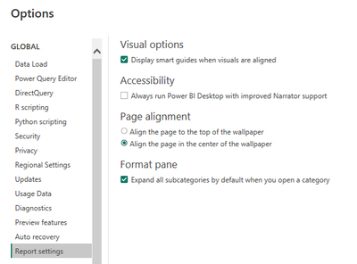
what version are you running? I am 2.115.842.0 and I do not have that option.....
- Mark as New
- Bookmark
- Subscribe
- Mute
- Subscribe to RSS Feed
- Permalink
- Report Inappropriate Content
"Drill through" disappeared from all my charts. It stopped working. What happened?
- Mark as New
- Bookmark
- Subscribe
- Mute
- Subscribe to RSS Feed
- Permalink
- Report Inappropriate Content
Version: 2.115.842.0 64-bit (March 2023)
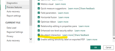
You may need to enable the Preview option first.
- Mark as New
- Bookmark
- Subscribe
- Mute
- Subscribe to RSS Feed
- Permalink
- Report Inappropriate Content
I have just turned off the preview feature. I seem to have either found a bug/loss of functionality, or you guys changed how I access it in a way that I can't figure it out.
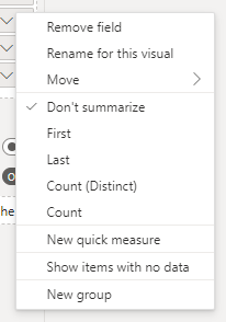
Example: I have a simple multi-row card visual. I have a variable in my report which is some type of record ID. When I add it to the multi-row card, by default it goes into the visual as "don't summarize". In my case, I want it to be a simple "count", so all I had to to in the old interface is click that variable after I place it in the field well and the many differnt summarization options are available. See sample screenshot for reference.
After turning on this preview, I could not find a way to change the non-summarized variable into a count, no matter what I did. It goes into the multi-row card in the default "don't summarize" behavior, and clicking it within the field well of the on-object builder only brings up the data panel/queries so that I can replace with some other variable from my datasets, but it no longer brings the same menu of that screenshot where I can change the summarization option from "don't summarize" to "count". How do I do that?
Up until now, I was kind of happy with the preview. As a general principle, I like when software has default behaviors for most frequent taken actions/choices, but I also don't like it when those default actions/choices come at the expense of easy access to full functionality - this feels a bit like how Apple does things i.e. "do it the Apple way or no way". I think my example is a good one. If the idea is to streamline content building and formatting on each object, I would expect an easy "right click access to get to full menu" option that would allow me to do everything that I could always do in the past interface. I don't understand why the new on-object menu would be a reason to prevent me from being able to choose summarization options with a simple click effort.
- Mark as New
- Bookmark
- Subscribe
- Mute
- Subscribe to RSS Feed
- Permalink
- Report Inappropriate Content
It's still there on right click 🙂 just no longer have an icon representing the entry point:
We've been hearing this feedback a lot, that without the icon it's hard to know aggregations is still there. We are updating the flyout menu to also have an aggregations dropdown coming in the May release so it'll be more discoverable.
- Mark as New
- Bookmark
- Subscribe
- Mute
- Subscribe to RSS Feed
- Permalink
- Report Inappropriate Content
Not to nitpick, but how is that not called out anywhere within the release notes or feature summary?!
- Mark as New
- Bookmark
- Subscribe
- Mute
- Subscribe to RSS Feed
- Permalink
- Report Inappropriate Content
THANK YOU! Yes, it seems the big "X" to remove data from the field well and the arrow pointing to right act as uncounscious driver of where we click in search of right click menu. I swear I had tried to click it several times before and never managed to hit the right spot. As it is, back again to preview to continue acquainting with it. Appreciate you taking the time to reply and glad to hear I was not the only one lost! Looking forward to seeing how you guys revamp the discoverability of functionality that got tucked away from view!
- Mark as New
- Bookmark
- Subscribe
- Mute
- Subscribe to RSS Feed
- Permalink
- Report Inappropriate Content
I like the new option, but I absolutely do not like the fact that when it's turned on it removes the format bar entirely that previously existed to the right. Please allow an option to turn on both options or remove the format section.
- Mark as New
- Bookmark
- Subscribe
- Mute
- Subscribe to RSS Feed
- Permalink
- Report Inappropriate Content
Good afternoon.
I have started to test the new look and feel for visualizations, and I'm coming back for the previous one.
To be in two examples, I tried to put the same field twice in the same visualization, and it didn't allow me. I did it to change the second one to a COUNT. The workaround was to turn the first on COUNT before putting the field again.
The list of fields can't be expanded, so this is the result:
It is impossible to use.
- Mark as New
- Bookmark
- Subscribe
- Mute
- Subscribe to RSS Feed
- Permalink
- Report Inappropriate Content
I turned off On-Object interaction. I think it has a lot of potential, but it still needs some optimization, and first of all - this functionality should not be a replacement of the old one - I would love it much more if it would be added on-top of the current functionalities.
In my case the main reason that forced me to turn off On-Object interaction was not being able to work with old panes functionality, where I could have in example Data pane, Bookmark pane and Object Selection pane visible at the same time, side-by-side. Right now when I select one pane, the other one is being automatically hidden, which drives me nuts, because more often than not I want to work with more than one pane visible (in example when you try to update multiple bookmarks, constant switching between panes is really a bad experience).
- Mark as New
- Bookmark
- Subscribe
- Mute
- Subscribe to RSS Feed
- Permalink
- Report Inappropriate Content
You can still open them side by side using the right click menu:
- Mark as New
- Bookmark
- Subscribe
- Mute
- Subscribe to RSS Feed
- Permalink
- Report Inappropriate Content
Thanks, it works. I was looking for this, but somehow I missed it.
One remark I stil have is that, if you already work with several open panes (for example Bookmarks, Format, and Data) and you want to add/activate another pane from the top menu - all previously opened panes are being collapsed (you can't avoid it, there is no this right click functionality in the top menu). May not seem a big thing, but not very comfortable and quite annoying in a long run.
- Mark as New
- Bookmark
- Subscribe
- Mute
- Subscribe to RSS Feed
- Permalink
- Report Inappropriate Content
What I like:
- I like the in-visual editing - eg. the titles
What I don't like:
It is now much more complicated to create bookmarks when you want to hide/unhide certain visuals. Previously I had the Selection and Bookmarks pane side by side so I could easily see which visuals get hidden/unhidden by clicking on certain bookmarks and I could also easily change this. Now I have to switch between Selection and Bookmark panes as they are stacked and it is not easily visible and maintainable which visuals are hidden.- EDIT: I have missed it but it is possible to have the panes opened side by side like before - if you right click on the pane, there is a option to "Open in a new pane" and this will open the pane side by side.
- Build a visual pane should also be enabled to be viewable separately in the right pane, not only at the visual. The problem I have with this pane in this preview feature is that if I have a longer field/measure name, I can't expand this Build a visual pane and it is very complicated to easily see what fields I use. Reorganizing the fields/measures is also more complicated and I have to be more precise when dragging the fields.
- It is not easily visible how to add new visual, it's very counter-intuitive, almost to the point that it might look there are no visuals at all. Adding more visuals from market place etc. also takes much more time/clicks.
- In general this new preview feature lowers my productivity and for most things to be done, I have to click more and look for the features more as they are not readily available at hand.
I would appreciate to have the possibility of keeping the in-visual editing (like the titles) and choosing between the stacked panes on the right panel or expanding / popping up selected panes so they become visible side by side like before.I have used the preview feature for about a week and I will be turning it off until some of the points from my and other user's feedback are addressed.
- Mark as New
- Bookmark
- Subscribe
- Mute
- Subscribe to RSS Feed
- Permalink
- Report Inappropriate Content
i am unable to find Drill Through facility in these new changes, please help
- Mark as New
- Bookmark
- Subscribe
- Mute
- Subscribe to RSS Feed
- Permalink
- Report Inappropriate Content
- Mark as New
- Bookmark
- Subscribe
- Mute
- Subscribe to RSS Feed
- Permalink
- Report Inappropriate Content
The official Power BI documentation still doesn't reflect this, which has caused a lot of confusion for users. Can you please get this updated?
Helpful resources

Microsoft Fabric Learn Together
Covering the world! 9:00-10:30 AM Sydney, 4:00-5:30 PM CET (Paris/Berlin), 7:00-8:30 PM Mexico City

Power BI Monthly Update - April 2024
Check out the April 2024 Power BI update to learn about new features.

| User | Count |
|---|---|
| 108 | |
| 94 | |
| 75 | |
| 63 | |
| 62 |
| User | Count |
|---|---|
| 143 | |
| 104 | |
| 104 | |
| 80 | |
| 66 |
