This is best Fabric, Power BI, SQL and AI community event. How do we know? The last event sold out! Save €200 with code FABCMTY200.
Register nowThe Fabric community is upgrading! Read all of the details including the timeline and what you can expect. Learn more
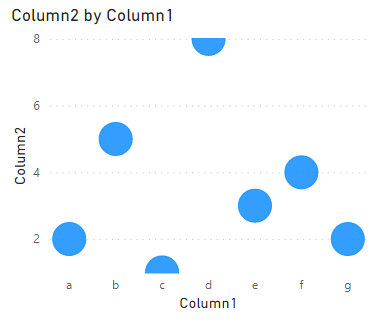
The Scatterplot automatically cuts off the dimention in the upper right. Is there a way to Fix this? With either the Default Scatter Plot visual or the Enhanced Scatter.
Solved! Go to Solution.
Hi @mcornfield ,
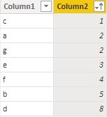
Because the center position of each scatter point in the scatter chart represents its value, the maximum and minimum values will appear as semicircles, like below.
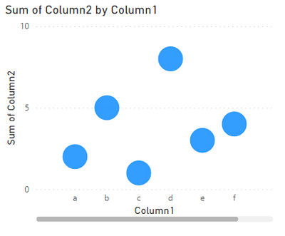
You can change the start and end value in X/Y axis to cover the data value.
Then it will works fine.
Best Regards,
Community Support Team _ kalyj
If this post helps, then please consider Accept it as the solution to help the other members find it more quickly.
Hi @mcornfield ,
Because the center position of each scatter point in the scatter chart represents its value, the maximum and minimum values will appear as semicircles, like below.
You can change the start and end value in X/Y axis to cover the data value.
Then it will works fine.
Best Regards,
Community Support Team _ kalyj
If this post helps, then please consider Accept it as the solution to help the other members find it more quickly.
I don't know that there's a good fix for this.
Consider voting and commenting on this related idea: Plot entire bubbles in scatter charts
Join us in Barcelona for FabCon and SQLCon, the Fabric, Power BI, SQL, and AI community event. Save €200 with code FABCMTY200.
| User | Count |
|---|---|
| 24 | |
| 22 | |
| 20 | |
| 18 | |
| 14 |
| User | Count |
|---|---|
| 32 | |
| 26 | |
| 23 | |
| 20 | |
| 20 |