FabCon is coming to Atlanta
Join us at FabCon Atlanta from March 16 - 20, 2026, for the ultimate Fabric, Power BI, AI and SQL community-led event. Save $200 with code FABCOMM.
Register now!- Power BI forums
- Get Help with Power BI
- Desktop
- Service
- Report Server
- Power Query
- Mobile Apps
- Developer
- DAX Commands and Tips
- Custom Visuals Development Discussion
- Health and Life Sciences
- Power BI Spanish forums
- Translated Spanish Desktop
- Training and Consulting
- Instructor Led Training
- Dashboard in a Day for Women, by Women
- Galleries
- Data Stories Gallery
- Themes Gallery
- Contests Gallery
- QuickViz Gallery
- Quick Measures Gallery
- Visual Calculations Gallery
- Notebook Gallery
- Translytical Task Flow Gallery
- TMDL Gallery
- R Script Showcase
- Webinars and Video Gallery
- Ideas
- Custom Visuals Ideas (read-only)
- Issues
- Issues
- Events
- Upcoming Events
The Power BI Data Visualization World Championships is back! Get ahead of the game and start preparing now! Learn more
- Power BI forums
- Forums
- Get Help with Power BI
- Desktop
- Scatter Plot Aggregating X and Y
- Subscribe to RSS Feed
- Mark Topic as New
- Mark Topic as Read
- Float this Topic for Current User
- Bookmark
- Subscribe
- Printer Friendly Page
- Mark as New
- Bookmark
- Subscribe
- Mute
- Subscribe to RSS Feed
- Permalink
- Report Inappropriate Content
Scatter Plot Aggregating X and Y
Hello Power BI Friends,
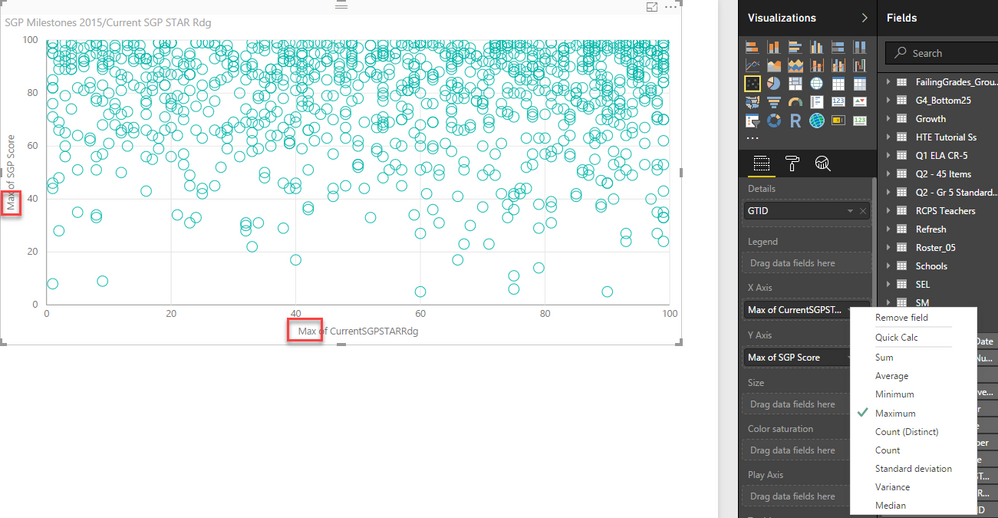
I am creating a Scatter Plot where the X-Axis and the Y-Axis are both two whole numbers in related tables. The details are a key coming from one of the tables.
However, Power BI is forcing me to summarize my X- and Y- axes and therefore, my points are not plotting as they would for a simple scatter plot.
Any suggestions are welcome!
Thank you,
Michael
Solved! Go to Solution.
- Mark as New
- Bookmark
- Subscribe
- Mute
- Subscribe to RSS Feed
- Permalink
- Report Inappropriate Content
Hi Micheal
You can use R script to get a scatter chart with non aggregated values. The script is simple.
You should create your dataset by dragging the fields into the values area and write the below script.
plot(dataset$SGPScore, dataset$SGPSTARRdg, xlab=”SGP Score”, ylab=”SGPSTARRdg”, xlim=c(0,300), ylim=c(0,300), main=”SGP Score Vs SGPSTARRdg”, pch=2, cex.main=1.5, frame.plot=FALSE, col=”green”)
Bhavesh
Love the Self Service BI.
Please use the 'Mark as answer' link to mark a post that answers your question. If you find a reply helpful, please remember to give Kudos.
- Mark as New
- Bookmark
- Subscribe
- Mute
- Subscribe to RSS Feed
- Permalink
- Report Inappropriate Content
Hi Bhavesh,
Thank you so much for your reply. I attempted running this R script, but receive the error below.
I'd appreciate any assistance with this, as I have very little experience with R.
Michael
- Mark as New
- Bookmark
- Subscribe
- Mute
- Subscribe to RSS Feed
- Permalink
- Report Inappropriate Content
Hi Bhavesh,
I was able to write my first R Script. Thank you for your help.
I used:
plot(dataset$SGPScore, dataset$CurrentSGPSTARRdg, xlab="SGPScore", ylab="CurrentSGPSTARRdg", main="SGP Score Vs CurrentSGPSTARRdg", pch=2, cex.main=1.5, frame.plot=FALSE, col="green")
Is there a way to have this visual interact with others, where I can click on a datapoint and then use thta to filter on a table?
Thanks!
Michael
- Mark as New
- Bookmark
- Subscribe
- Mute
- Subscribe to RSS Feed
- Permalink
- Report Inappropriate Content
Scatter plots on Power BI require a measure on each axis - you can't use just columns. Workarounds are discussed in this thread: https://community.powerbi.com/t5/Desktop/Scatter-plot-summarizing-data/td-p/37229
You can vote to have this issue addressed on this idea, and maybe others: https://ideas.powerbi.com/forums/265200-power-bi-ideas/suggestions/9784617-ability-to-put-categorica...
- Mark as New
- Bookmark
- Subscribe
- Mute
- Subscribe to RSS Feed
- Permalink
- Report Inappropriate Content
Steve,
Thank you for your reply. I have voted on the forum.
Michael
Helpful resources

Power BI Dataviz World Championships
The Power BI Data Visualization World Championships is back! Get ahead of the game and start preparing now!

| User | Count |
|---|---|
| 37 | |
| 37 | |
| 33 | |
| 32 | |
| 29 |
| User | Count |
|---|---|
| 130 | |
| 88 | |
| 82 | |
| 68 | |
| 64 |


