FabCon is coming to Atlanta
Join us at FabCon Atlanta from March 16 - 20, 2026, for the ultimate Fabric, Power BI, AI and SQL community-led event. Save $200 with code FABCOMM.
Register now!- Power BI forums
- Get Help with Power BI
- Desktop
- Service
- Report Server
- Power Query
- Mobile Apps
- Developer
- DAX Commands and Tips
- Custom Visuals Development Discussion
- Health and Life Sciences
- Power BI Spanish forums
- Translated Spanish Desktop
- Training and Consulting
- Instructor Led Training
- Dashboard in a Day for Women, by Women
- Galleries
- Data Stories Gallery
- Themes Gallery
- Contests Gallery
- QuickViz Gallery
- Quick Measures Gallery
- Visual Calculations Gallery
- Notebook Gallery
- Translytical Task Flow Gallery
- TMDL Gallery
- R Script Showcase
- Webinars and Video Gallery
- Ideas
- Custom Visuals Ideas (read-only)
- Issues
- Issues
- Events
- Upcoming Events
Get Fabric Certified for FREE during Fabric Data Days. Don't miss your chance! Request now
- Power BI forums
- Forums
- Get Help with Power BI
- Desktop
- Scatter Chart 'Details' Alignment .
- Subscribe to RSS Feed
- Mark Topic as New
- Mark Topic as Read
- Float this Topic for Current User
- Bookmark
- Subscribe
- Printer Friendly Page
- Mark as New
- Bookmark
- Subscribe
- Mute
- Subscribe to RSS Feed
- Permalink
- Report Inappropriate Content
Scatter Chart 'Details' Alignment .
Hi All ,
Iam trying to achieve the Risk Matrix as below , A 5*5 Matrix where in X-Axis is Likelihood of Risk and Y -Axis is impact .
I have followed and understood the steps from this linkhttps://community.powerbi.com/t5/Desktop/Risk-matrix-chart-in-Power-BI/td-p/161587/page/2 and creted a scatter plot with background color coded screenshot added to it .
Now , Iam able to plot the Risk categories but is there any way I can plot the Risk categories in below alignment .
Expected Result :
Actual Result : Is there any way I can align the Risk categories aligned(One below another ) as above sample picture . Risk Category is under the Details option in PowerBI scatter chart
Thanks a lot in advance .
Tagging fols whom I feel are related to this topic .
@visual67 @ScatterPie_San1 @Anonymous @zydesigns Coloring a risk matrix background
Solved! Go to Solution.
- Mark as New
- Bookmark
- Subscribe
- Mute
- Subscribe to RSS Feed
- Permalink
- Report Inappropriate Content
@neeharikathota , as you have fixed the background image. Better to start and end values for the x and Y axis. This will makes sure dots are aligned within those limits and might fall on your visual at expcted place.
- Mark as New
- Bookmark
- Subscribe
- Mute
- Subscribe to RSS Feed
- Permalink
- Report Inappropriate Content
Hi Amit @amitchandak ,
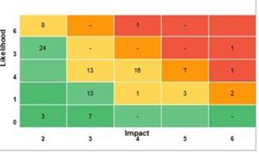
iam back with another query related to this topic . Now user wants to see above risk matrix based on count of risk at each point of the above 5 *5 matrix . Something like below , so user wants to see the tota count of risk at a point of time in the scatter chart . And post that after clicking on the number they want to see the actual risk category details in data point table .
I tried to create a count measure and give as an input to scatter chart 'Details' tab but this is not being accepted as a column .
Please let me know how to achieve this .
Thanks in advance .
- Mark as New
- Bookmark
- Subscribe
- Mute
- Subscribe to RSS Feed
- Permalink
- Report Inappropriate Content
@neeharikathota , as you have fixed the background image. Better to start and end values for the x and Y axis. This will makes sure dots are aligned within those limits and might fall on your visual at expcted place.
Helpful resources

Power BI Monthly Update - November 2025
Check out the November 2025 Power BI update to learn about new features.

Fabric Data Days
Advance your Data & AI career with 50 days of live learning, contests, hands-on challenges, study groups & certifications and more!


