FabCon is coming to Atlanta
Join us at FabCon Atlanta from March 16 - 20, 2026, for the ultimate Fabric, Power BI, AI and SQL community-led event. Save $200 with code FABCOMM.
Register now!- Power BI forums
- Get Help with Power BI
- Desktop
- Service
- Report Server
- Power Query
- Mobile Apps
- Developer
- DAX Commands and Tips
- Custom Visuals Development Discussion
- Health and Life Sciences
- Power BI Spanish forums
- Translated Spanish Desktop
- Training and Consulting
- Instructor Led Training
- Dashboard in a Day for Women, by Women
- Galleries
- Data Stories Gallery
- Themes Gallery
- Contests Gallery
- QuickViz Gallery
- Quick Measures Gallery
- Visual Calculations Gallery
- Notebook Gallery
- Translytical Task Flow Gallery
- TMDL Gallery
- R Script Showcase
- Webinars and Video Gallery
- Ideas
- Custom Visuals Ideas (read-only)
- Issues
- Issues
- Events
- Upcoming Events
Vote for your favorite vizzies from the Power BI Dataviz World Championship submissions. Vote now!
- Power BI forums
- Forums
- Get Help with Power BI
- Desktop
- Re: Scatter Chart 'Details' Alignment .
- Subscribe to RSS Feed
- Mark Topic as New
- Mark Topic as Read
- Float this Topic for Current User
- Bookmark
- Subscribe
- Printer Friendly Page
- Mark as New
- Bookmark
- Subscribe
- Mute
- Subscribe to RSS Feed
- Permalink
- Report Inappropriate Content
Scatter Chart 'Details' Alignment .
Hi All ,
Iam trying to achieve the Risk Matrix as below , A 5*5 Matrix where in X-Axis is Likelihood of Risk and Y -Axis is impact .
I have followed and understood the steps from this linkhttps://community.powerbi.com/t5/Desktop/Risk-matrix-chart-in-Power-BI/td-p/161587/page/2 and creted a scatter plot with background color coded screenshot added to it .
Now , Iam able to plot the Risk categories but is there any way I can plot the Risk categories in below alignment .
Expected Result :
Actual Result : Is there any way I can align the Risk categories aligned(One below another ) as above sample picture . Risk Category is under the Details option in PowerBI scatter chart
Thanks a lot in advance .
Tagging fols whom I feel are related to this topic .
@visual67 @ScatterPie_San1 @Anonymous @zydesigns Coloring a risk matrix background
Solved! Go to Solution.
- Mark as New
- Bookmark
- Subscribe
- Mute
- Subscribe to RSS Feed
- Permalink
- Report Inappropriate Content
@neeharikathota , as you have fixed the background image. Better to start and end values for the x and Y axis. This will makes sure dots are aligned within those limits and might fall on your visual at expcted place.
- Mark as New
- Bookmark
- Subscribe
- Mute
- Subscribe to RSS Feed
- Permalink
- Report Inappropriate Content
Hi Amit @amitchandak ,
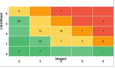
iam back with another query related to this topic . Now user wants to see above risk matrix based on count of risk at each point of the above 5 *5 matrix . Something like below , so user wants to see the tota count of risk at a point of time in the scatter chart . And post that after clicking on the number they want to see the actual risk category details in data point table .
I tried to create a count measure and give as an input to scatter chart 'Details' tab but this is not being accepted as a column .
Please let me know how to achieve this .
Thanks in advance .
- Mark as New
- Bookmark
- Subscribe
- Mute
- Subscribe to RSS Feed
- Permalink
- Report Inappropriate Content
@neeharikathota , as you have fixed the background image. Better to start and end values for the x and Y axis. This will makes sure dots are aligned within those limits and might fall on your visual at expcted place.
Helpful resources

Power BI Dataviz World Championships
Vote for your favorite vizzies from the Power BI World Championship submissions!

Join our Community Sticker Challenge 2026
If you love stickers, then you will definitely want to check out our Community Sticker Challenge!

Power BI Monthly Update - January 2026
Check out the January 2026 Power BI update to learn about new features.

| User | Count |
|---|---|
| 64 | |
| 56 | |
| 43 | |
| 20 | |
| 17 |
| User | Count |
|---|---|
| 123 | |
| 108 | |
| 44 | |
| 32 | |
| 26 |


