Get certified for free when you join Fabric Data Days 2026 and dive into Fabric, Power BI, SQL, AI, and other essential data skills.
Join nowJuly 28 - August 9 | Final Round of the Power BI Dataviz World Championships. This is your chance. Learn more
Hi All ,
Iam trying to achieve the Risk Matrix as below , A 5*5 Matrix where in X-Axis is Likelihood of Risk and Y -Axis is impact .
I have followed and understood the steps from this linkhttps://community.powerbi.com/t5/Desktop/Risk-matrix-chart-in-Power-BI/td-p/161587/page/2 and creted a scatter plot with background color coded screenshot added to it .
Now , Iam able to plot the Risk categories but is there any way I can plot the Risk categories in below alignment .
Expected Result :
Actual Result : Is there any way I can align the Risk categories aligned(One below another ) as above sample picture . Risk Category is under the Details option in PowerBI scatter chart
Thanks a lot in advance .
Tagging fols whom I feel are related to this topic .
@visual67 @ScatterPie_San1 @Anonymous @zydesigns Coloring a risk matrix background
Solved! Go to Solution.
@neeharikathota , as you have fixed the background image. Better to start and end values for the x and Y axis. This will makes sure dots are aligned within those limits and might fall on your visual at expcted place.
Hi Amit @amitchandak ,
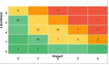
iam back with another query related to this topic . Now user wants to see above risk matrix based on count of risk at each point of the above 5 *5 matrix . Something like below , so user wants to see the tota count of risk at a point of time in the scatter chart . And post that after clicking on the number they want to see the actual risk category details in data point table .
I tried to create a count measure and give as an input to scatter chart 'Details' tab but this is not being accepted as a column .
Please let me know how to achieve this .
Thanks in advance .
@neeharikathota , as you have fixed the background image. Better to start and end values for the x and Y axis. This will makes sure dots are aligned within those limits and might fall on your visual at expcted place.
If you love stickers, then you will definitely want to check out our community sticker challenge, Barcelona edition!
Check out the July 2026 Power BI update to learn about new features.
| User | Count |
|---|---|
| 28 | |
| 28 | |
| 19 | |
| 19 | |
| 19 |
| User | Count |
|---|---|
| 37 | |
| 29 | |
| 18 | |
| 17 | |
| 15 |