
Get certified for free when you join Fabric Data Days 2026 and dive into Fabric, Power BI, SQL, AI, and other essential data skills.
Join nowJuly 28 - August 9 | Final Round of the Power BI Dataviz World Championships. This is your chance. Learn more
Hello community,
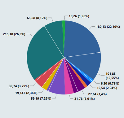
I'm in a hardship while trying to use the SWITCH function to make my chart figure out a dynamic legend and colors.
As you can see here, I have a legend that interpret my data with two different metrics :
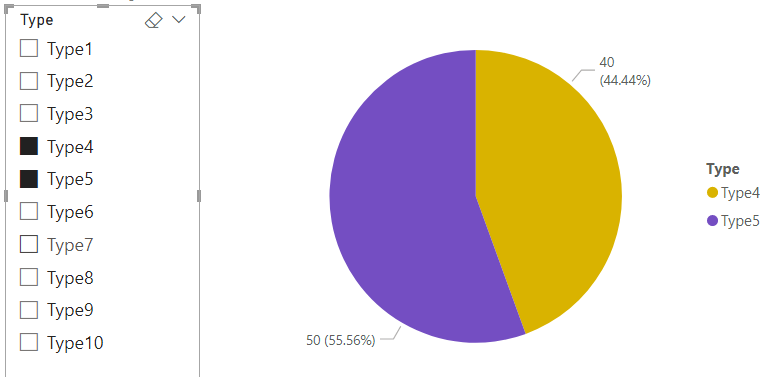
So when I use the slicer to filter it I would like to the filtered data to return 2 different colors and to show on the legend as well, the other possibility that I have right now is to remove the legend and return all the different data with a singular color, however, when I use the slicer all the legend remains at he chart :
Could you enlighten me how I can proper use the SWITCH measure in this case ? Other solutions are very welcome as well.
Thank you in advance
Hi, @AGCL
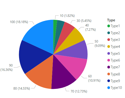
Sample data:
Is this the result you expect?
Best Regards,
Community Support Team _Charlotte
If this post helps, then please consider Accept it as the solution to help the other members find it more quickly.
Technically yes, however, I would like to keep my slicer with the main specification while it brings forth the two different data and interpret them as two different for the same main think.
Exemple : Dell - I can have data with 2 Dell different notebooks, but they are still Dell, so when I slice Dell they are suppose to appear at the chart with two different colors and legends
If you love stickers, then you will definitely want to check out our community sticker challenge, Barcelona edition!
Check out the July 2026 Power BI update to learn about new features.
| User | Count |
|---|---|
| 29 | |
| 28 | |
| 20 | |
| 20 | |
| 19 |
| User | Count |
|---|---|
| 35 | |
| 26 | |
| 20 | |
| 18 | |
| 17 |