Join us at FabCon Vienna from September 15-18, 2025
The ultimate Fabric, Power BI, SQL, and AI community-led learning event. Save €200 with code FABCOMM.
Get registered- Power BI forums
- Get Help with Power BI
- Desktop
- Service
- Report Server
- Power Query
- Mobile Apps
- Developer
- DAX Commands and Tips
- Custom Visuals Development Discussion
- Health and Life Sciences
- Power BI Spanish forums
- Translated Spanish Desktop
- Training and Consulting
- Instructor Led Training
- Dashboard in a Day for Women, by Women
- Galleries
- Data Stories Gallery
- Themes Gallery
- Contests Gallery
- Quick Measures Gallery
- Notebook Gallery
- Translytical Task Flow Gallery
- TMDL Gallery
- R Script Showcase
- Webinars and Video Gallery
- Ideas
- Custom Visuals Ideas (read-only)
- Issues
- Issues
- Events
- Upcoming Events
Enhance your career with this limited time 50% discount on Fabric and Power BI exams. Ends August 31st. Request your voucher.
- Power BI forums
- Forums
- Get Help with Power BI
- Desktop
- Running Total
- Subscribe to RSS Feed
- Mark Topic as New
- Mark Topic as Read
- Float this Topic for Current User
- Bookmark
- Subscribe
- Printer Friendly Page
- Mark as New
- Bookmark
- Subscribe
- Mute
- Subscribe to RSS Feed
- Permalink
- Report Inappropriate Content
Running Total
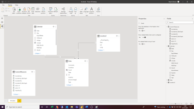
I have a simple data model recording accidents per month and want to create a bar graph showing month accidents and a running total.
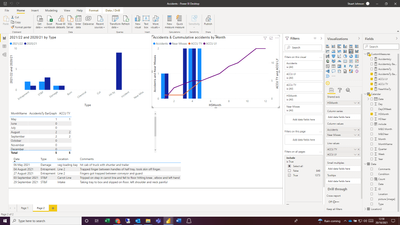
Normally this wouldn't be an issue but our Accidents data uses a start month of May i have a custom column to give a value of 1 to May, 2 to June etc. If i create the acumulative total on this value everything works fine:
However i'd rather show the month names rather than number. If i chage the axis the date changes and only shows the actual figure:
The month Name isn't a numerical fielf for me to use in the accumulation calulation. Is there a way to do this?
My measure is:
- Mark as New
- Bookmark
- Subscribe
- Mute
- Subscribe to RSS Feed
- Permalink
- Report Inappropriate Content
Hi @Anonymous
Try this:
Meausre=
CALCULATE(
    [AccidentsTy],
    FILTER(
        all(Calendar),Calendar(date)<=max(calendar(date)
)
)
If this post helps, please consider accepting it as the solution to help the other members find it more quickly.
Appreciate your Kudos!!
- Mark as New
- Bookmark
- Subscribe
- Mute
- Subscribe to RSS Feed
- Permalink
- Report Inappropriate Content
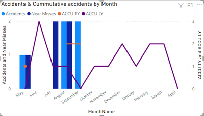
Thanks Vahid, that just gives me a complete total which is the same each month:
It shows the total rather than a running total on both graphs (MonthName and HSMonth)
- Mark as New
- Bookmark
- Subscribe
- Mute
- Subscribe to RSS Feed
- Permalink
- Report Inappropriate Content
It would be better if you shared a sample of your data or the PBIX file.
BTE, try this:
Meausre=
CALCULATE(
    [AccidentsTy],
    FILTER(
        all(Data),Data(date)<=max(calendar(date)
)
)
If this post helps, please consider accepting it as the solution to help the other members find it more quickly.
Appreciate your Kudos!!
- Mark as New
- Bookmark
- Subscribe
- Mute
- Subscribe to RSS Feed
- Permalink
- Report Inappropriate Content
Thanks Vahid,
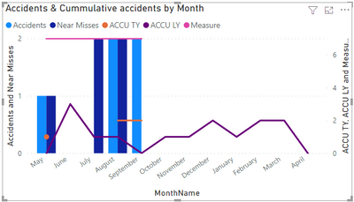
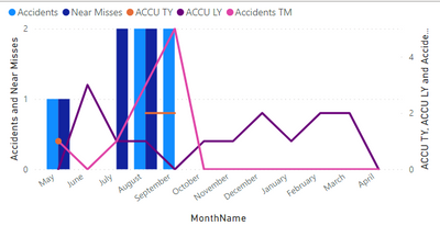
Almost there. is there a way to account for zero values. Currently it looks like this:
If i use the measure that adds 0 values for the barchart i get the result below:
Helpful resources
| User | Count |
|---|---|
| 81 | |
| 74 | |
| 42 | |
| 30 | |
| 28 |
| User | Count |
|---|---|
| 108 | |
| 96 | |
| 53 | |
| 48 | |
| 47 |
