Fabric Data Days starts November 4th!
Advance your Data & AI career with 50 days of live learning, dataviz contests, hands-on challenges, study groups & certifications and more!
Get registered- Power BI forums
- Get Help with Power BI
- Desktop
- Service
- Report Server
- Power Query
- Mobile Apps
- Developer
- DAX Commands and Tips
- Custom Visuals Development Discussion
- Health and Life Sciences
- Power BI Spanish forums
- Translated Spanish Desktop
- Training and Consulting
- Instructor Led Training
- Dashboard in a Day for Women, by Women
- Galleries
- Data Stories Gallery
- Themes Gallery
- Contests Gallery
- QuickViz Gallery
- Quick Measures Gallery
- Visual Calculations Gallery
- Notebook Gallery
- Translytical Task Flow Gallery
- TMDL Gallery
- R Script Showcase
- Webinars and Video Gallery
- Ideas
- Custom Visuals Ideas (read-only)
- Issues
- Issues
- Events
- Upcoming Events
Get Fabric Certified for FREE during Fabric Data Days. Don't miss your chance! Request now
- Power BI forums
- Forums
- Get Help with Power BI
- Desktop
- Re: Rolling average without date table
- Subscribe to RSS Feed
- Mark Topic as New
- Mark Topic as Read
- Float this Topic for Current User
- Bookmark
- Subscribe
- Printer Friendly Page
- Mark as New
- Bookmark
- Subscribe
- Mute
- Subscribe to RSS Feed
- Permalink
- Report Inappropriate Content
Rolling average without date table
Hi,
I have a table with sales and I want to be able to plot the rolloing average in a chart. I now have a DAX measure for average last 3 years but only as a number seen from today and I can't use that for a chart with time on the x-axis.
What I use for non dynamic average:
Average last 3 years =
AVERAGEX(
FILTER(
'table1',
'table1'[id] > MAX('table1'[id]) -6 &&
'table1'[id] <= MAX('table1'[id])
), 'table1'[sales]
)
My table (table1):
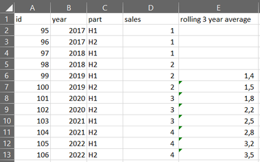
What I need so that I can plot in chart:
Thanks in advance!
Br
Johannes
Solved! Go to Solution.
- Mark as New
- Bookmark
- Subscribe
- Mute
- Subscribe to RSS Feed
- Permalink
- Report Inappropriate Content
Hi @JohannesM ,
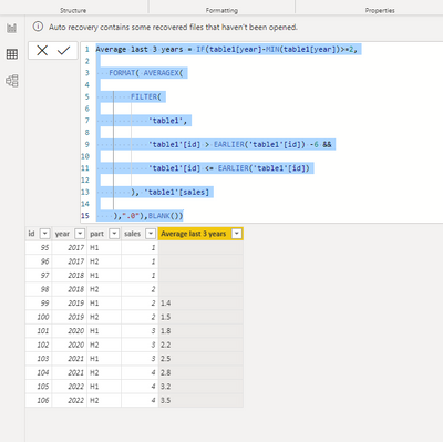
Pls use the below dax to create a new column:
Average last 3 years = IF(table1[year]-MIN(table1[year])>=2,

   FORMAT( AVERAGEX(

        FILTER(

            'table1',

            'table1'[id] > EARLIER('table1'[id]) -6 &&

            'table1'[id] <= EARLIER('table1'[id])

        ), 'table1'[sales]

    ),".0"),BLANK())
Output result:
Best Regards
Lucien
- Mark as New
- Bookmark
- Subscribe
- Mute
- Subscribe to RSS Feed
- Permalink
- Report Inappropriate Content
Thanks a lot! That did it.
Br
Johannes
Helpful resources

Power BI Monthly Update - November 2025
Check out the November 2025 Power BI update to learn about new features.

Fabric Data Days
Advance your Data & AI career with 50 days of live learning, contests, hands-on challenges, study groups & certifications and more!

| User | Count |
|---|---|
| 97 | |
| 73 | |
| 50 | |
| 47 | |
| 44 |


