- Power BI forums
- Get Help with Power BI
- Desktop
- Service
- Report Server
- Power Query
- Mobile Apps
- Developer
- DAX Commands and Tips
- Custom Visuals Development Discussion
- Health and Life Sciences
- Power BI Spanish forums
- Translated Spanish Desktop
- Training and Consulting
- Instructor Led Training
- Dashboard in a Day for Women, by Women
- Galleries
- Data Stories Gallery
- Themes Gallery
- Contests Gallery
- QuickViz Gallery
- Quick Measures Gallery
- Visual Calculations Gallery
- Notebook Gallery
- Translytical Task Flow Gallery
- TMDL Gallery
- R Script Showcase
- Webinars and Video Gallery
- Ideas
- Custom Visuals Ideas (read-only)
- Issues
- Issues
- Events
- Upcoming Events
We've captured the moments from FabCon & SQLCon that everyone is talking about, and we are bringing them to the community, live and on-demand. Starts on April 14th. Register now
- Power BI forums
- Forums
- Get Help with Power BI
- Desktop
- Re: Rolling average without date table
- Subscribe to RSS Feed
- Mark Topic as New
- Mark Topic as Read
- Float this Topic for Current User
- Bookmark
- Subscribe
- Printer Friendly Page
- Mark as New
- Bookmark
- Subscribe
- Mute
- Subscribe to RSS Feed
- Permalink
- Report Inappropriate Content
Rolling average without date table
Hi,
I have a table with sales and I want to be able to plot the rolloing average in a chart. I now have a DAX measure for average last 3 years but only as a number seen from today and I can't use that for a chart with time on the x-axis.
What I use for non dynamic average:
Average last 3 years =
AVERAGEX(
FILTER(
'table1',
'table1'[id] > MAX('table1'[id]) -6 &&
'table1'[id] <= MAX('table1'[id])
), 'table1'[sales]
)
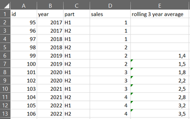
My table (table1):
What I need so that I can plot in chart:
Thanks in advance!
Br
Johannes
Solved! Go to Solution.
- Mark as New
- Bookmark
- Subscribe
- Mute
- Subscribe to RSS Feed
- Permalink
- Report Inappropriate Content
Hi @JohannesM ,
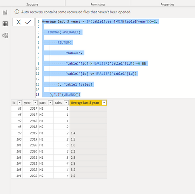
Pls use the below dax to create a new column:
Average last 3 years = IF(table1[year]-MIN(table1[year])>=2,

   FORMAT( AVERAGEX(

        FILTER(

            'table1',

            'table1'[id] > EARLIER('table1'[id]) -6 &&

            'table1'[id] <= EARLIER('table1'[id])

        ), 'table1'[sales]

    ),".0"),BLANK())
Output result:
Best Regards
Lucien
- Mark as New
- Bookmark
- Subscribe
- Mute
- Subscribe to RSS Feed
- Permalink
- Report Inappropriate Content
Thanks a lot! That did it.
Br
Johannes
Helpful resources

New to Fabric Survey
If you have recently started exploring Fabric, we'd love to hear how it's going. Your feedback can help with product improvements.

Power BI DataViz World Championships - June 2026
A new Power BI DataViz World Championship is coming this June! Don't miss out on submitting your entry.

Join our Fabric User Panel
Share feedback directly with Fabric product managers, participate in targeted research studies and influence the Fabric roadmap.

| User | Count |
|---|---|
| 54 | |
| 39 | |
| 32 | |
| 17 | |
| 15 |
| User | Count |
|---|---|
| 64 | |
| 63 | |
| 37 | |
| 36 | |
| 22 |


