Get Fabric certified for FREE!
Don't miss your chance to take the Fabric Data Engineer (DP-600) exam for FREE! Find out how by attending the DP-600 session on April 23rd (pacific time), live or on-demand.
Learn more- Power BI forums
- Get Help with Power BI
- Desktop
- Service
- Report Server
- Power Query
- Mobile Apps
- Developer
- DAX Commands and Tips
- Custom Visuals Development Discussion
- Health and Life Sciences
- Power BI Spanish forums
- Translated Spanish Desktop
- Training and Consulting
- Instructor Led Training
- Dashboard in a Day for Women, by Women
- Galleries
- Data Stories Gallery
- Themes Gallery
- Contests Gallery
- QuickViz Gallery
- Quick Measures Gallery
- Visual Calculations Gallery
- Notebook Gallery
- Translytical Task Flow Gallery
- TMDL Gallery
- R Script Showcase
- Webinars and Video Gallery
- Ideas
- Custom Visuals Ideas (read-only)
- Issues
- Issues
- Events
- Upcoming Events
Next up in the FabCon + SQLCon recap series: The roadmap for Microsoft SQL and Maximizing Developer experiences in Fabric. All sessions are available on-demand after the live show. Register now
- Power BI forums
- Forums
- Get Help with Power BI
- Desktop
- Re: Reference Line Question
- Subscribe to RSS Feed
- Mark Topic as New
- Mark Topic as Read
- Float this Topic for Current User
- Bookmark
- Subscribe
- Printer Friendly Page
- Mark as New
- Bookmark
- Subscribe
- Mute
- Subscribe to RSS Feed
- Permalink
- Report Inappropriate Content
Reference Line Question
Hi All
I am an advanced Qlik user and looking to find a way to add a reference line to a trend chart in Power BI.
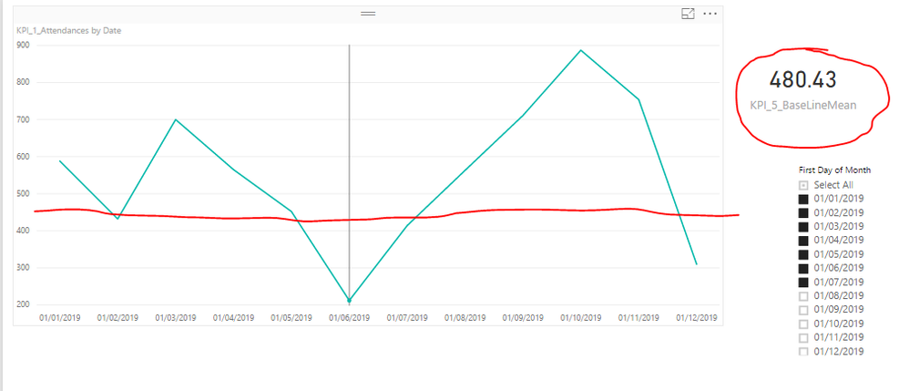
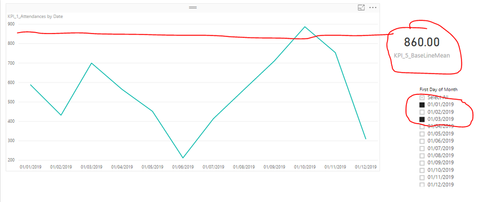
I have a calculated measure ie KPI_5_BaseLineMean which returns one value depending on date selections. I would like to add this measure as a reference line to the line chart. Please see the example screenshots below.
Regards
Kay
Solved! Go to Solution.
- Mark as New
- Bookmark
- Subscribe
- Mute
- Subscribe to RSS Feed
- Permalink
- Report Inappropriate Content
Hi @kay87,
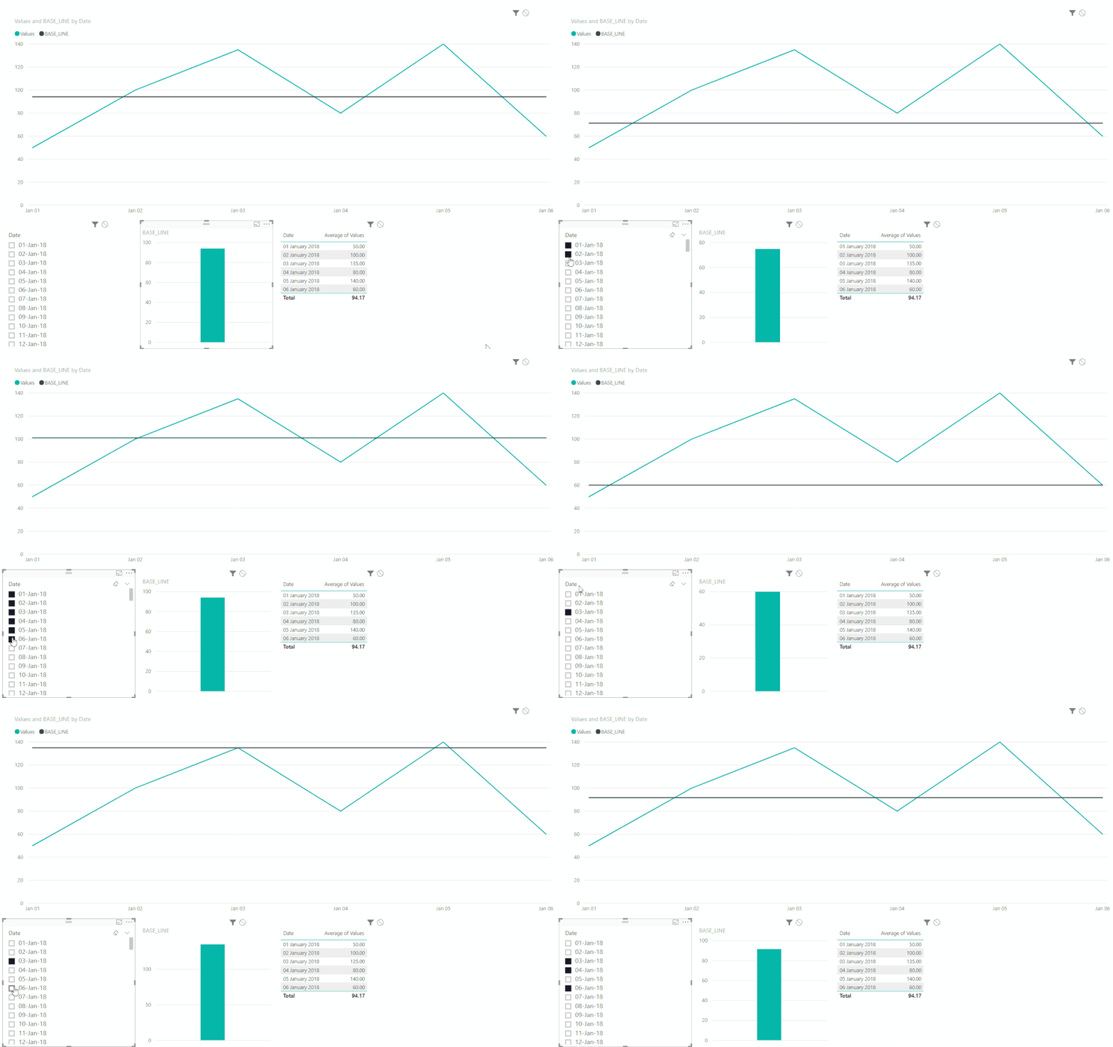
I have made a mockup of a file using only dates + value and calculating the moving average:
- Create a date table
- Make a non-active relationship between both table based on date
- Create the following measure:
BASE_LINE =
CALCULATE (
    AVERAGEX (
        SUMMARIZE (
            ALL ( 'Fact Table'[Date]; 'Fact Table'[Values] );
            'Fact Table'[Date];
            "AVERAGE VALUES"; AVERAGE ( 'Fact Table'[Values] )
        );
        [AVERAGE VALUES]
    );
    'Fact Table'[Date] = VALUES ( 'Fact Table'[Date] );
    USERELATIONSHIP ( DimDate[Date]; 'Fact Table'[Date] )
)
Be aware that I'm using AVERAGEX but based on your context you may have to use another type of aggregator.- Create a slicer with the Date table date
- Add the measure to your line chart along side with the values.
As you can see the average is moving with the changes of the slicer.
Not sure if this is waht you need.
Regards,
Mfelix
Regards
Miguel Félix
Did I answer your question? Mark my post as a solution!
Proud to be a Super User!
Check out my blog: Power BI em Português- Mark as New
- Bookmark
- Subscribe
- Mute
- Subscribe to RSS Feed
- Permalink
- Report Inappropriate Content
Thank you soo very much for this MFelix. This is very close to what I want to do. My average formula is very different but this is massively helpful and point sme in a direction.
Is there a chance you could share the bix file for my reference?
Regards
Kay
- Mark as New
- Bookmark
- Subscribe
- Mute
- Subscribe to RSS Feed
- Permalink
- Report Inappropriate Content
Hi @kay87,
See attach the PBIX file.
Be aware it's a we transfer link so will only last 7 days.
Regards,
MFelix
Regards
Miguel Félix
Did I answer your question? Mark my post as a solution!
Proud to be a Super User!
Check out my blog: Power BI em Português- Mark as New
- Bookmark
- Subscribe
- Mute
- Subscribe to RSS Feed
- Permalink
- Report Inappropriate Content
Didn't get the screen shots. You could potentially do this via something like a clustered column and line chart visual.
OK, now I see the screen shots. Weird. Well, currently you cannot use columns or measures in Analytics pane constant lines to the best of my knowledge.
Follow on LinkedIn
@ me in replies or I'll lose your thread!!!
Instead of a Kudo, please vote for this idea
Become an expert!: Enterprise DNA
External Tools: MSHGQM
YouTube Channel!: Microsoft Hates Greg
Latest book!: DAX For Humans
DAX is easy, CALCULATE makes DAX hard...
Helpful resources

New to Fabric Survey
If you have recently started exploring Fabric, we'd love to hear how it's going. Your feedback can help with product improvements.

Power BI DataViz World Championships - June 2026
A new Power BI DataViz World Championship is coming this June! Don't miss out on submitting your entry.

Join our Fabric User Panel
Share feedback directly with Fabric product managers, participate in targeted research studies and influence the Fabric roadmap.

| User | Count |
|---|---|
| 48 | |
| 45 | |
| 41 | |
| 20 | |
| 17 |
| User | Count |
|---|---|
| 69 | |
| 64 | |
| 32 | |
| 31 | |
| 27 |


