A new Data Days event is coming soon!
This time we’re going bigger than ever. Fabric, Power BI, SQL, AI and more. We're covering it all. You won't want to miss it.
Learn more- Power BI forums
- Get Help with Power BI
- Desktop
- Service
- Report Server
- Power Query
- Mobile Apps
- Developer
- DAX Commands and Tips
- Custom Visuals Development Discussion
- Health and Life Sciences
- Power BI Spanish forums
- Translated Spanish Desktop
- Training and Consulting
- Instructor Led Training
- Dashboard in a Day for Women, by Women
- Galleries
- Data Stories Gallery
- Themes Gallery
- Contests Gallery
- QuickViz Gallery
- Quick Measures Gallery
- Visual Calculations Gallery
- Notebook Gallery
- Translytical Task Flow Gallery
- TMDL Gallery
- R Script Showcase
- Webinars and Video Gallery
- Ideas
- Custom Visuals Ideas (read-only)
- Issues
- Issues
- Events
- Upcoming Events
Level up your Power BI skills this month - build one visual each week and tell better stories with data! Get started
- Power BI forums
- Forums
- Get Help with Power BI
- Desktop
- Re: R Script ggplot Line Plot
- Subscribe to RSS Feed
- Mark Topic as New
- Mark Topic as Read
- Float this Topic for Current User
- Bookmark
- Subscribe
- Printer Friendly Page
- Mark as New
- Bookmark
- Subscribe
- Mute
- Subscribe to RSS Feed
- Permalink
- Report Inappropriate Content
R Script ggplot Line Plot
Hello,
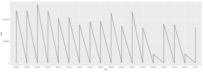
I'm trying for the first time ever R Scripting with ggplot. However I've encountered a small roadblock. While attempting to do a line chart, why does my data plunges to 0 but lines back to the number it should be? My data doesn't behave in such way, so what am I missing? I'm truly an beginner in this topic, so it might be something dumb, however I haven't found any answers online yet.
library(ggplot2)
library(gtable)
library(grid)
#library(extrafont)

data <- dataset
mon <- data$Monto
trans <- data$Transacciones
fec <- format(as.Date(data$Fecha), "%Y/%m")

options(scipen=999)
p1 <- ggplot(data, aes(fec, mon, group = 1)) + geom_line()

p1
* Note: I've been attempting to create a visual of two y axes. That's why I'm using ggplot. I'm halfway there, but I need to get this fixed first.
Solved! Go to Solution.
- Mark as New
- Bookmark
- Subscribe
- Mute
- Subscribe to RSS Feed
- Permalink
- Report Inappropriate Content
Based on your code, it seems you put date field into your dataset. I assume you have data on day level. As you format your Date into "YearMonth", which means you have multiple data point on same X axis category. This the reason why your line goes crazy.
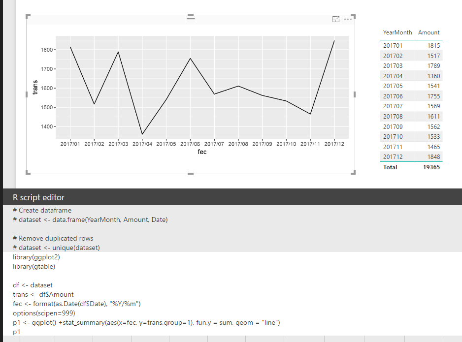
In your scenario, you should use stat_summary() function to have those data points aggregate on each "YearMonth". Please refer to my sample below:
library(ggplot2)
library(gtable)

df <- dataset
trans <- df$Amount
fec <- format(as.Date(df$Date), "%Y/%m")
options(scipen=999)
p1 <- ggplot() +stat_summary(aes(x=fec, y=trans,group=1), fun.y = sum, geom = "line")
p1
Regards,
Helpful resources

Power BI Monthly Update - April 2026
Check out the April 2026 Power BI update to learn about new features.

Data Days 2026 coming soon!
Sign up to receive a private message when registration opens and key events begin.

New to Fabric Survey
If you have recently started exploring Fabric, we'd love to hear how it's going. Your feedback can help with product improvements.

| User | Count |
|---|---|
| 38 | |
| 29 | |
| 28 | |
| 20 | |
| 18 |
| User | Count |
|---|---|
| 66 | |
| 36 | |
| 30 | |
| 25 | |
| 24 |


