Get certified for free when you join Fabric Data Days 2026 and dive into Fabric, Power BI, SQL, AI, and other essential data skills.
Join nowJuly 28 - August 9 | Final Round of the Power BI Dataviz World Championships. This is your chance. Learn more
Hello all,
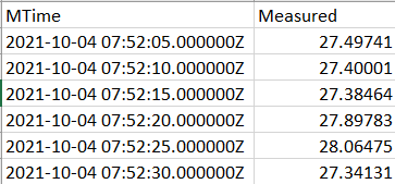
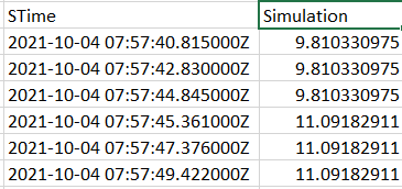
Currently I'm working with CSV data, 2 Files as shown below,
Measured Data
Simulation Data
I want to make a scatter plot chart using a power bi visual.
Imp Note: The measured CSV File has around 8k rows,
and the simulation CSV File has around 1.5k rows.
They are not plotted against the same exact times. The reason why Simulation has less points is that, once the Measured is marked on the chart, the simulation data points cover from the beginning to the end like overall.
So bascially for both of these, we need to use all the 4 axes.
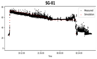
This is what I want,
I tried it in Power BI, I can get the Measured points in one chart, and similarly Simulation points in another chart.
But, how do I combine the 2 together in one chart like this one?
Kindly require your assistance asap. Thank you in advance!
Hello,
How do you make a Scatter plot graph like this with 2 data points (Measured and Simulation) in Power BI?
I have used the Python Visual. But so far have only made the Measured (Black data points). How do you do it with another set of data points? Do we have to overlap 2 graphs on each other?
Thank you!
Hi @niyati_61 ,
The default scatter plot chart does not support your needs. You could check if Microsoft AppSource has the view you need.
If not, you will need to develop custom visual.
Best Regards,
Jay
If you love stickers, then you will definitely want to check out our community sticker challenge, Barcelona edition!
Check out the July 2026 Power BI update to learn about new features.
| User | Count |
|---|---|
| 29 | |
| 28 | |
| 20 | |
| 20 | |
| 19 |
| User | Count |
|---|---|
| 35 | |
| 28 | |
| 21 | |
| 19 | |
| 17 |